Client work · TV and film
Done right, nobody notices any of it.
Set graphics that make a location believable — signage, plaques, posters, paperwork.
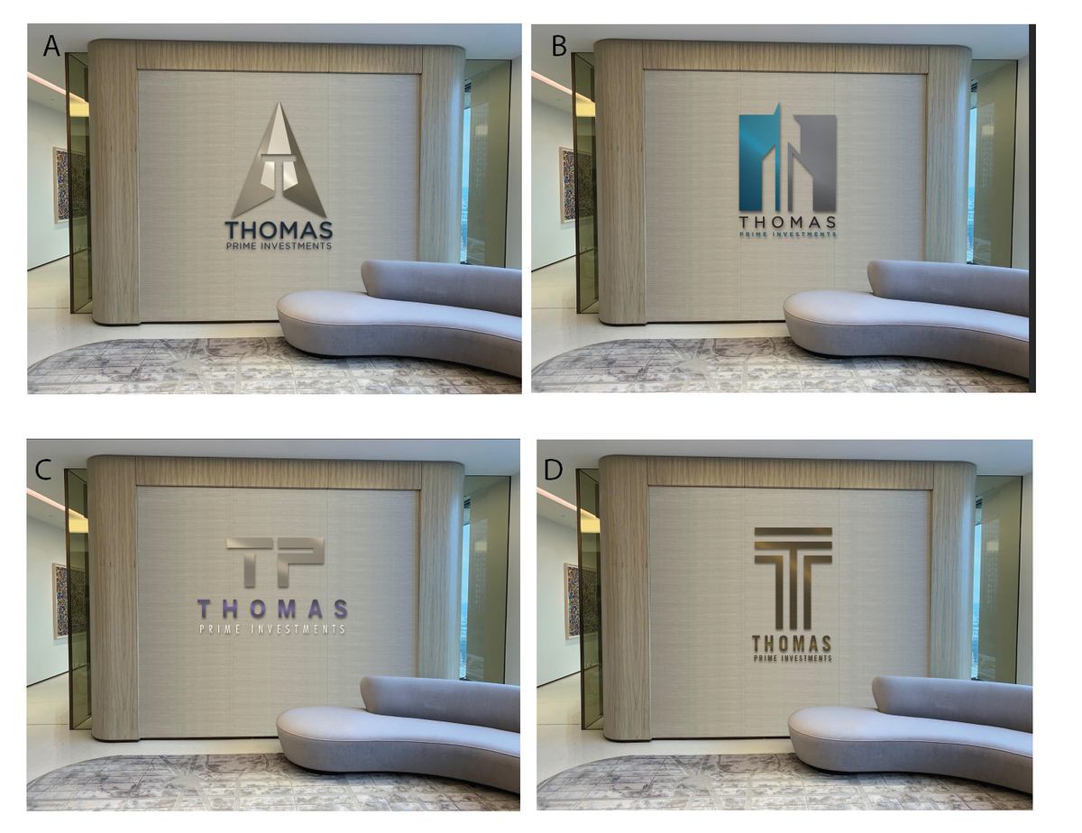
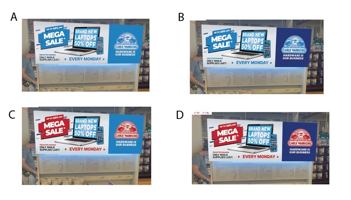
Branding matters
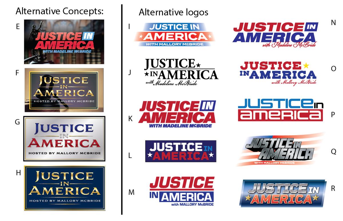
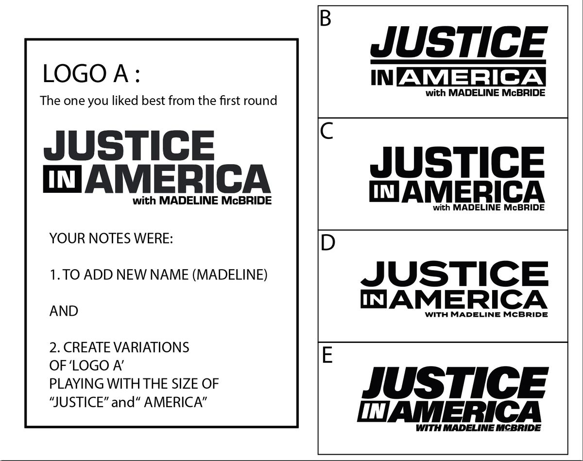
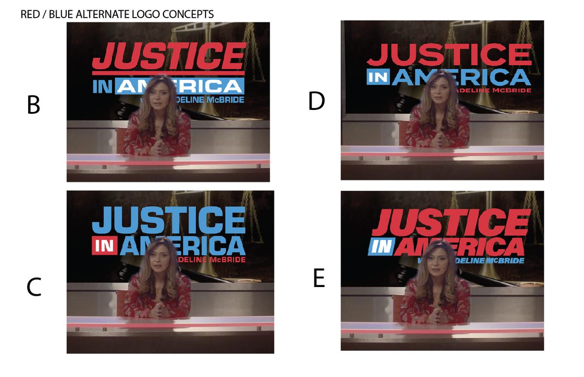
I’m always thinking about the best way to serve the story, and to entertain the audience, with graphics. A fictional company needs a real identity before it can appear on screen — and the choice between four marks changes how a room feels.
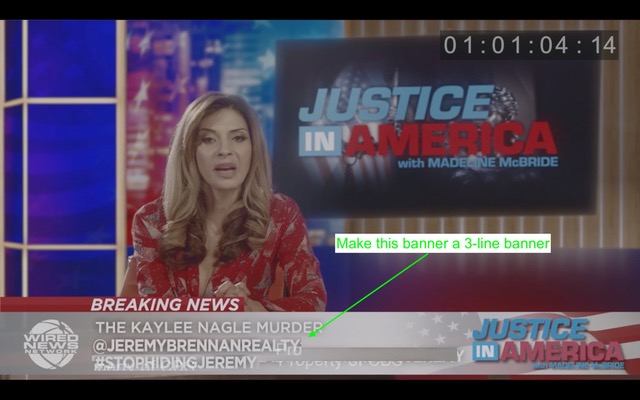
Justice in America — Bull, CBS
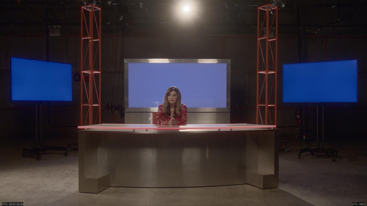
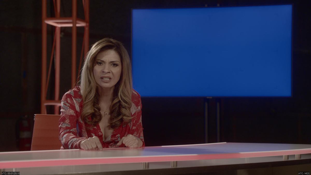
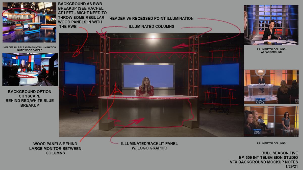
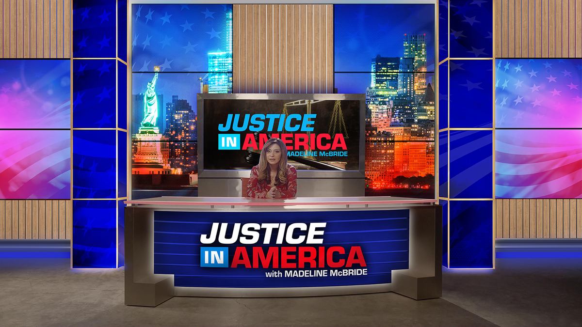
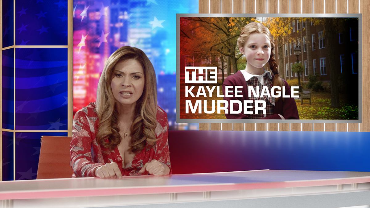
A primetime legal talk show that does not exist, built from an empty studio floor. The set was shot bare against blue screens, then designed, approved and assembled as a virtual environment — logo, desk, columns, cityscape and on-air graphics.
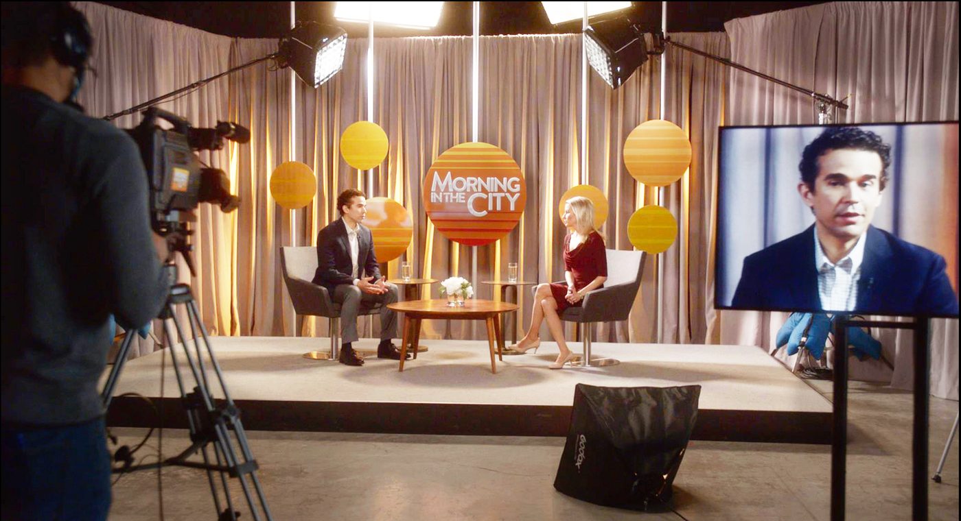
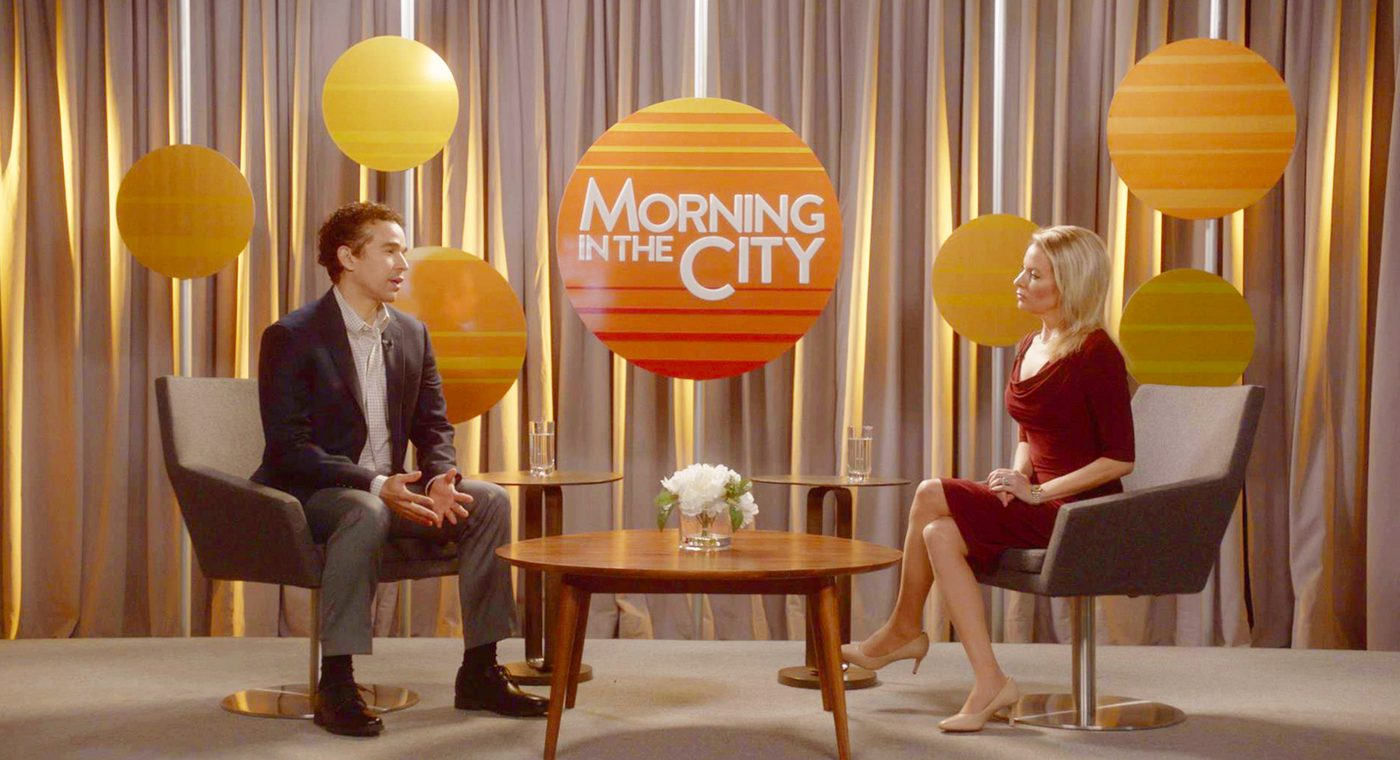
Morning in the City — Bull, CBS
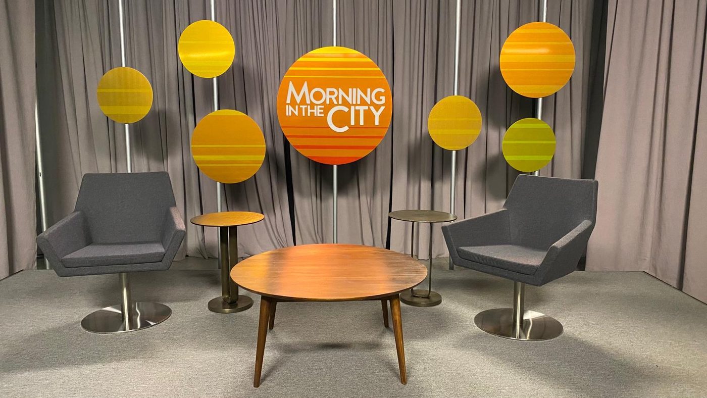
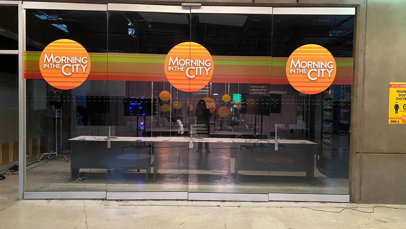
A daytime talk show with no studio of its own. The schedule did not allow a new build, so an existing set had to become one — which meant the identity had to do the work a set usually does. A sunrise logo, a striped band and a scatter of discs, strong enough that a curtain wall and a glass partition read as a broadcast floor.
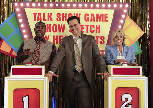
A game show, three shows deep — 30 Rock, NBC
A marquee, a prize podium and a wall of colour, for a format that only exists inside a sketch, inside a show, inside the series. Everything had to look like a network built it in 1974 and never touched it again.
Super Savings Depot
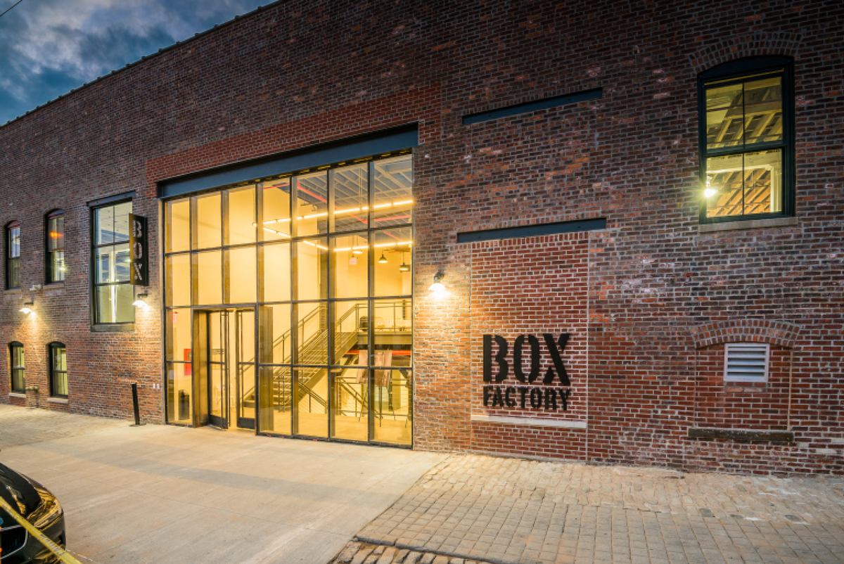
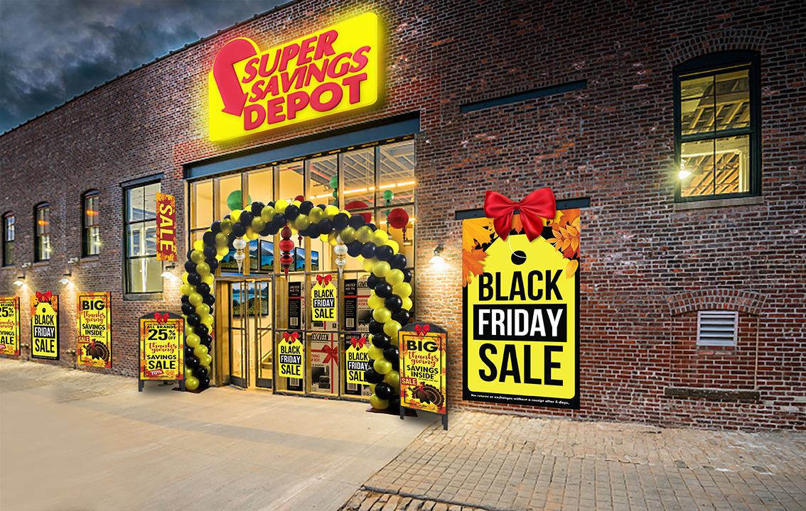
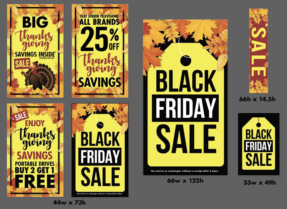
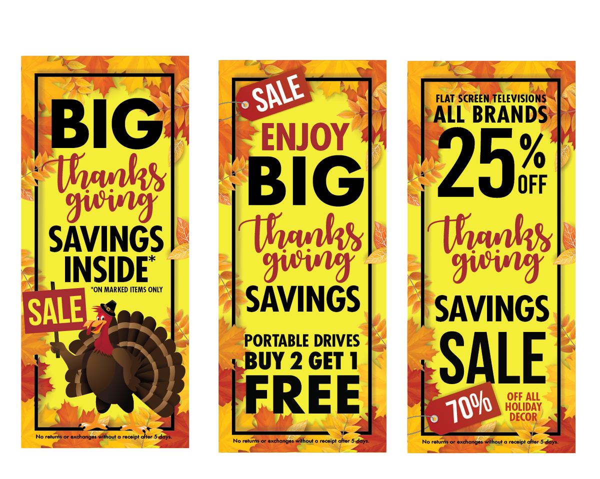
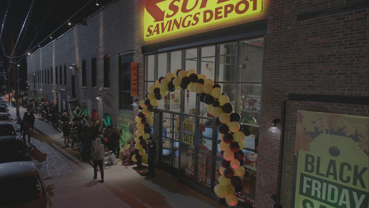
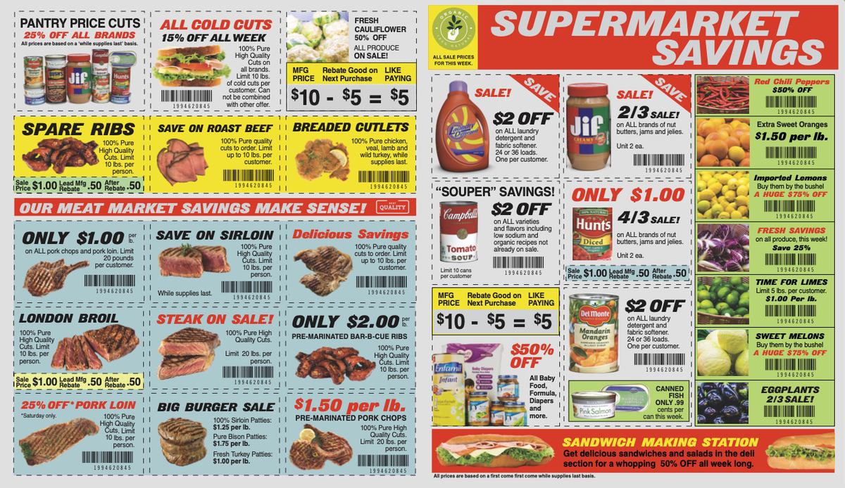
A bare brick building turned into a big-box store for a Black Friday sequence. Retail sets need a lot of graphics — every window, every sandwich board, every door — and all of it has to look like it came from the same marketing department.
The store that could not be named — 30 Rock, NBC
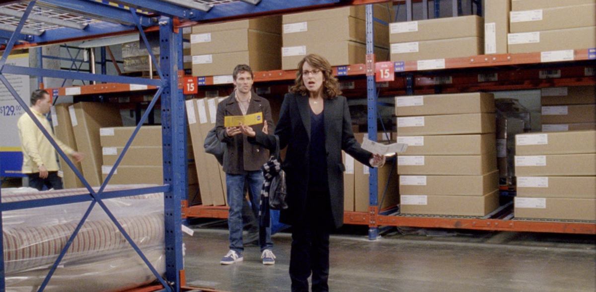
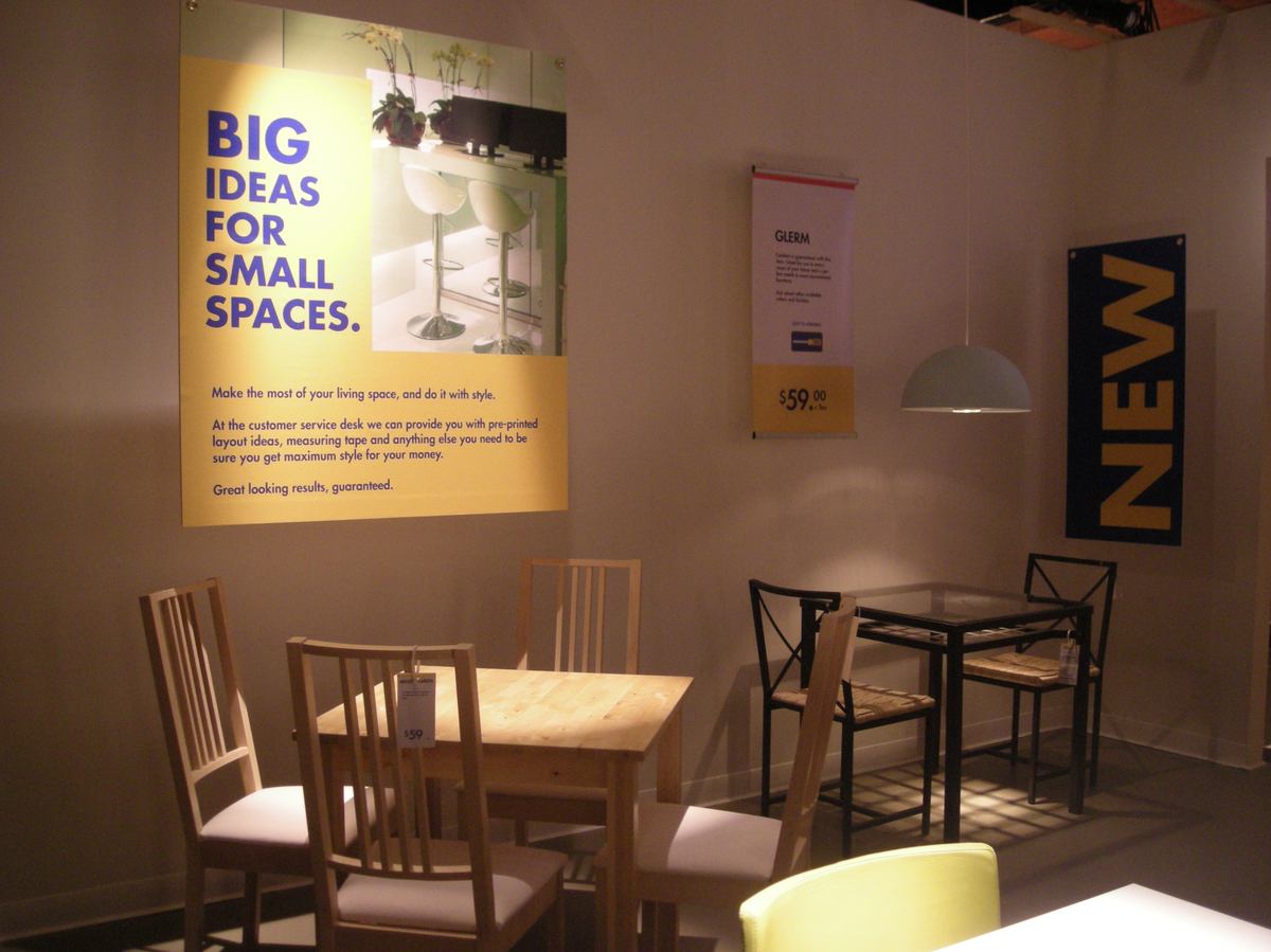
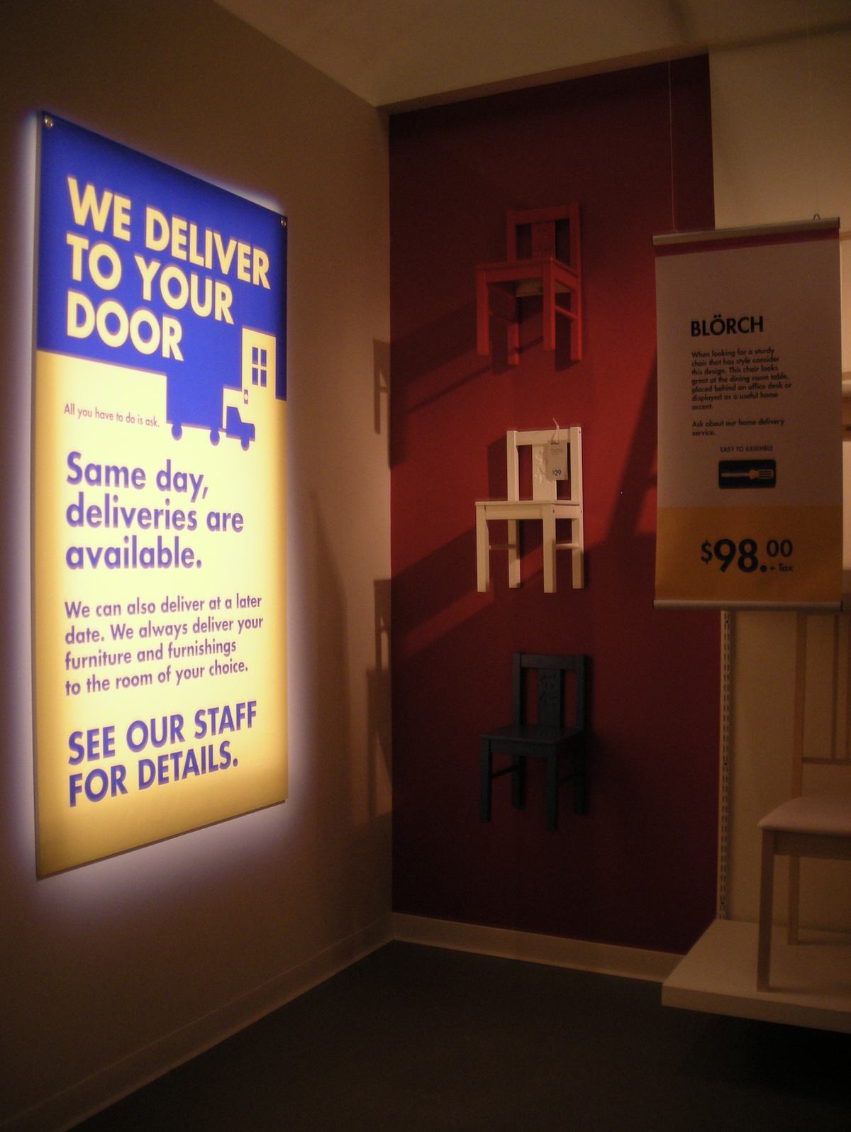
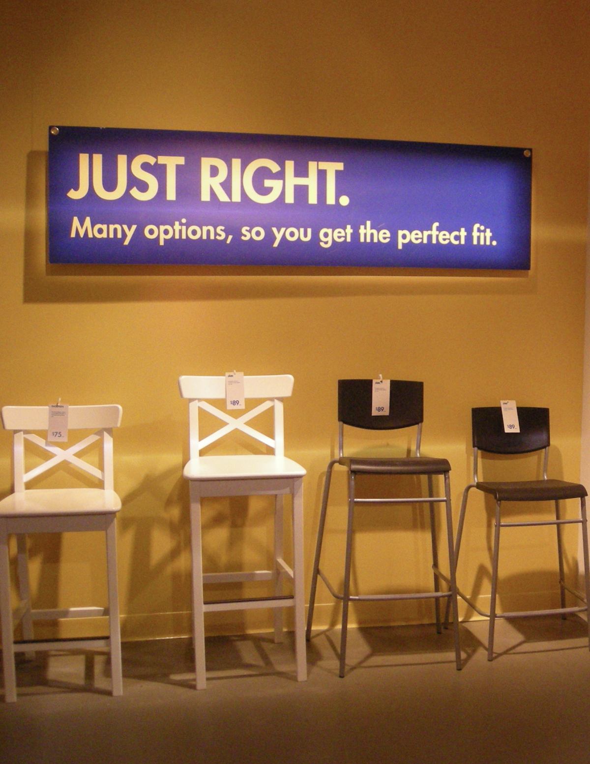
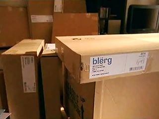
I designed a whole fake branch of a very famous Swedish furniture chain. The joke only works if the audience recognises it instantly, and I could not use the name anywhere — so everything had to be carried by the graphics.
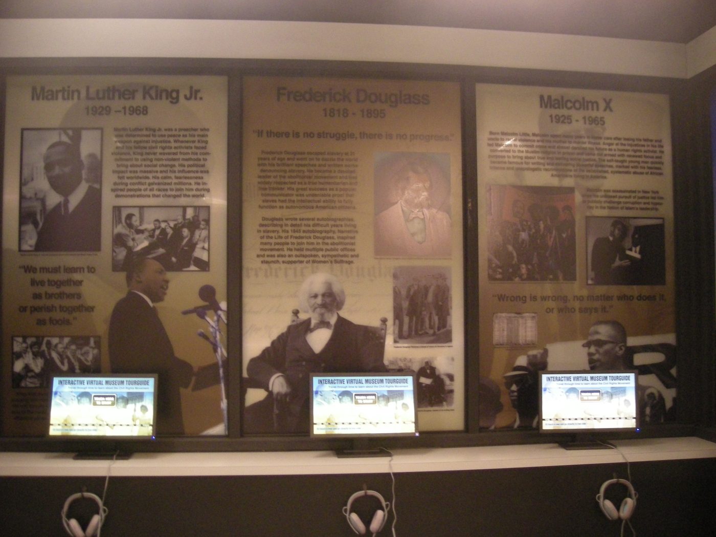
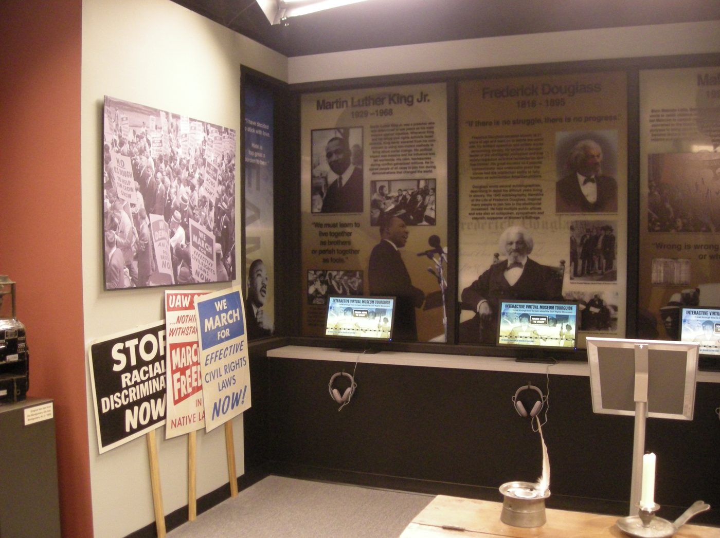
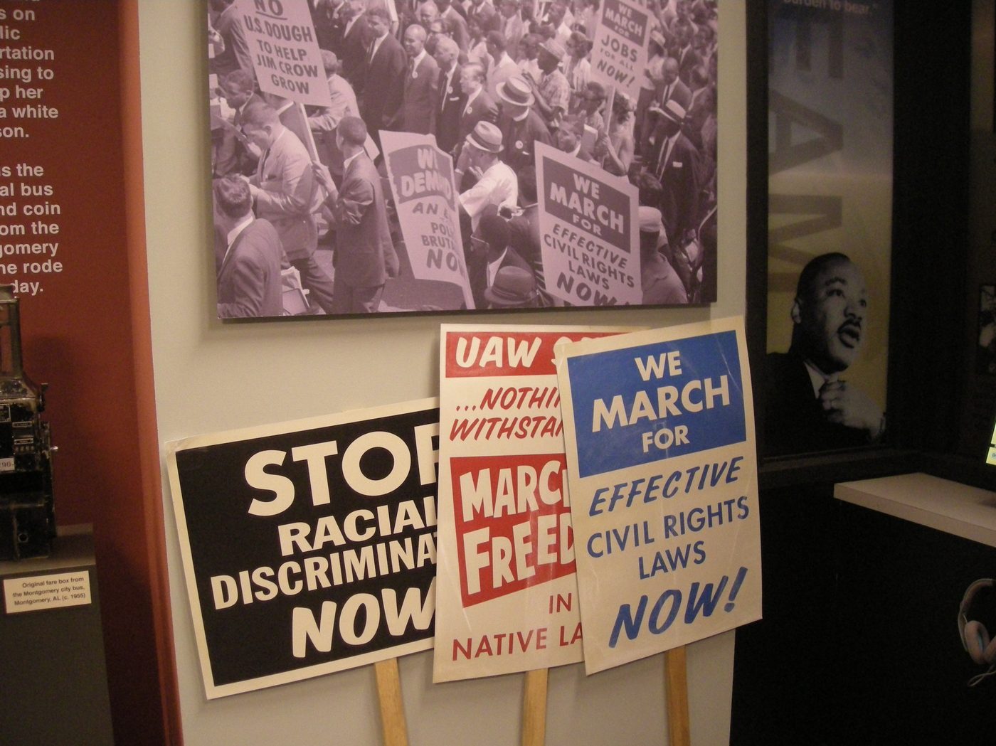
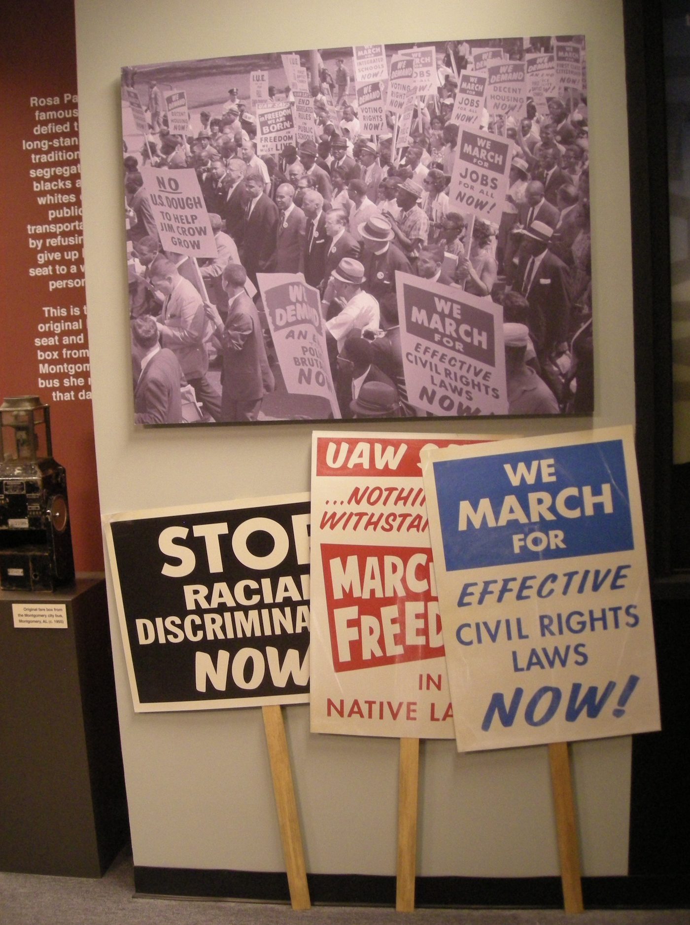
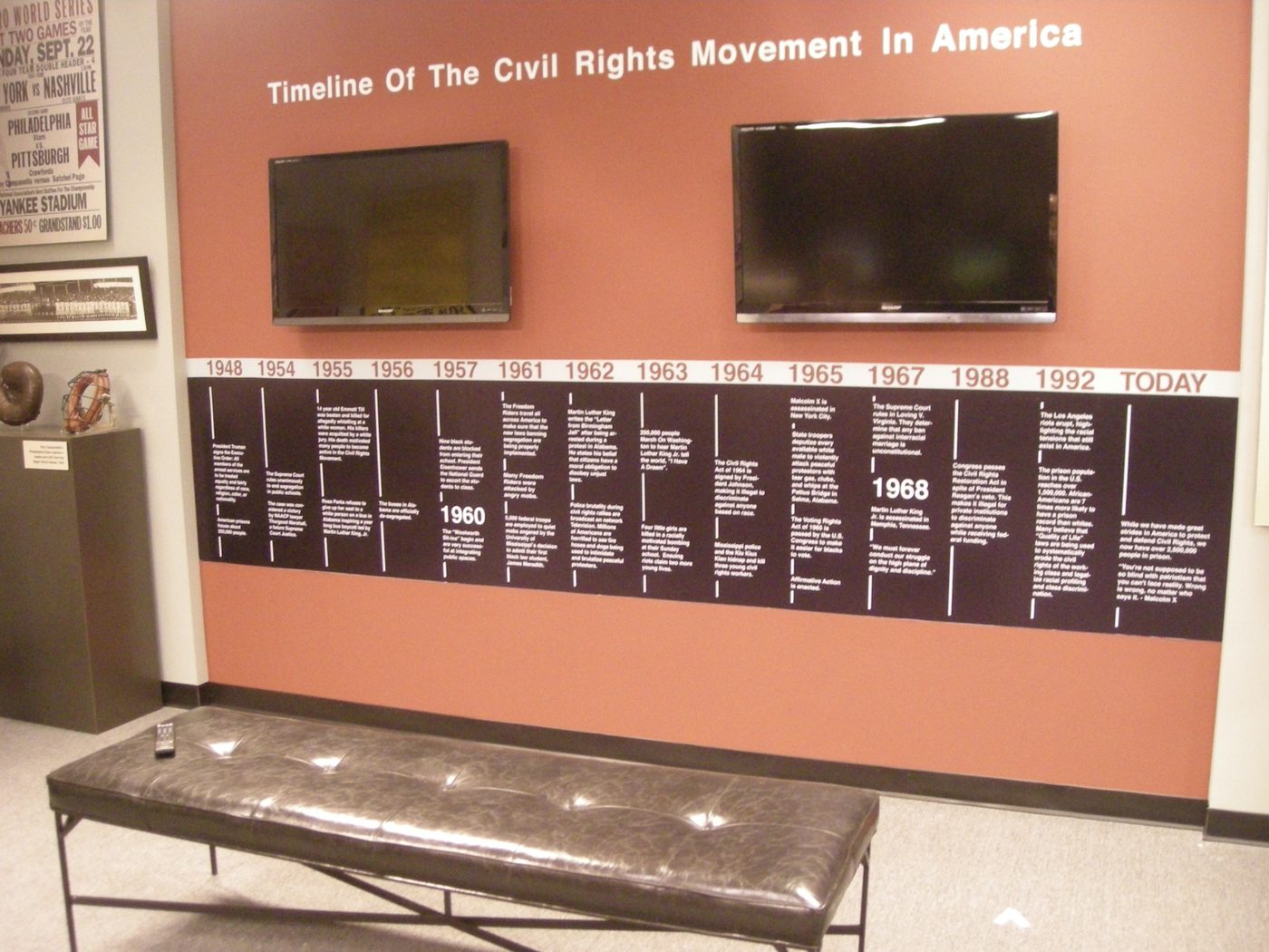
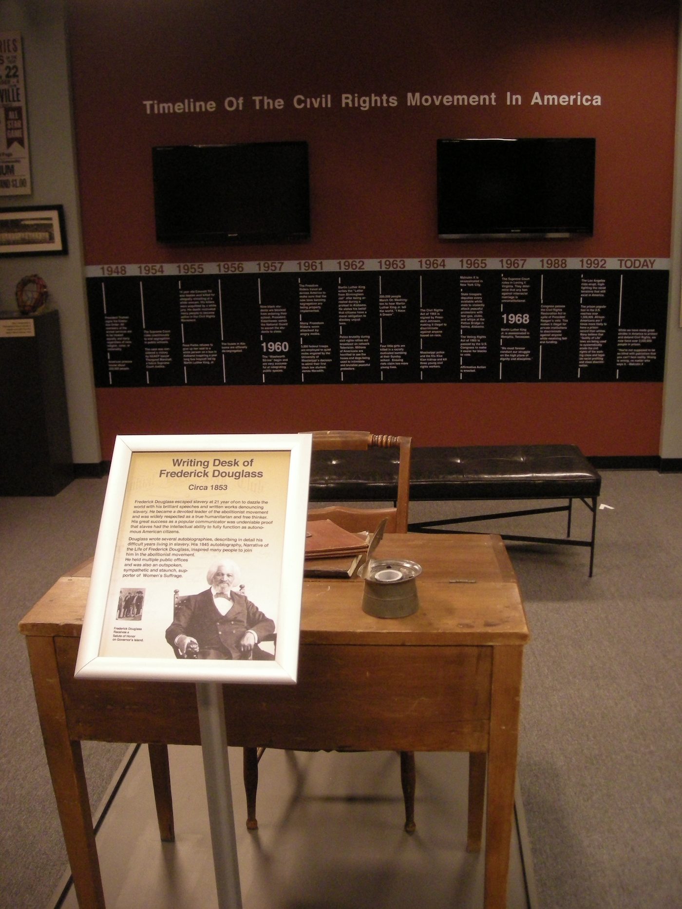
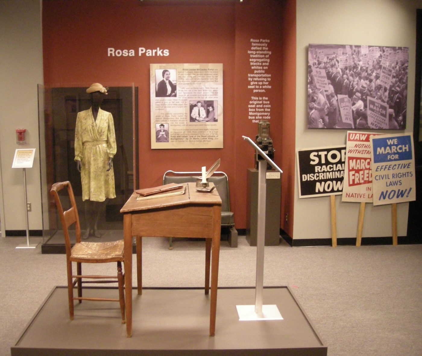
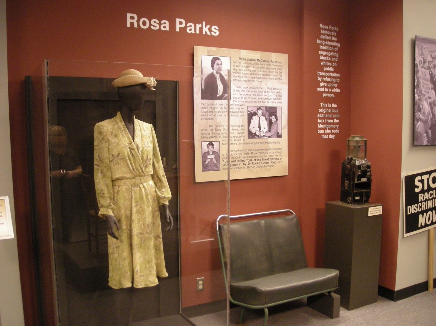
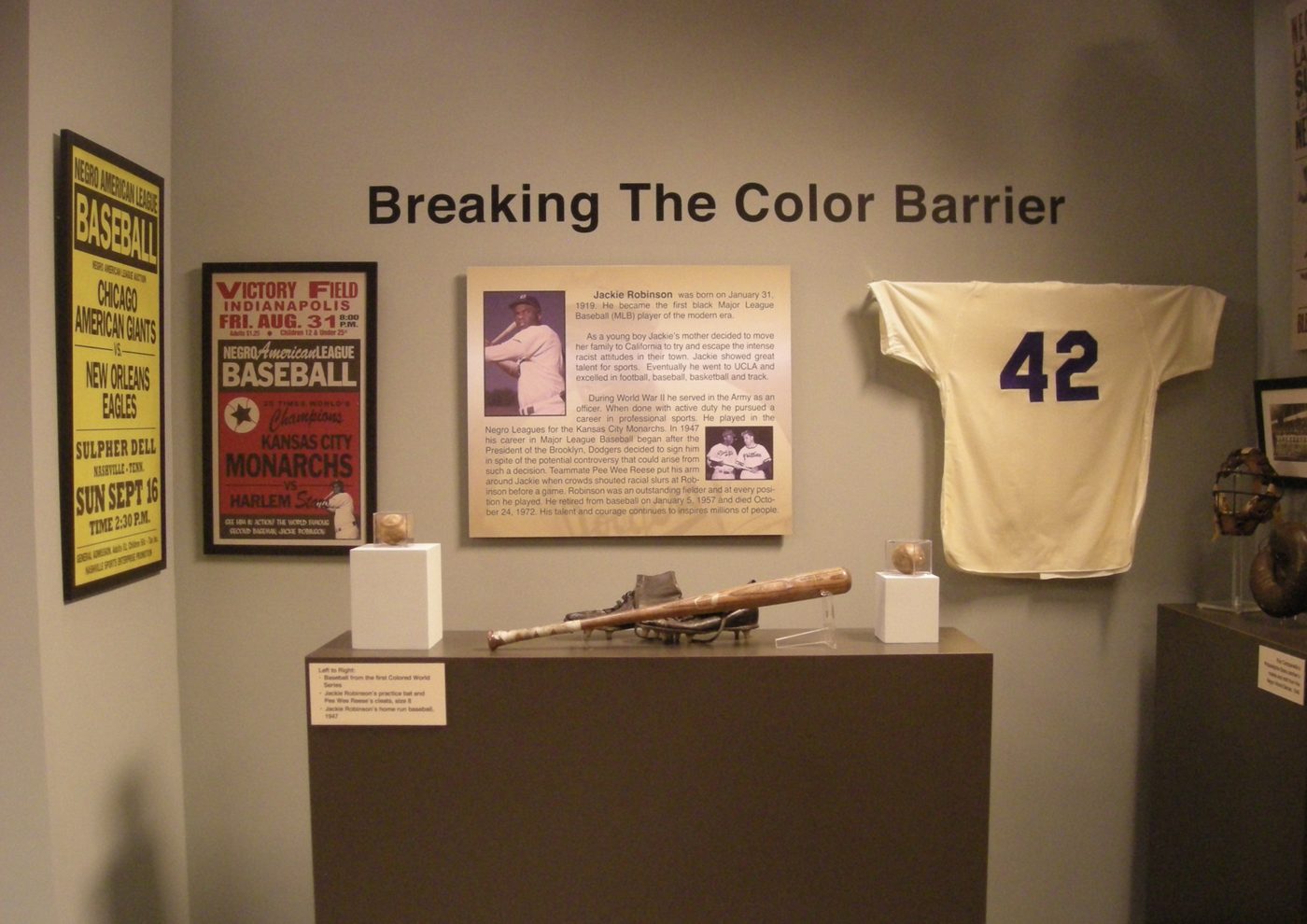
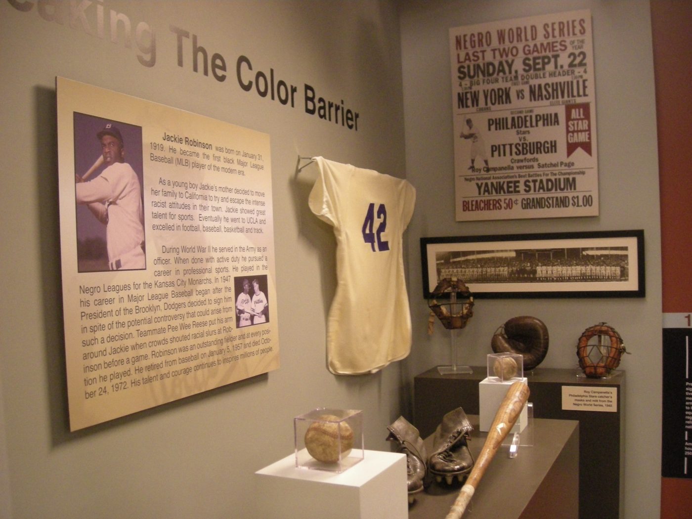
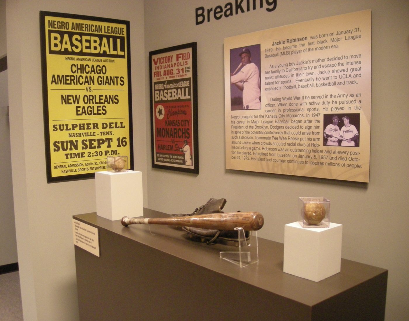
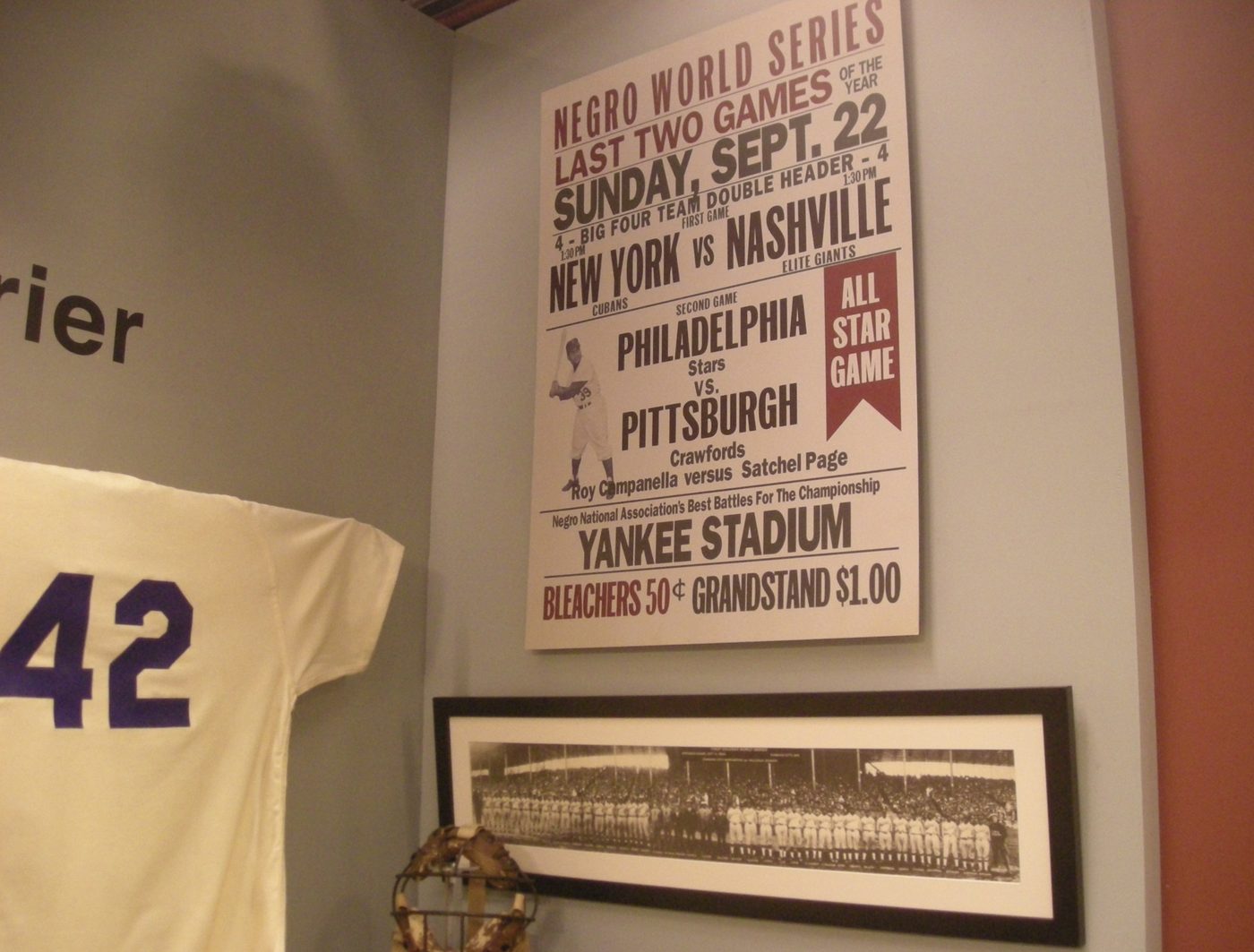
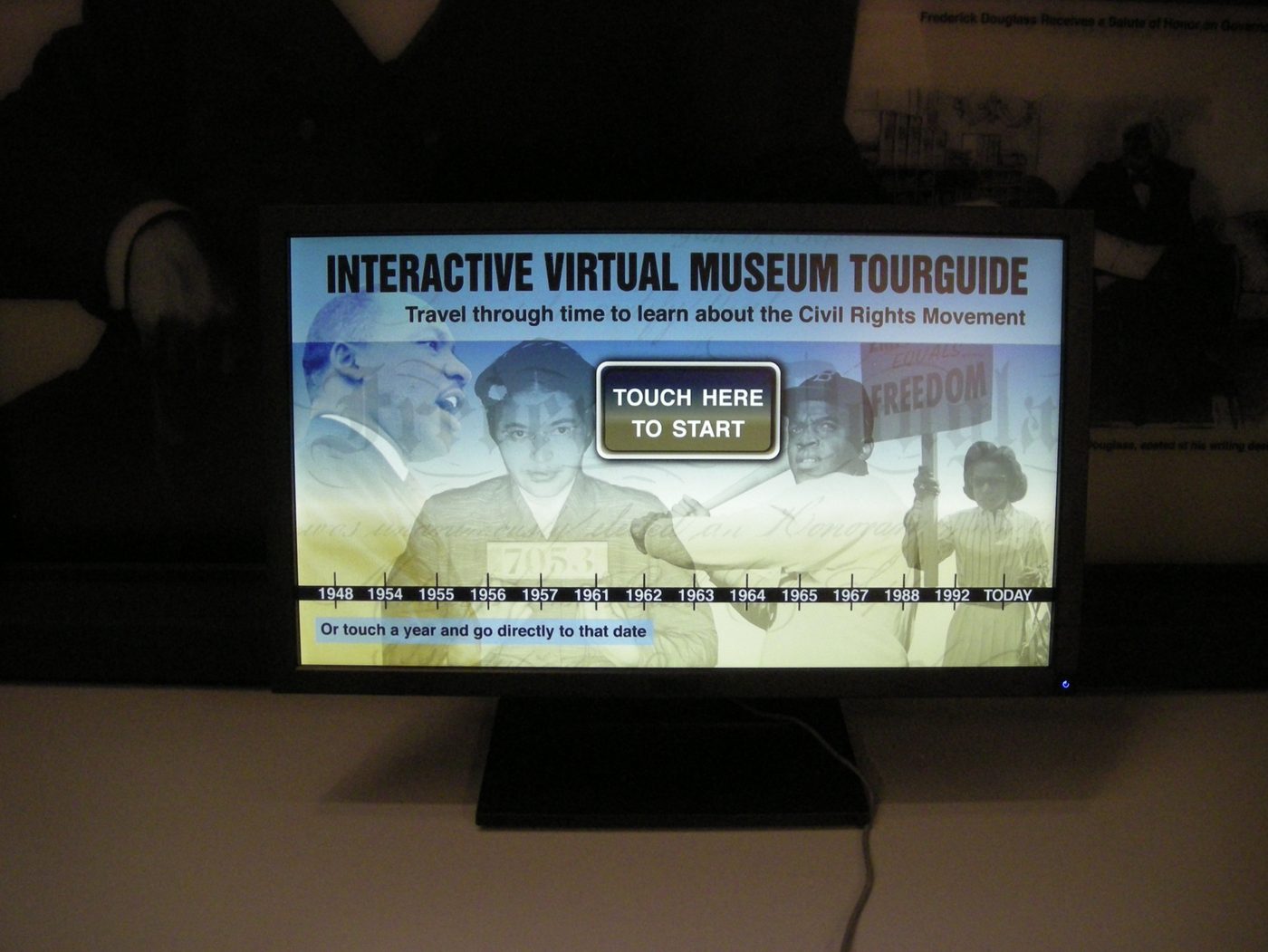
The African American History Museum — 30 Rock, NBC
A museum interior is the hardest kind of set dressing, because a museum is already a designed thing. Every panel, label and case has to look as though an institution catalogued it years ago and a curator wrote the copy — not as though it was made last week for a camera. Four galleries, built as one room.
Cable Warriors, and a supermarket
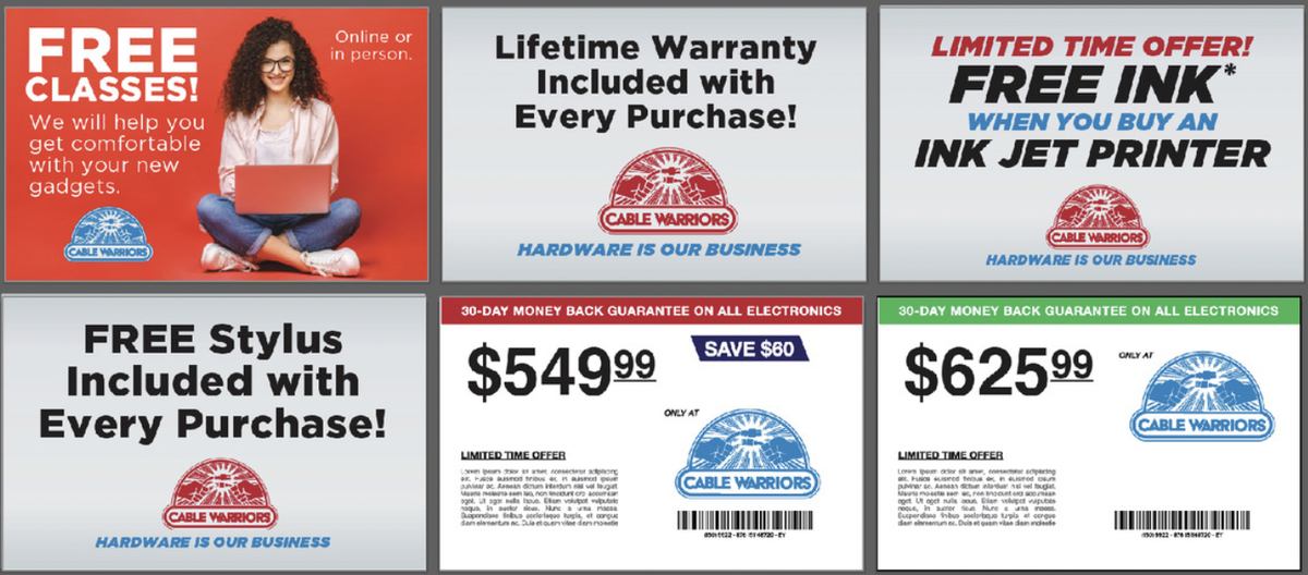
Two more retail brands invented from nothing — an electronics chain and a grocery circular — each needing a logo, a house style and enough collateral to fill a set.

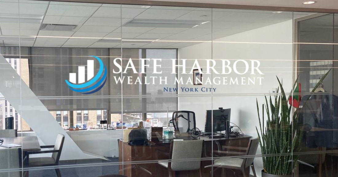
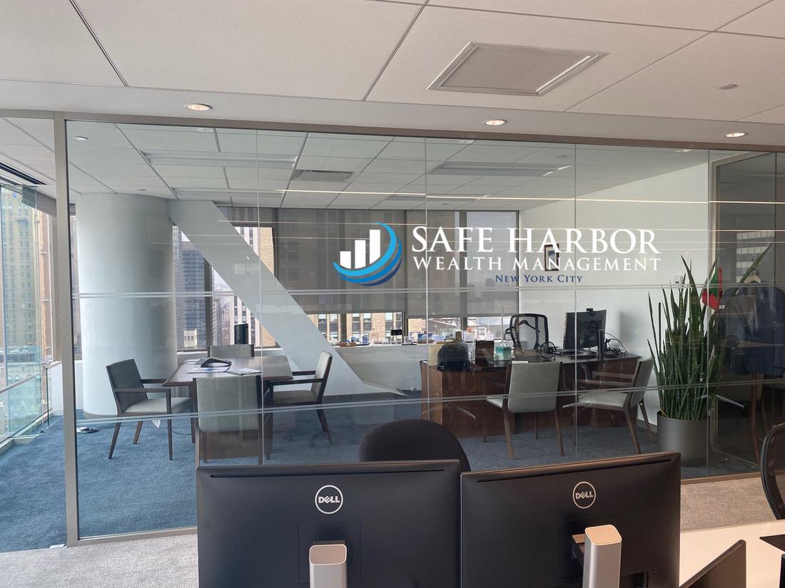
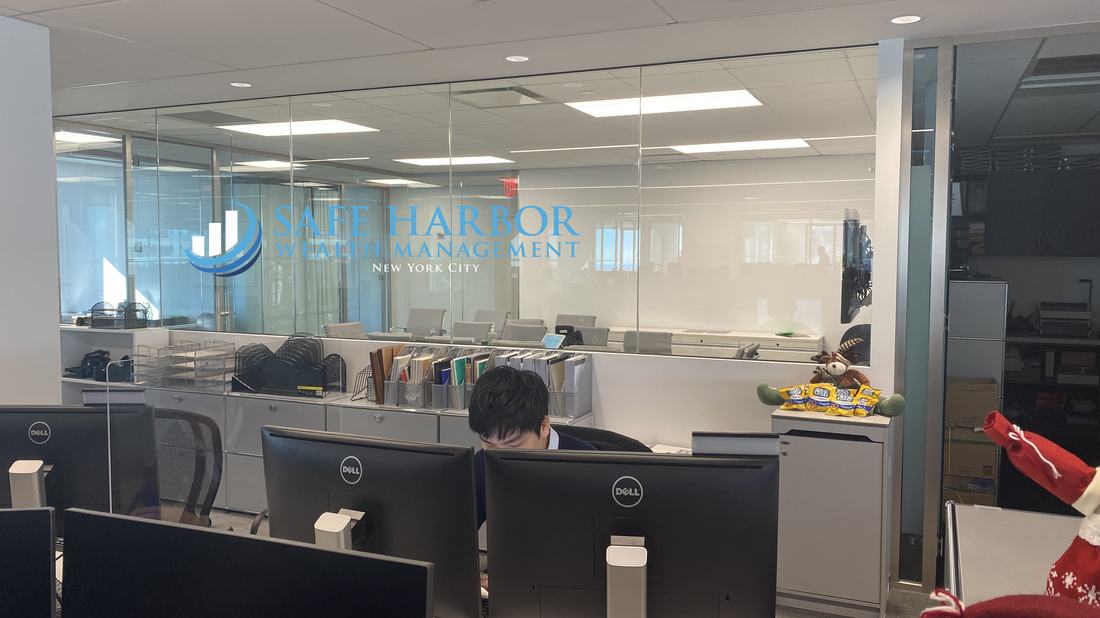
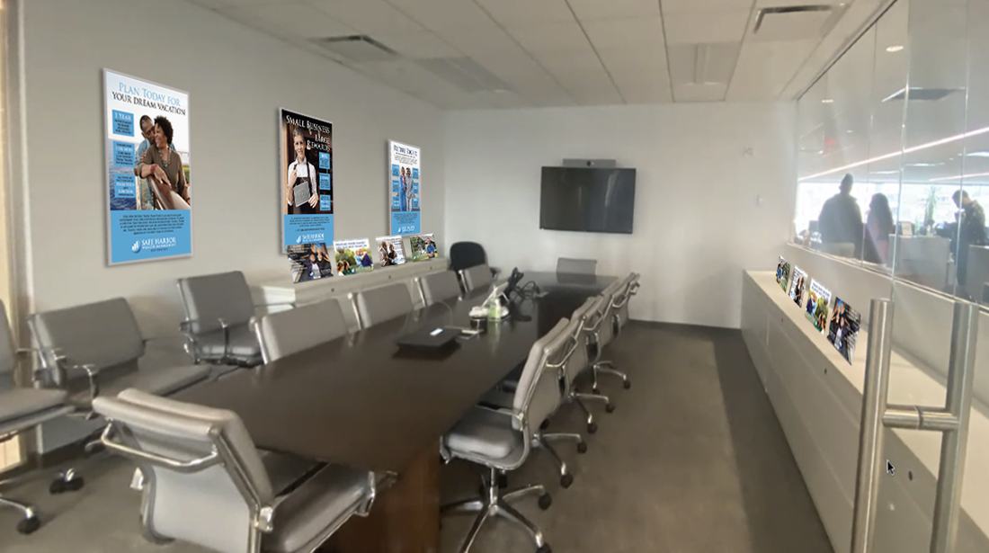
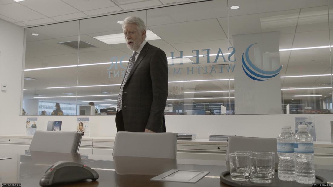
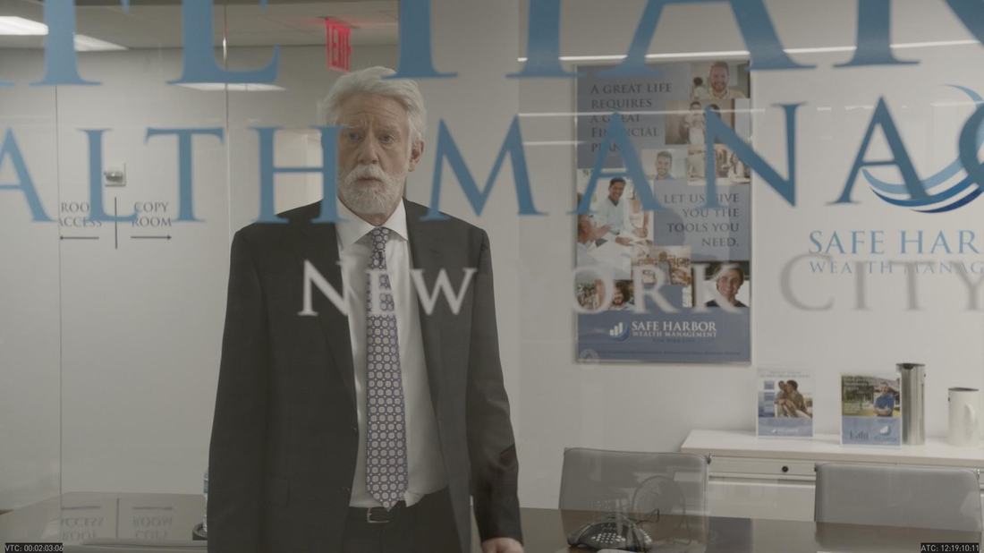
Safe Harbor Wealth Management — Bull, CBS
The episode was about a man whose corruption was catching up with him. Everything the company put on its walls had to promise security, so that the moment law enforcement closed in, the room itself would be telling on him. The brand had to be built before it could be undermined.





Checks Cashed
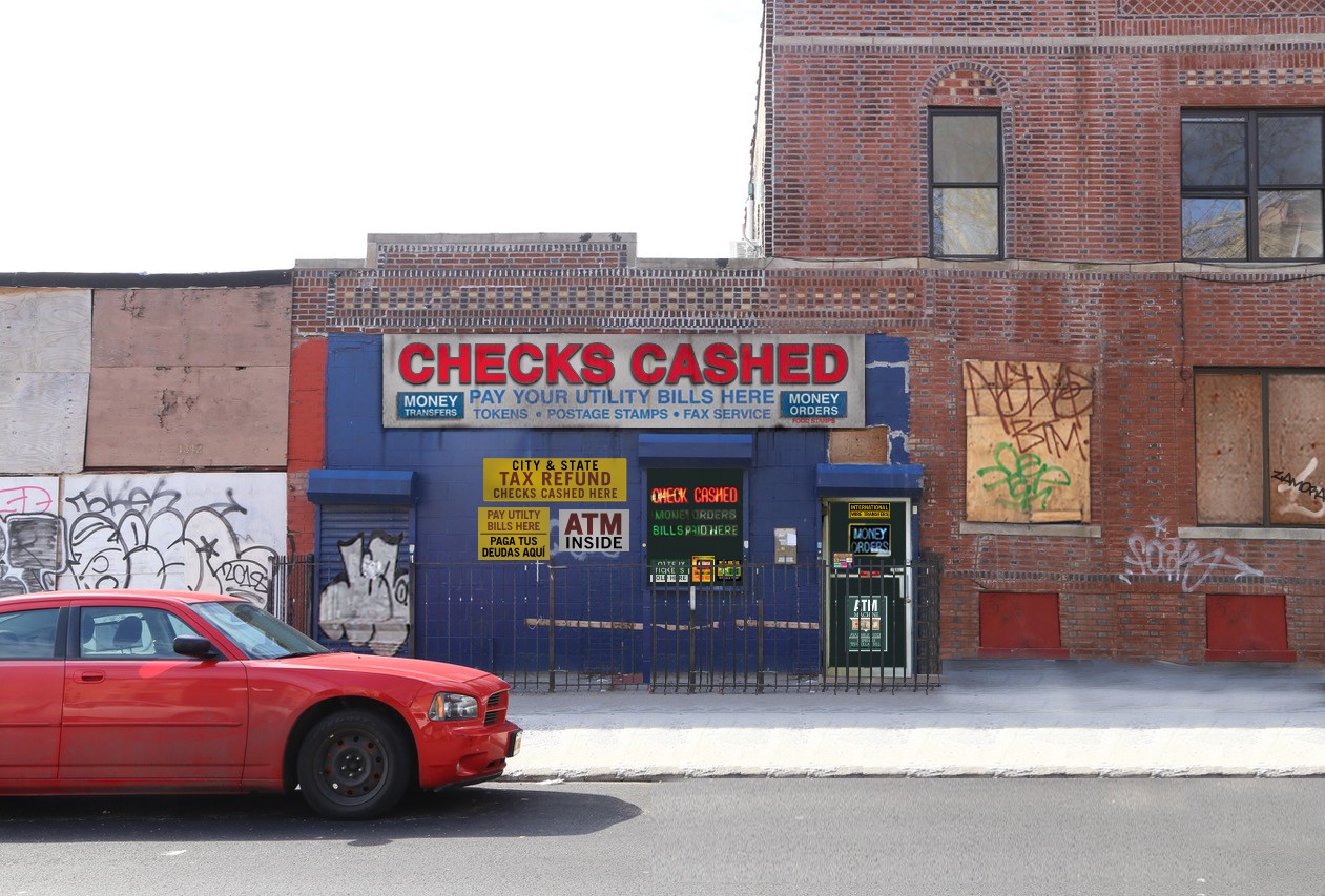
A cheque-cashing storefront, specified to Pantones and built onto a real block. This category of shopfront has its own visual grammar — the stacked service list, the primaries, the bilingual line, the ATM INSIDE panel — and getting it wrong reads instantly as fake.
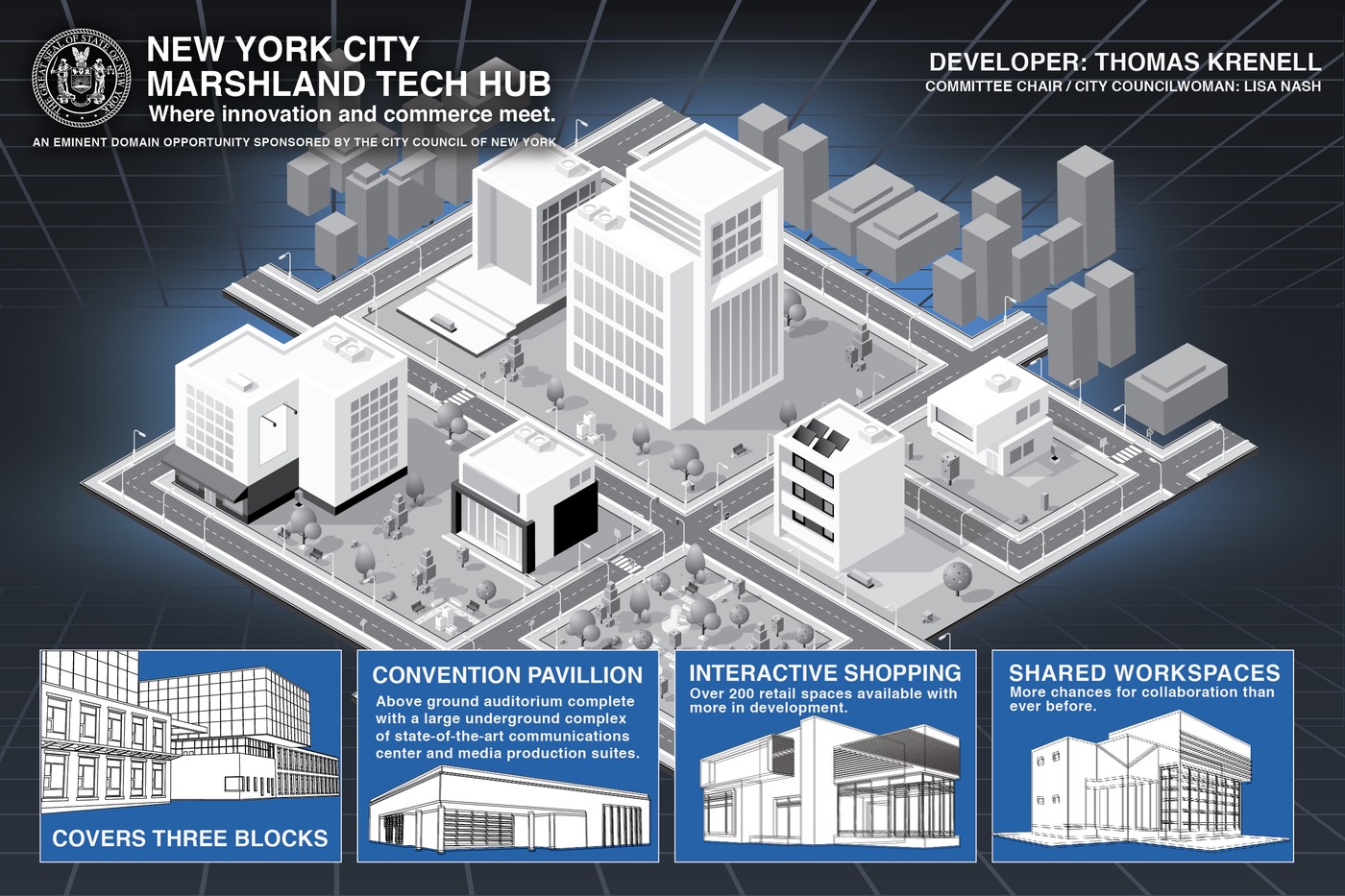
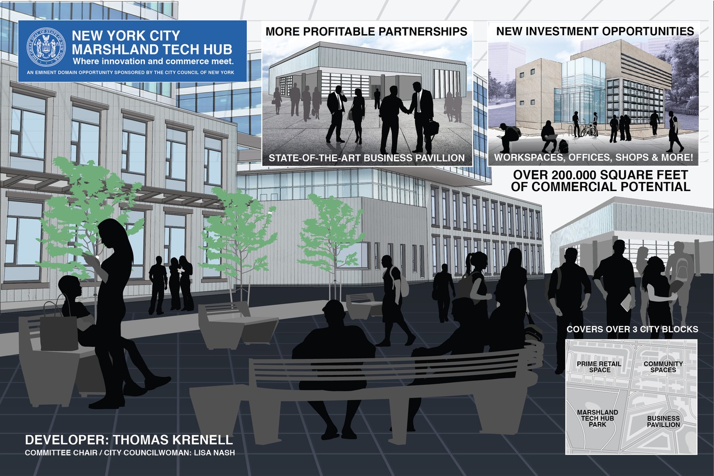
New York City Marshland Tech Hub
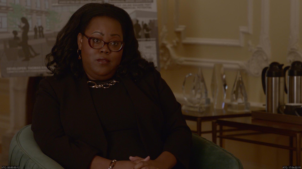
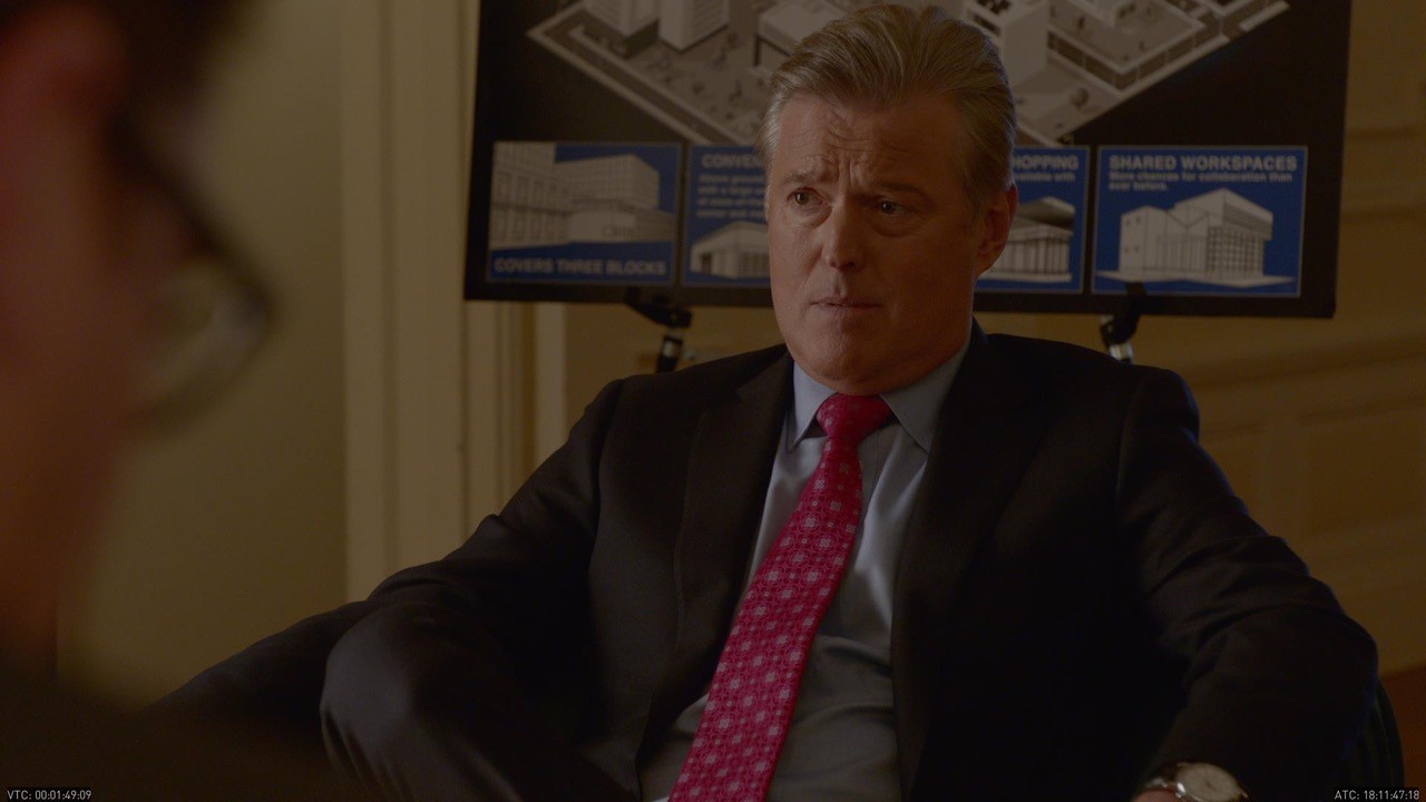
A development pitch for a project that has to convince a room on screen: an isometric masterplan, a street-level render and enough sober civic language to sound like it has already been through committee. Presentation boards are lit hard and shot past shoulders, so the hierarchy has to survive being half in frame.
Vehicles from somewhere else
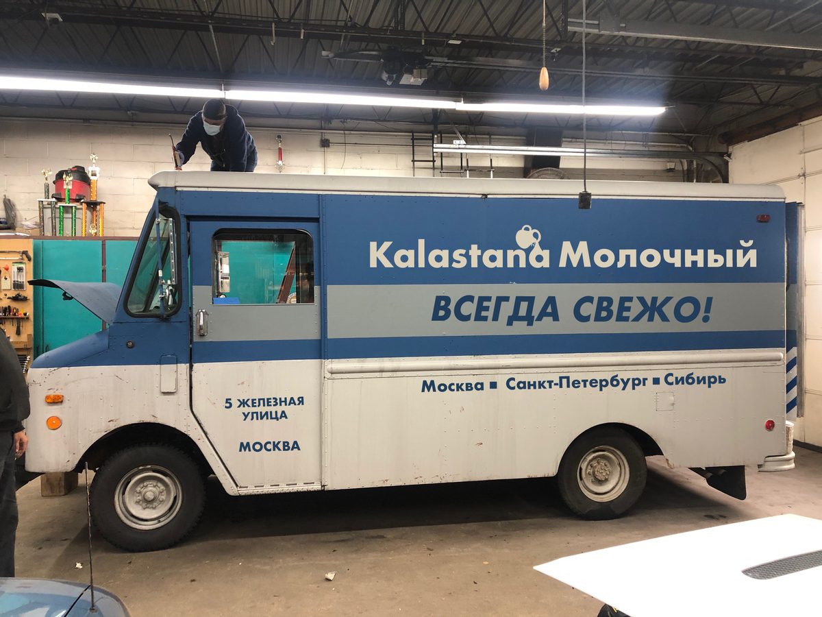
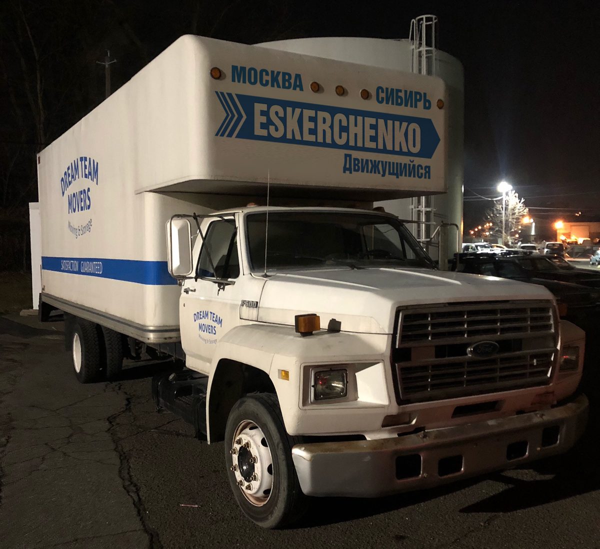
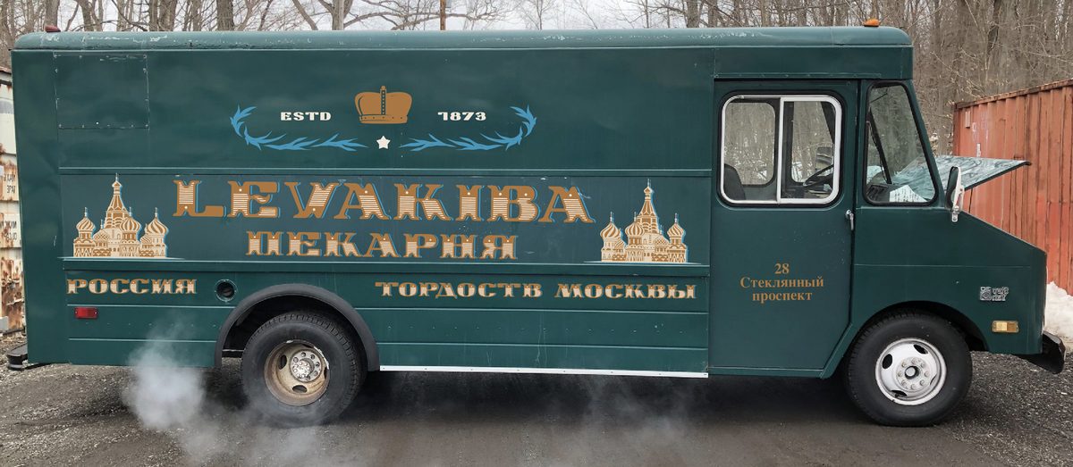
Sometimes a location in New York has to read as another country, and what is parked at the curb does most of that work. Three invented companies — a dairy, a bakery and a moving firm — each needing a mark, a house style and a Moscow address.
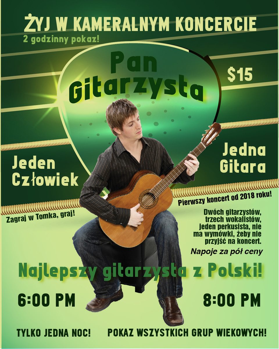
Polish posters for a coffee shop
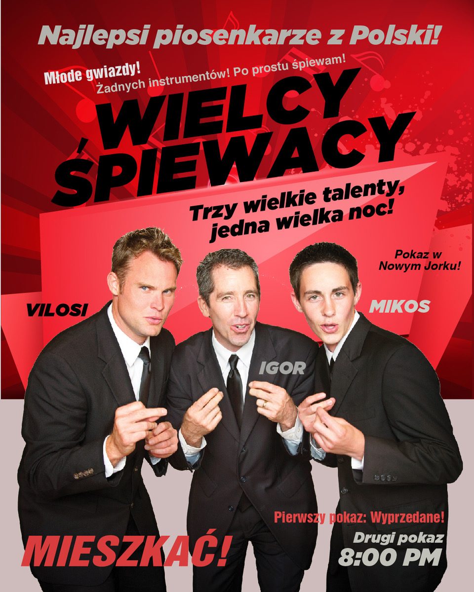
Set dressing for a Polish coffee shop — a wall of gig posters for four bands that do not exist. Each act got its own design vocabulary, so the wall reads as something collected over years rather than made in one pass.


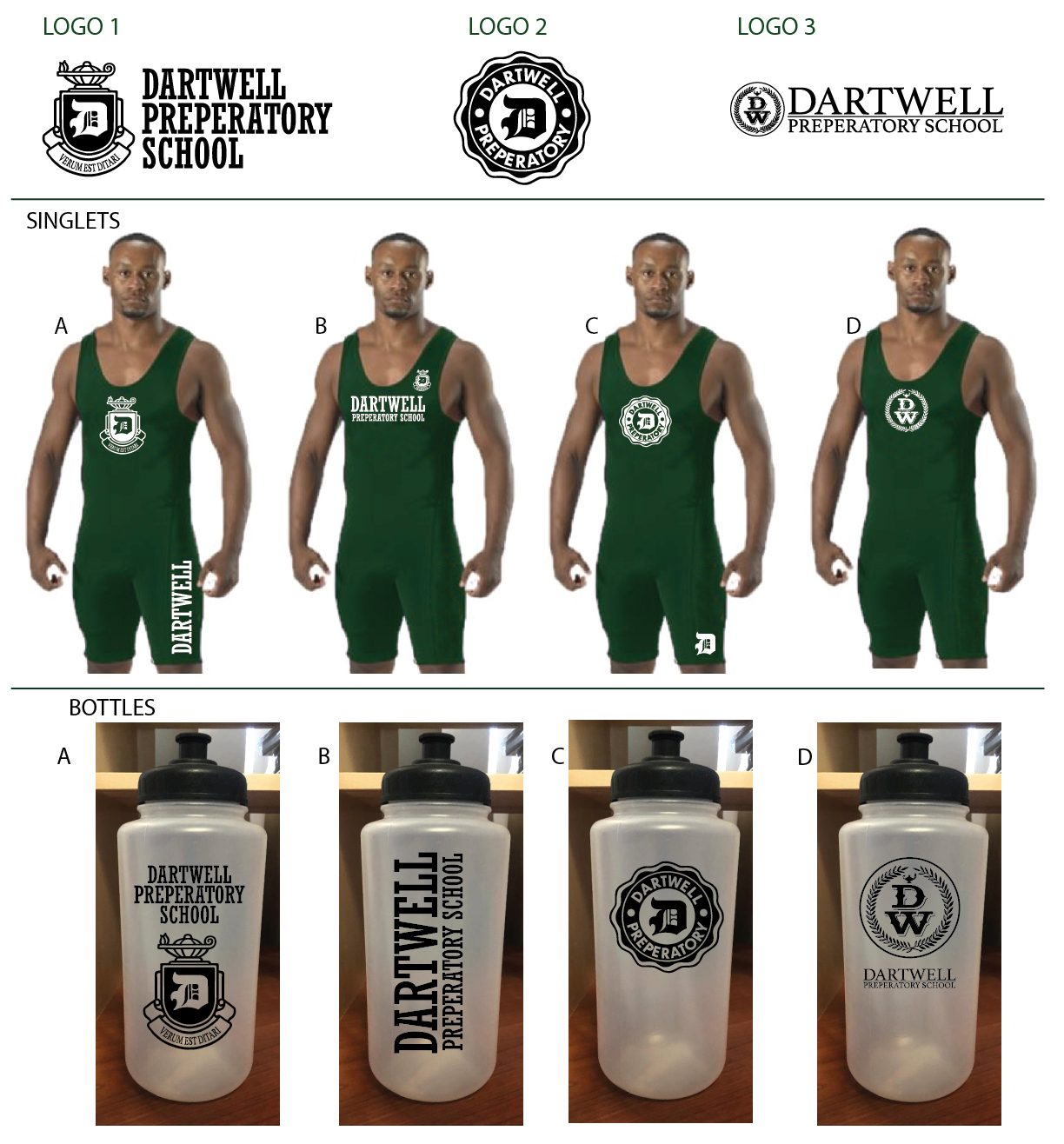
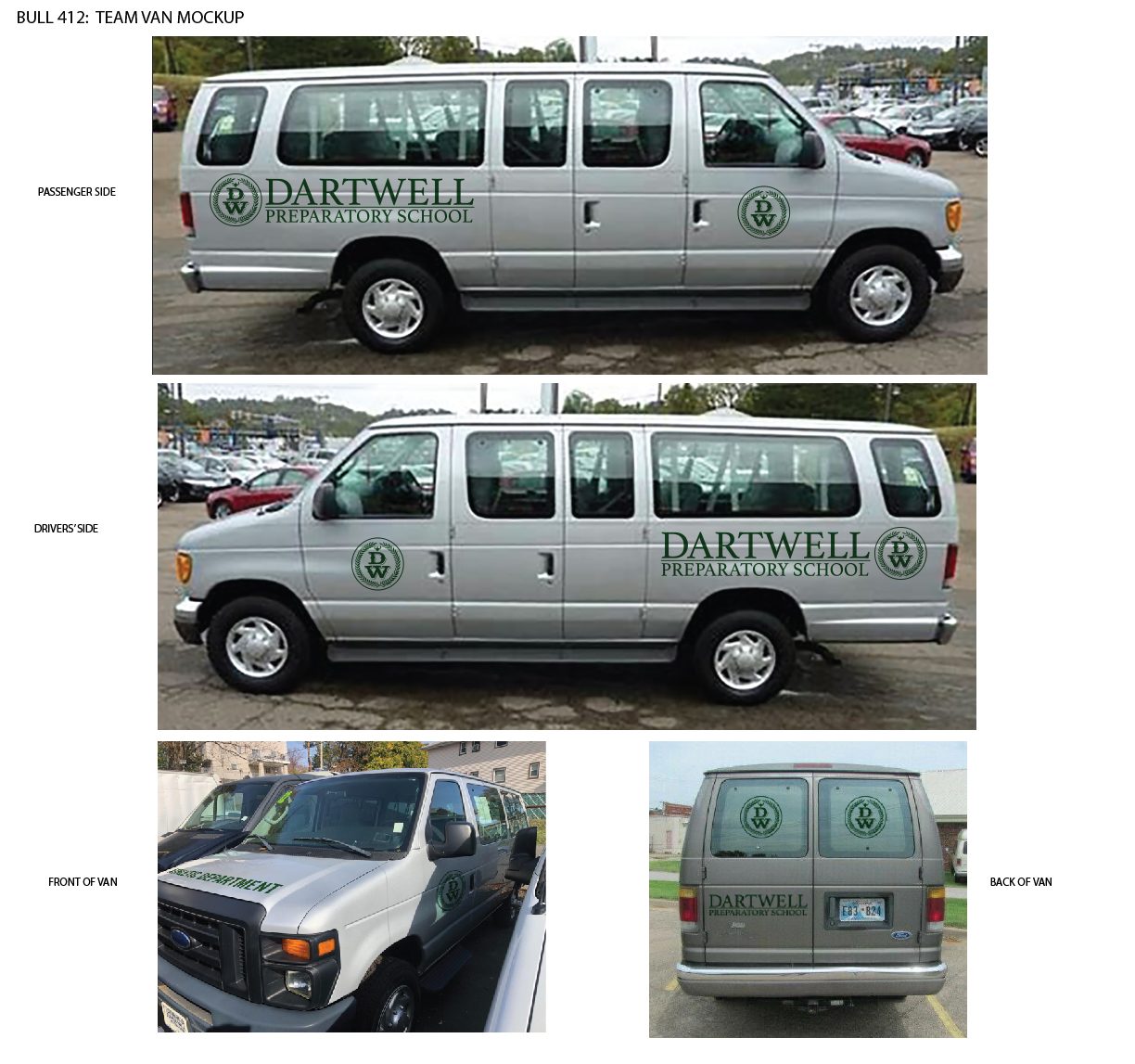
Dartwell Preparatory School — Bull, CBS
A private school built outwards from its crest. The mark had to work engraved on a bottle, stretched across a gymnasium wall and cut in vinyl on the side of a van, so three versions were drawn and tested on the things they would actually land on.
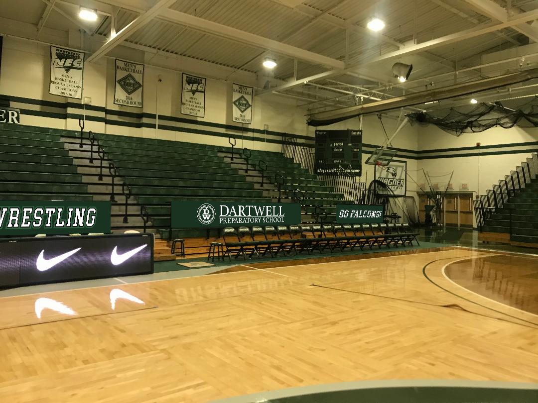
Tatum High School
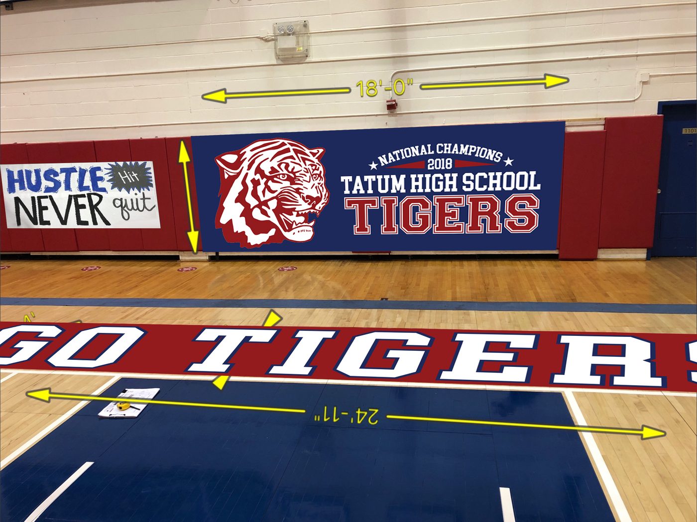
A second gym, and a second way of proving a sign before it is made. The banner and the floor letters were dropped onto the location photograph with the run measured across them, so the size was settled on paper rather than on installation day.
Hudson University
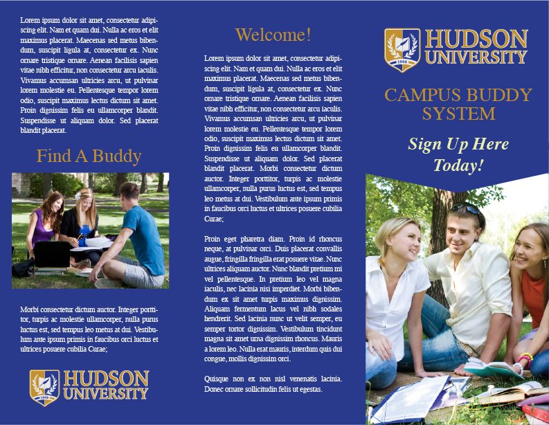
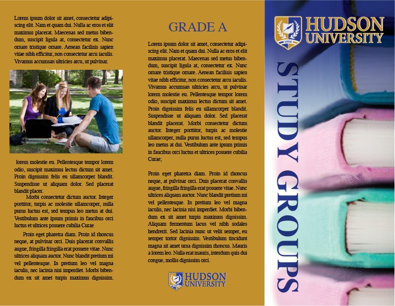
Three campus brochures in one house style. Small prop and set dressing graphics like brochures help make the action more realistic — and a stack of them on a table has to look like it came from one admissions office, not three.

The New Home Day School
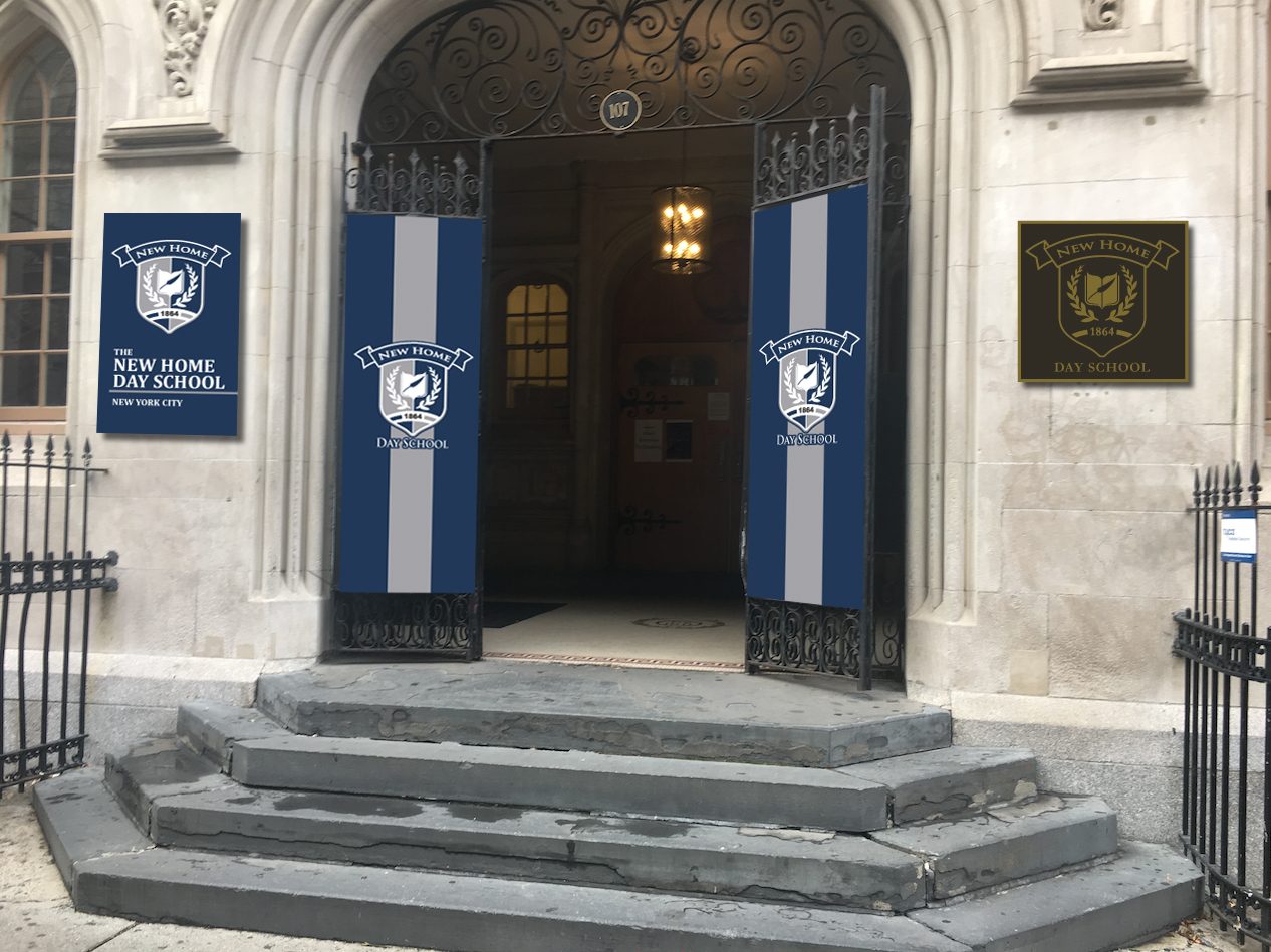
An entrance decided in Photoshop. Gate banners, a wall panel and a plaque placed on the photograph of the real doorway, so the whole approach could be judged at once before a single piece was printed.
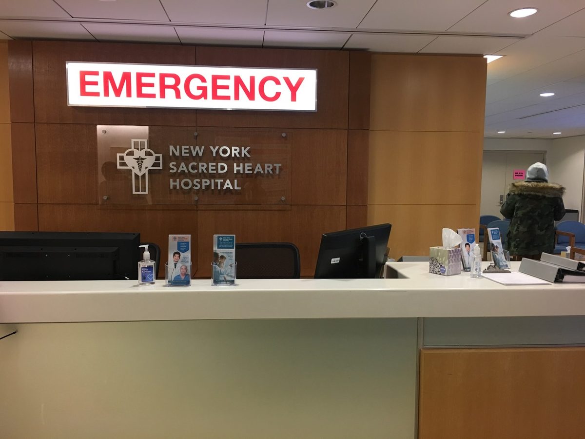
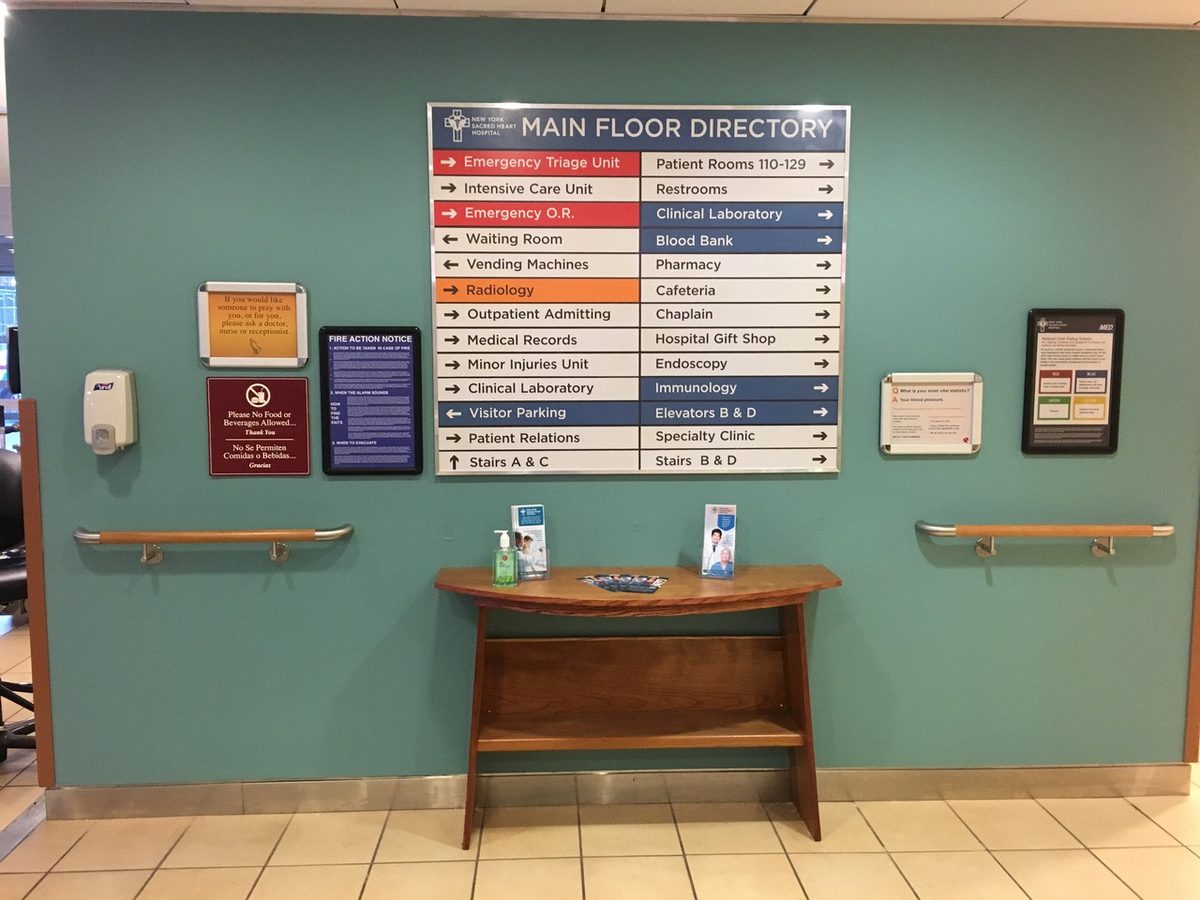
New York Sacred Heart Hospital
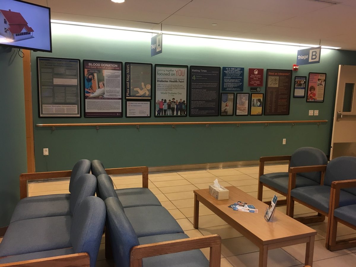
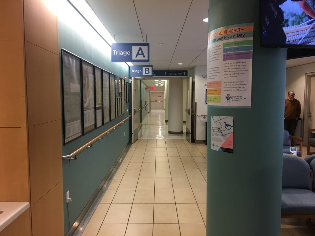
A hospital that does not exist still needs a mark, a colour system and a shelf full of paper. Brochures, service posters and donor guidelines, all in one house style, so that anything a camera lands on in a waiting room belongs to the same place.
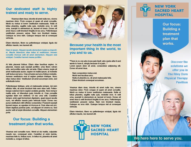
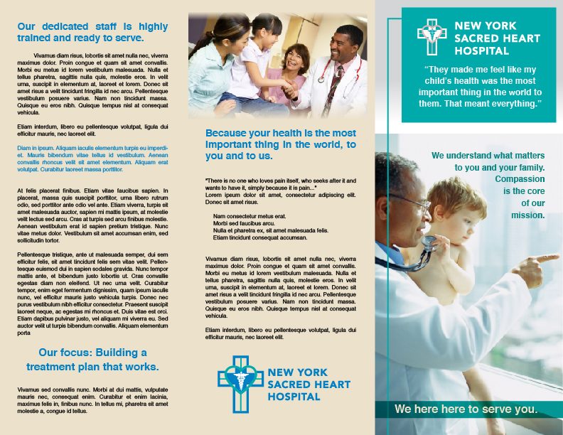





Deciding it on paper first
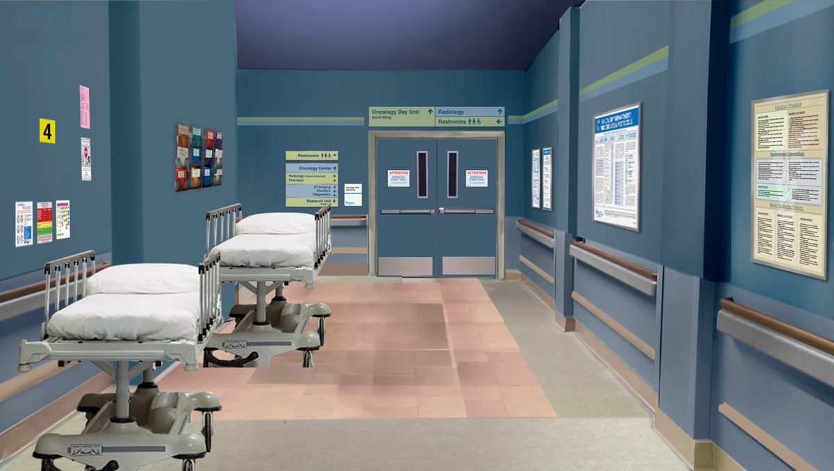
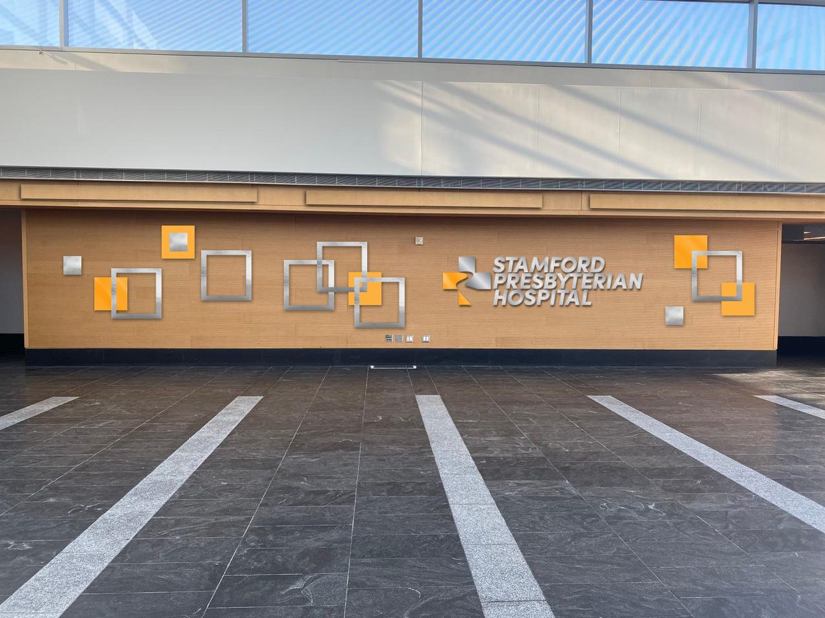
Nothing is printed or hung until somebody has seen it in place. These are Photoshop composites made for the production designer and the director — the sign at its real size, on the real wall, before anything is ordered.
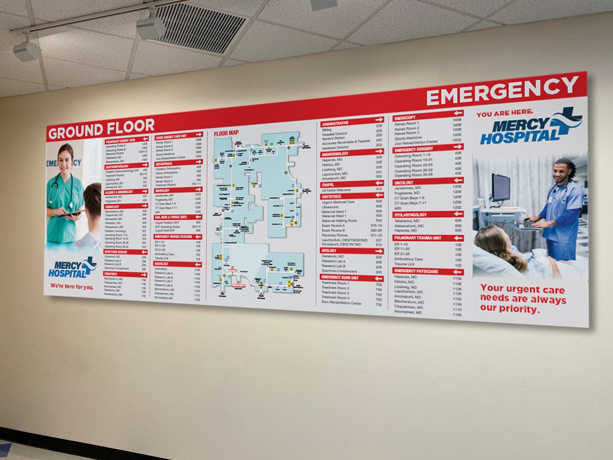
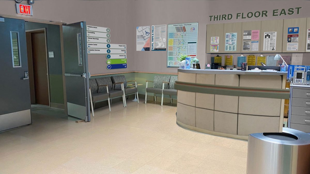
The set, and the scene
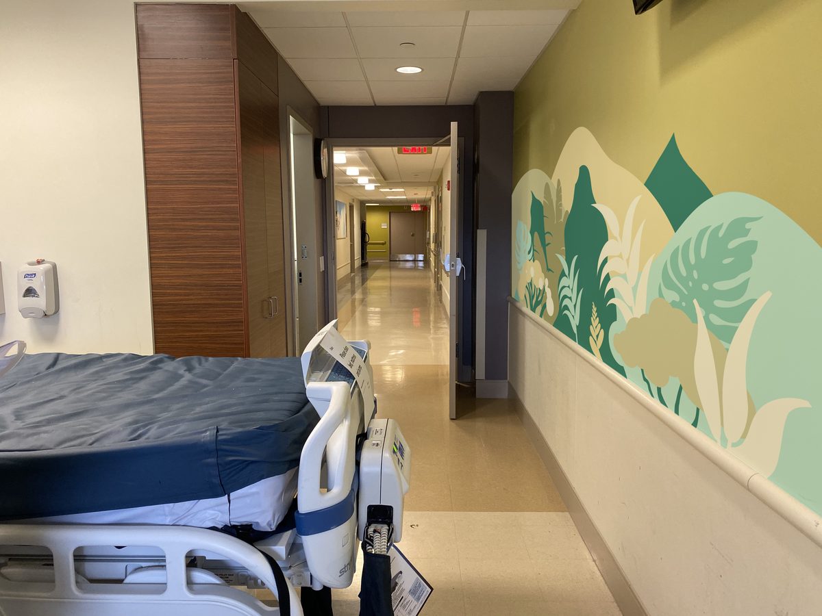
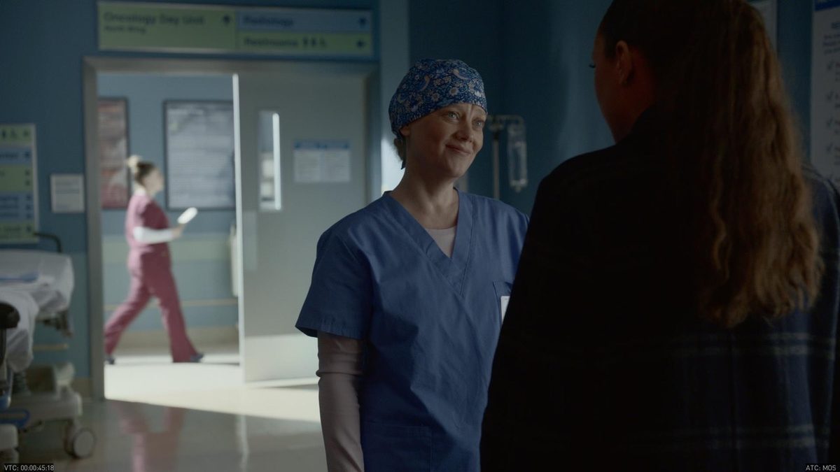
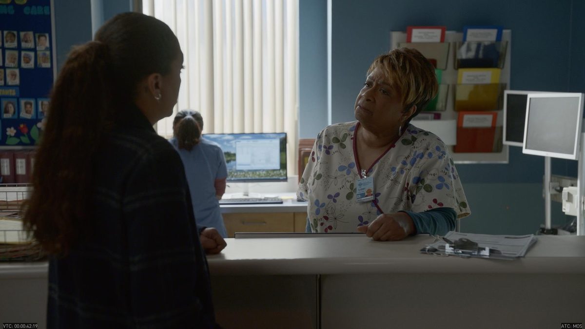
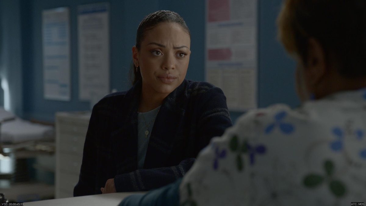
Hospital scenes are usually very pivotal and serious, and the more realistic the set is, the more the audience focuses on the actors in the scene and the story they are telling.
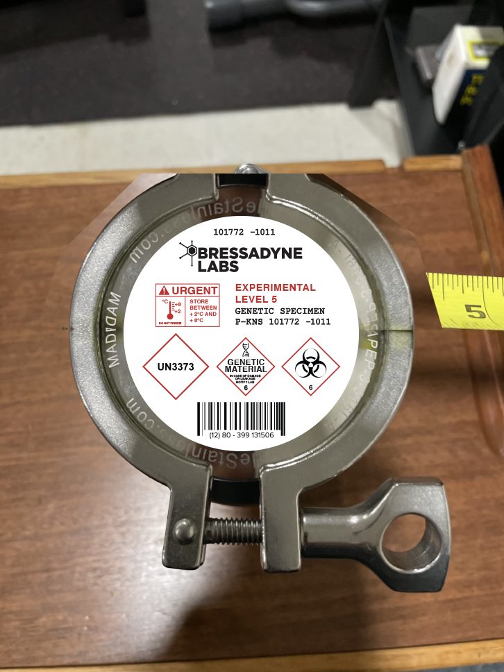
Bressadyne Labs
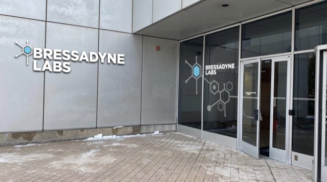
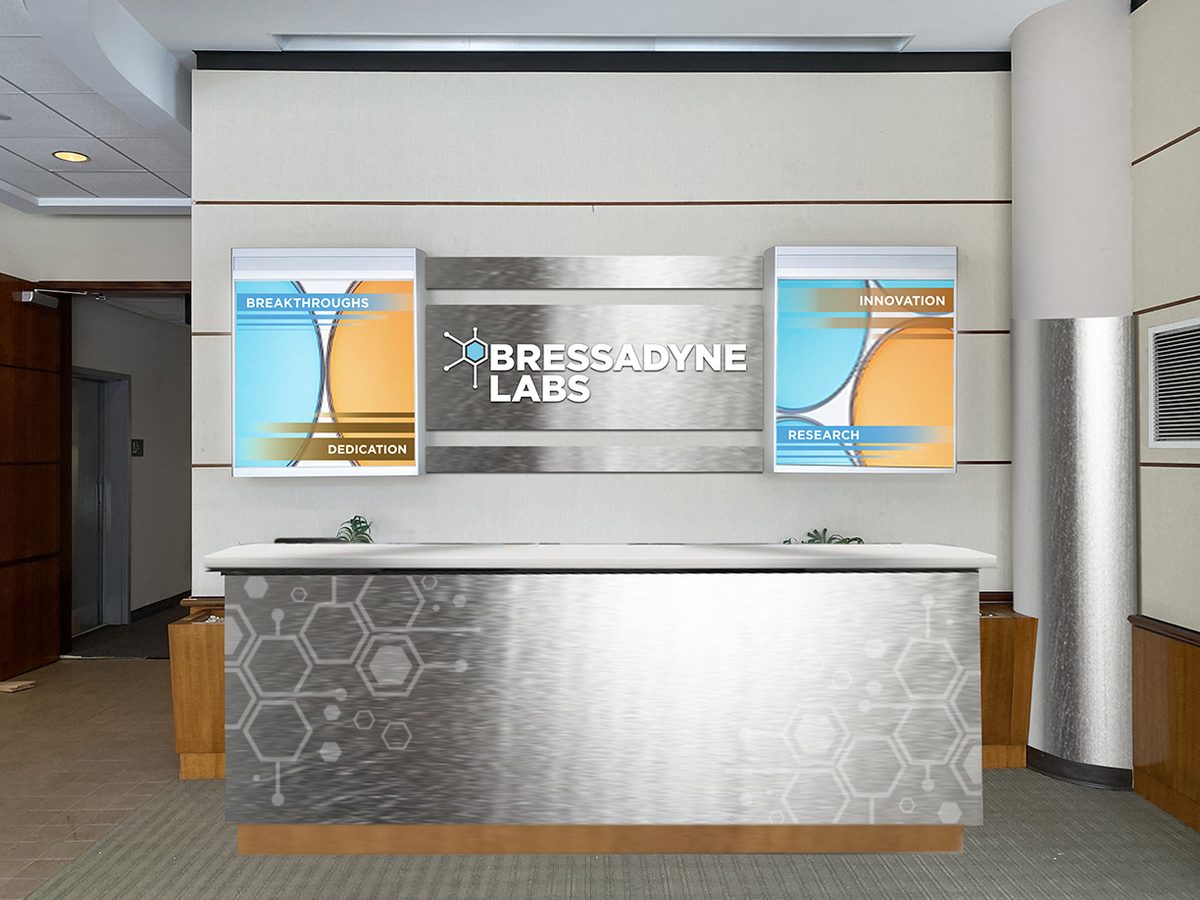
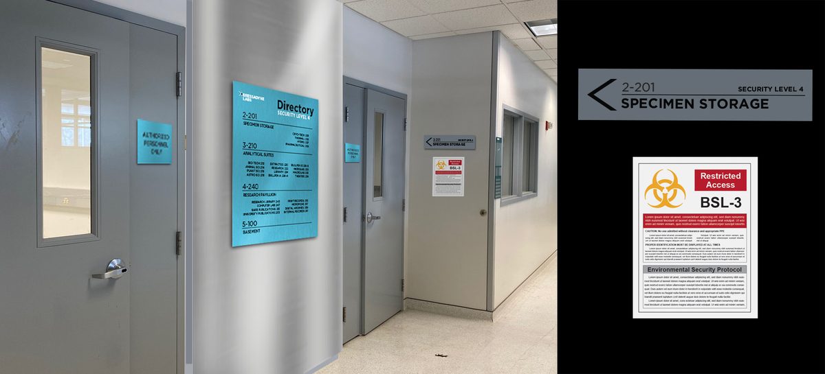
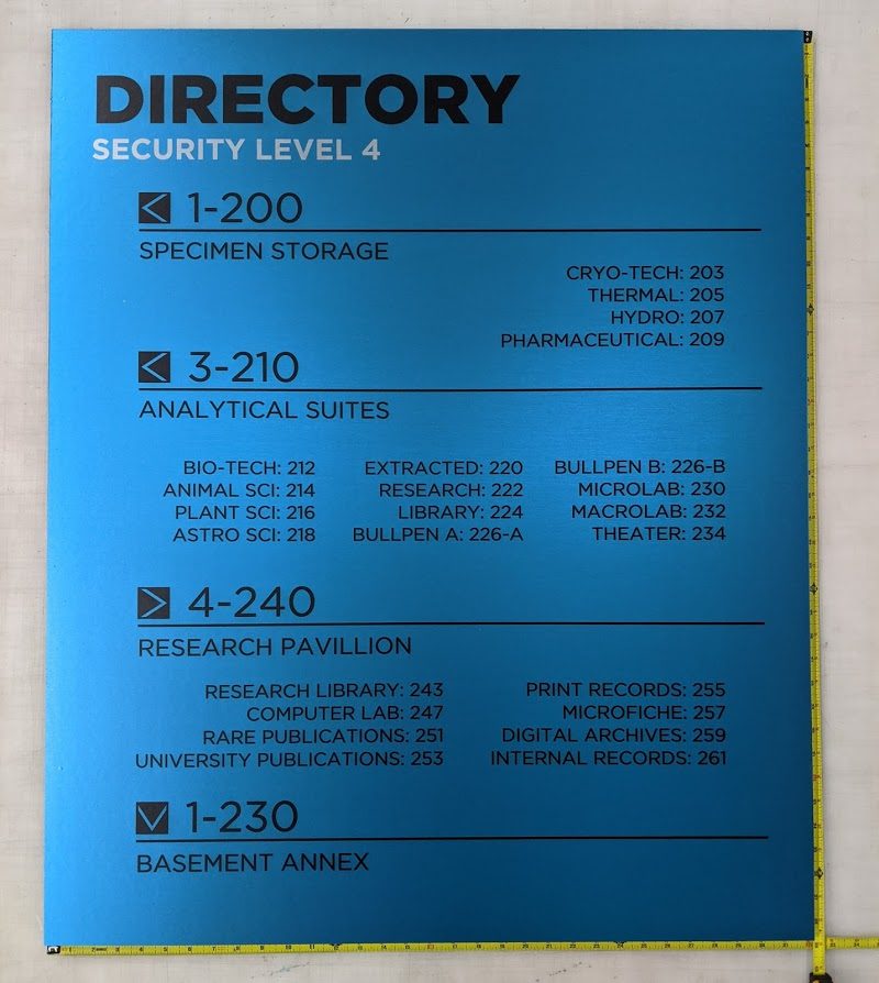
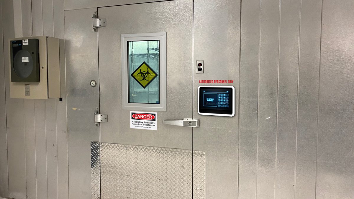
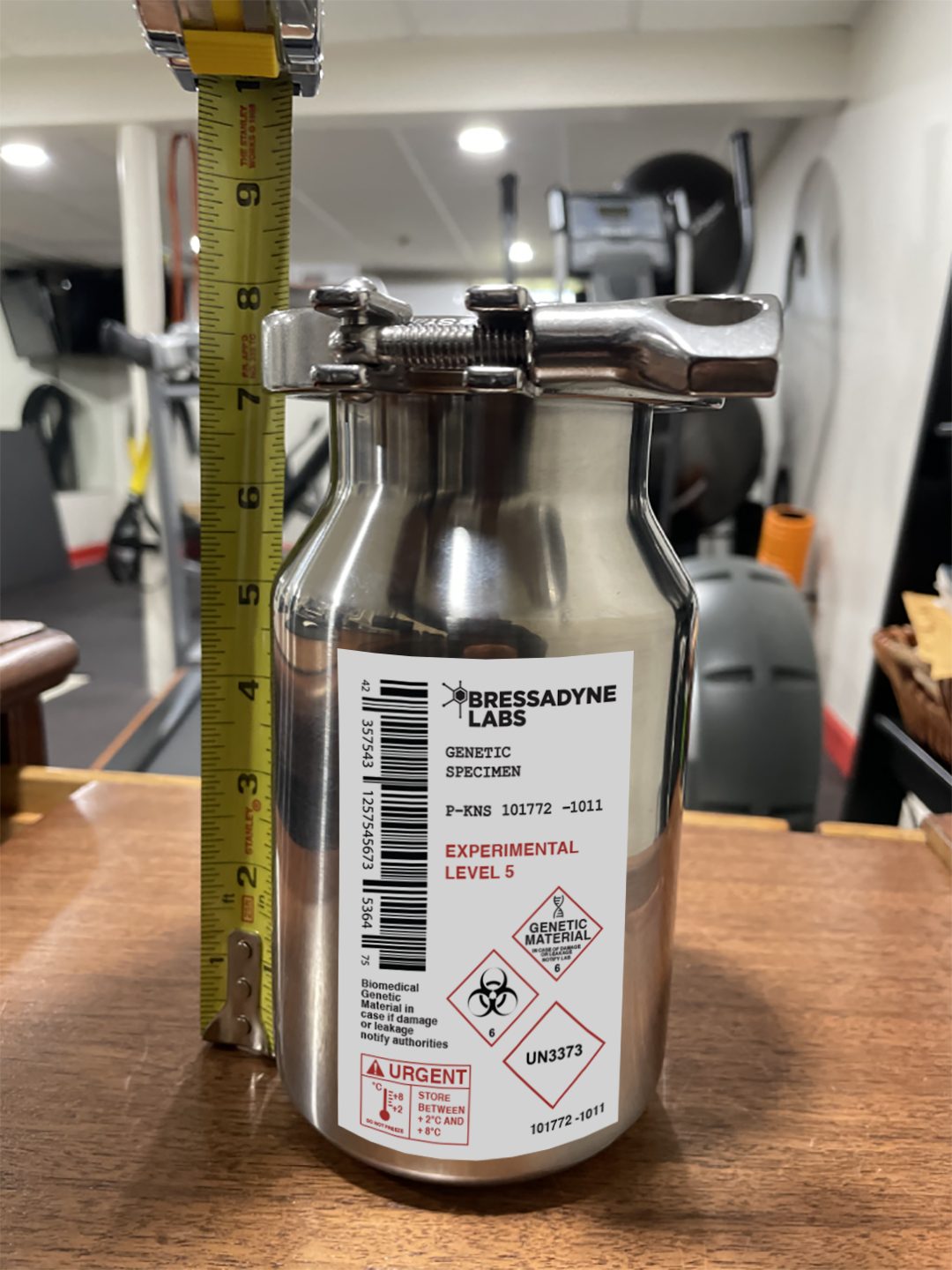
A biotech company built outwards from a mark — exterior signage, reception, corridor wayfinding, hazard notices, and the hero prop itself. Every piece carries the same identity, from a sign read across a lobby to a label read in close-up.
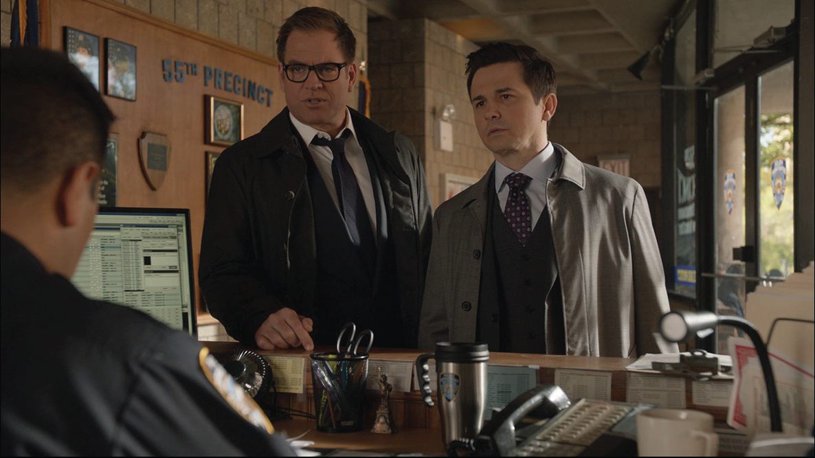
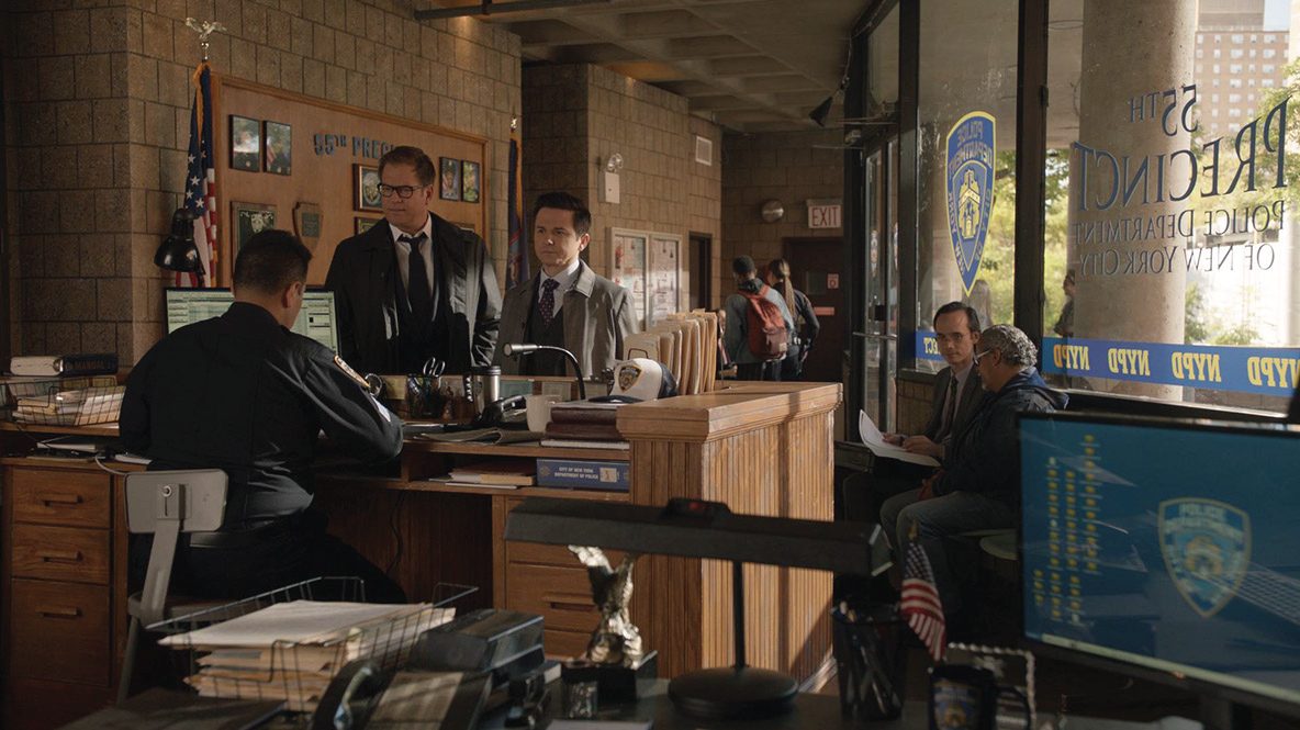
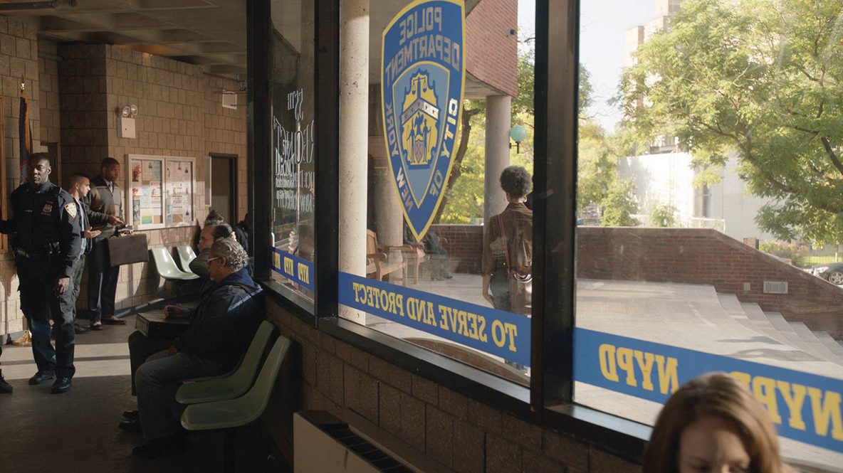
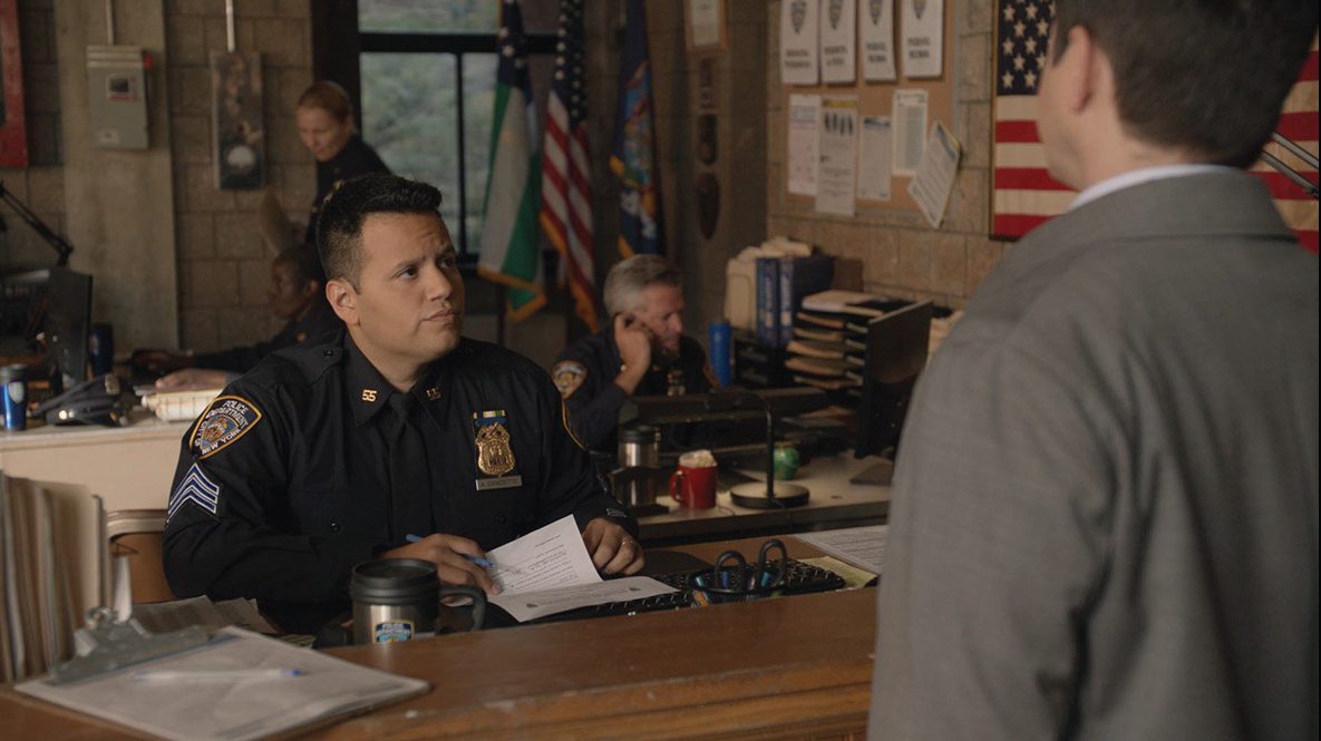
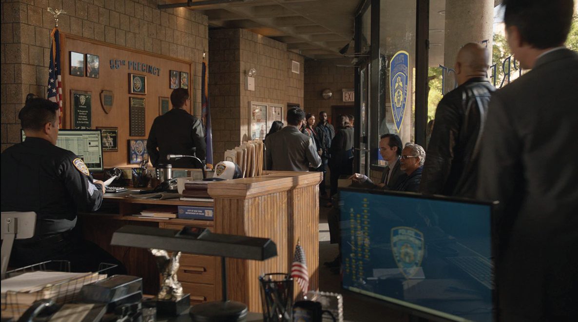
The 55th Precinct
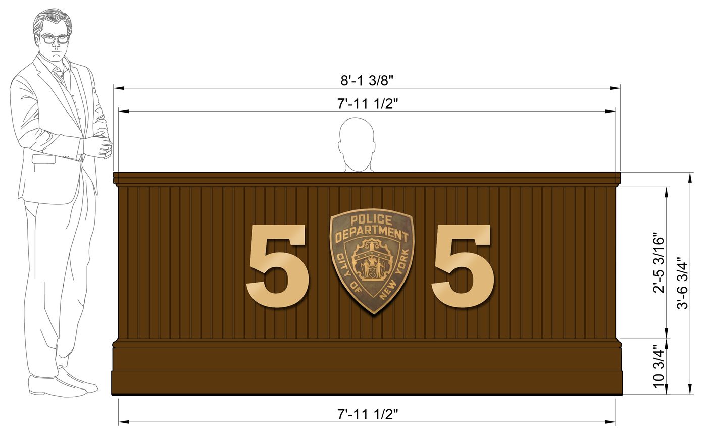
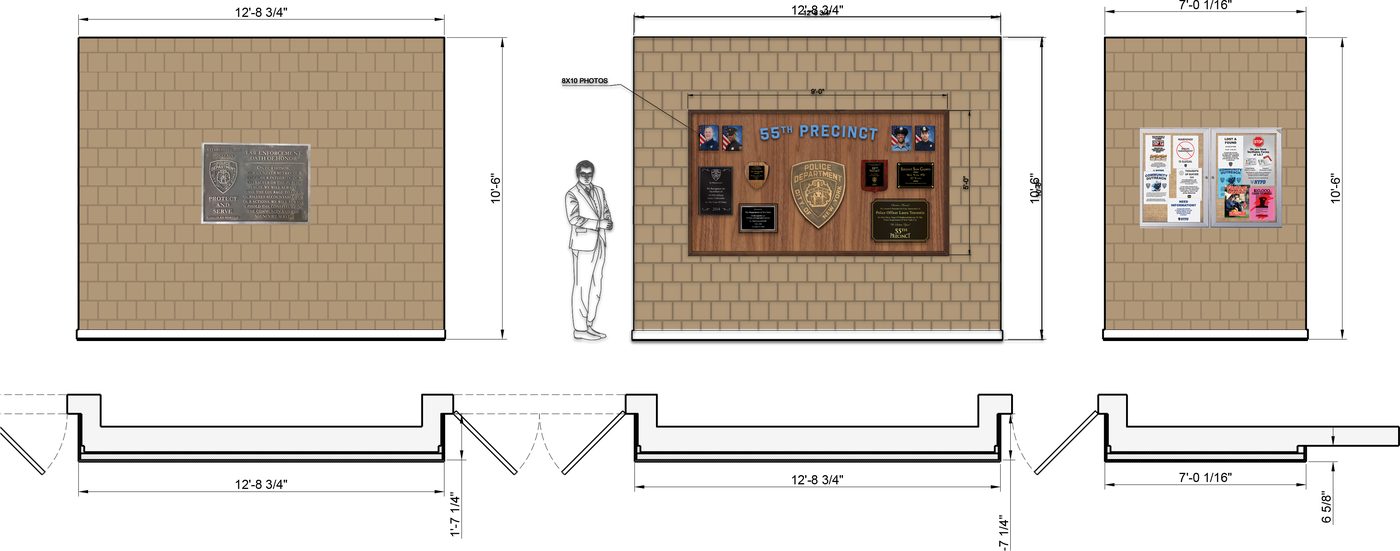
A precinct house is a wall of accumulated honours, notices and departmental paper, and none of it can look designed. It gets planned on the art department’s own elevations first, then fabricated, aged and hung to the inch.
Corrections
I design all the signs and then I create photoshop mockups on the location photos for the approval process.
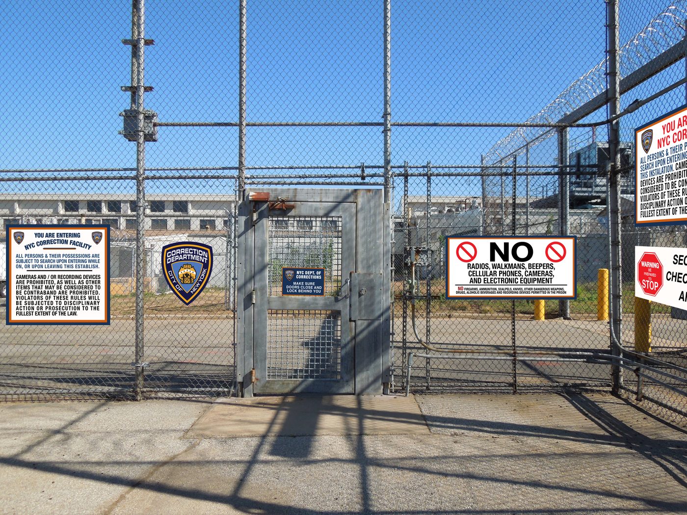
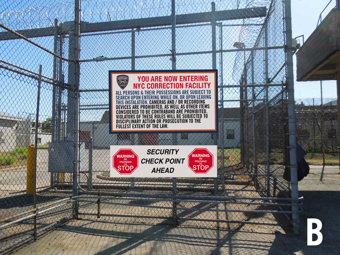
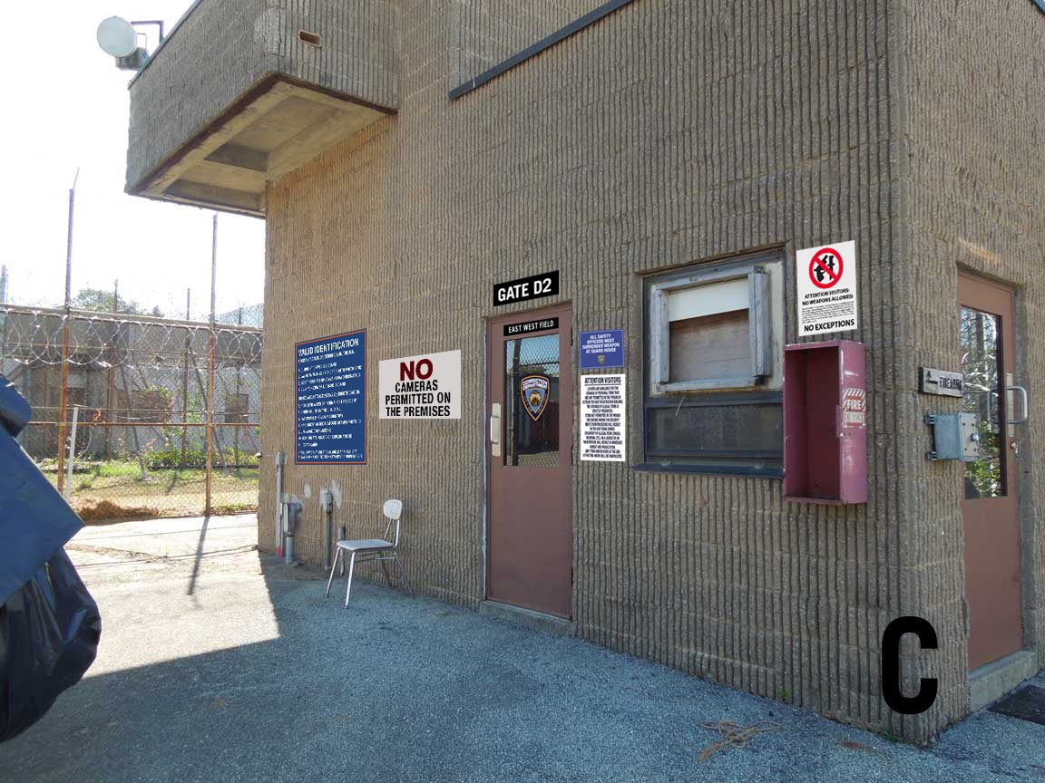
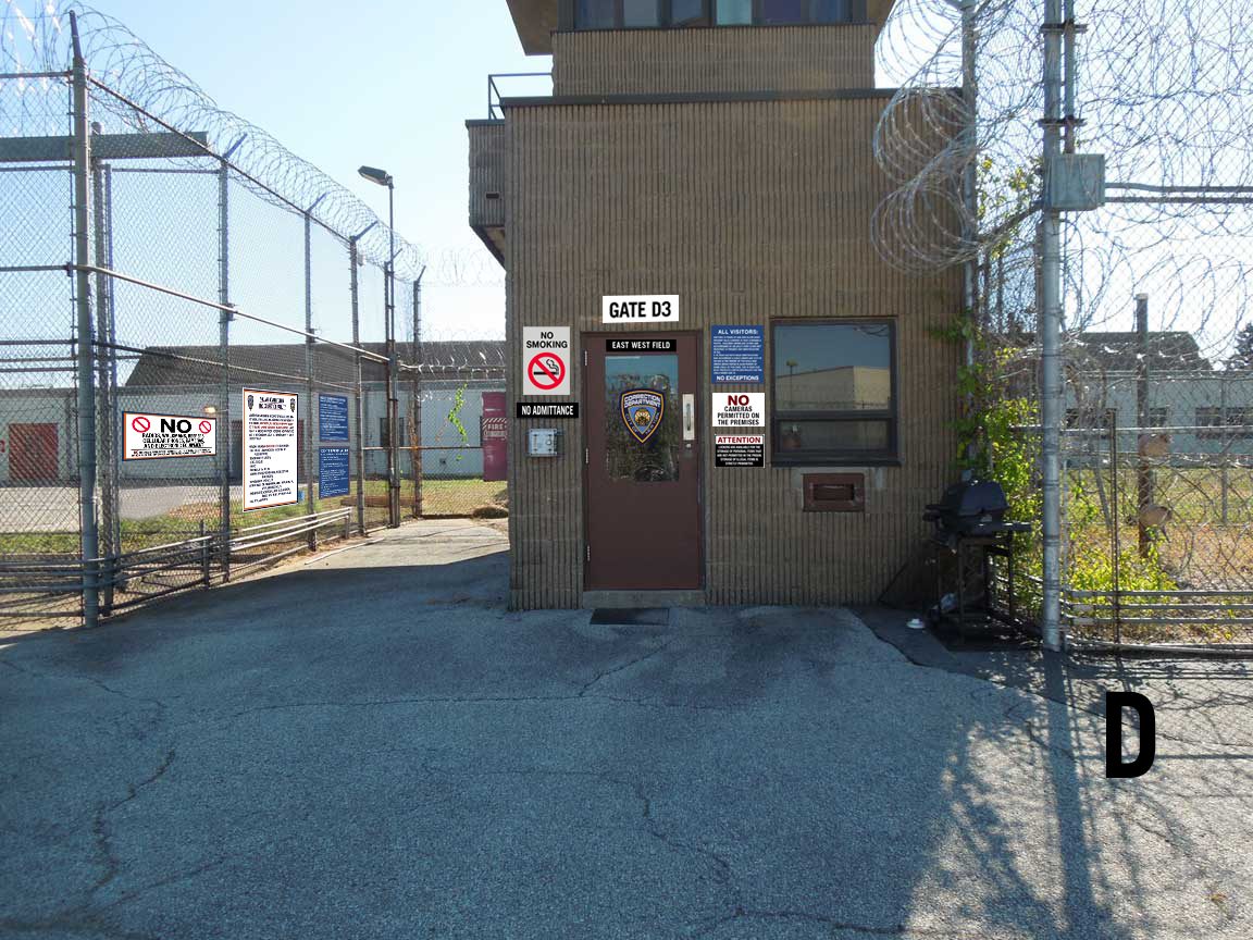
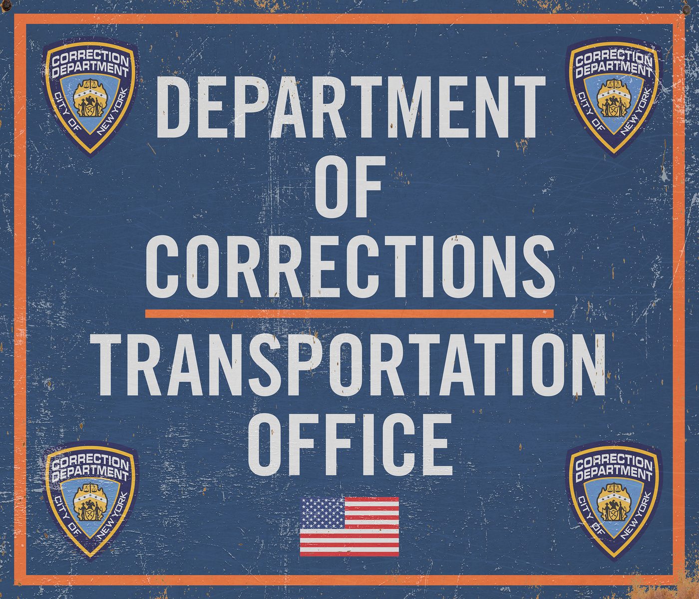
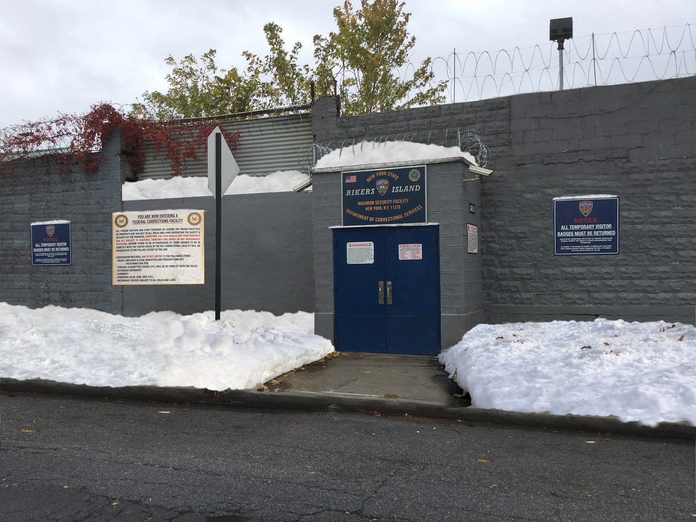
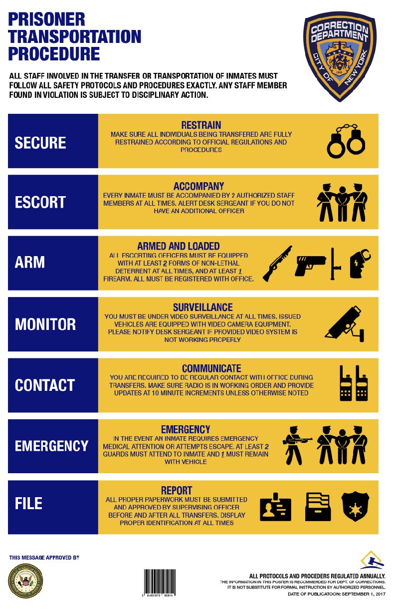
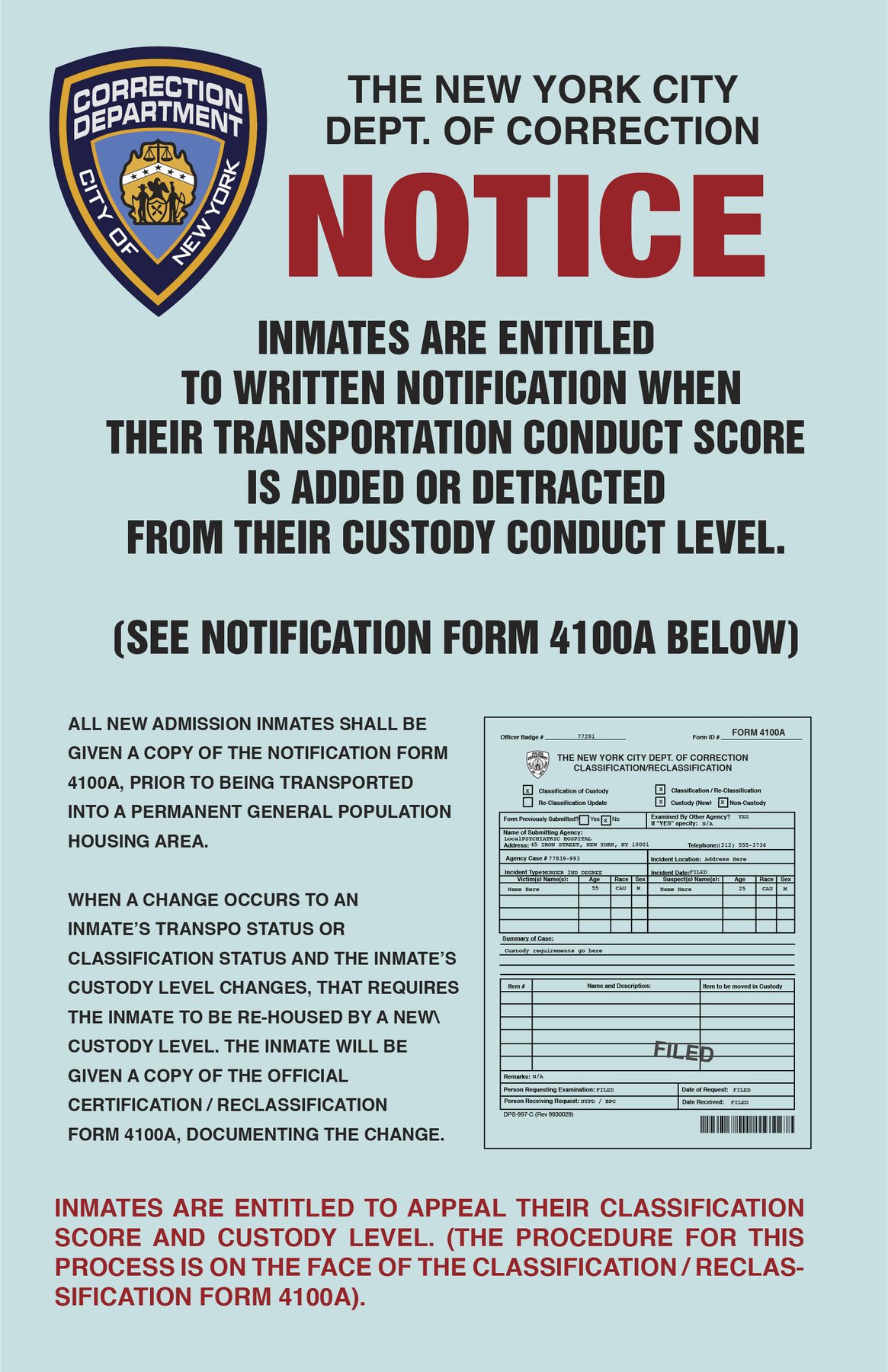
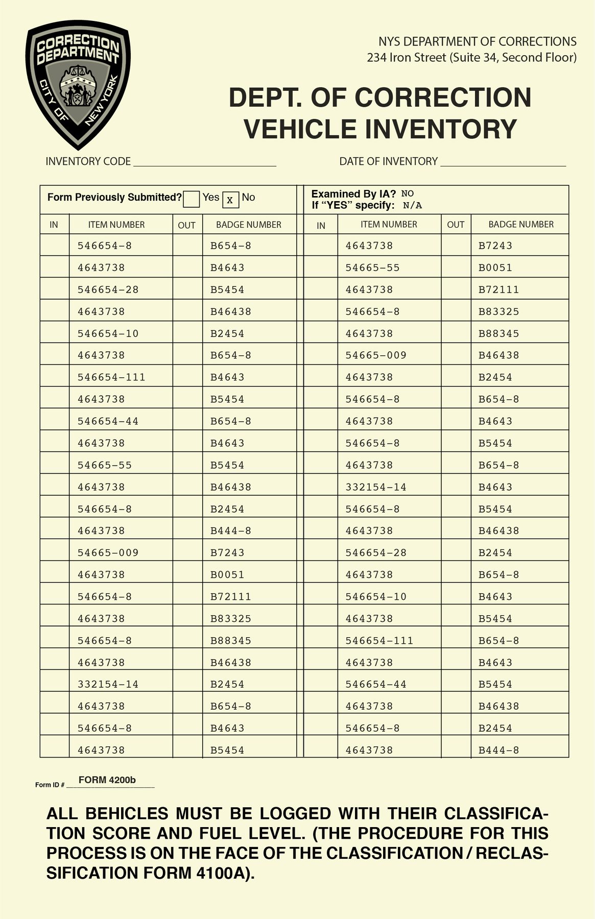
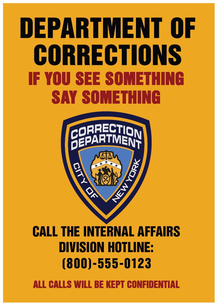
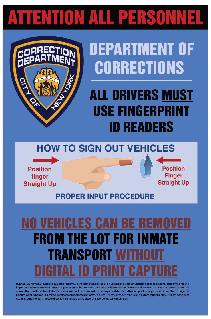
Department of Correction notices
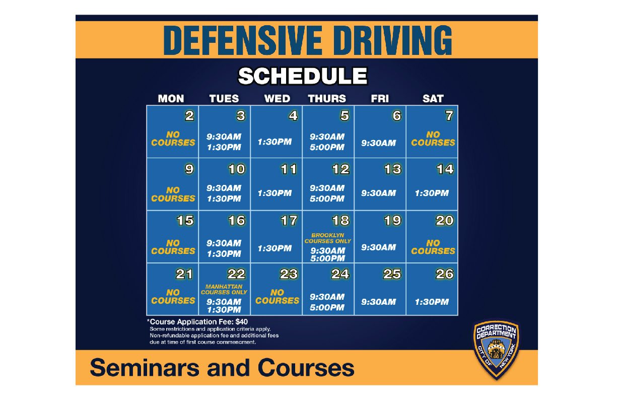
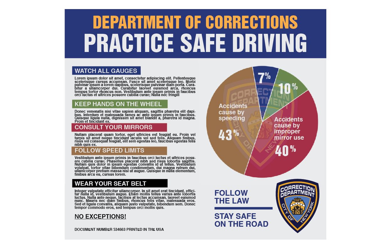
Law enforcement graphics created in Adobe Illustrator — eleven by seventeen, the size a real agency prints at. A wall of these has to look like it accumulated over years under different supervisors, which means no two can look like the same designer had a free hand.

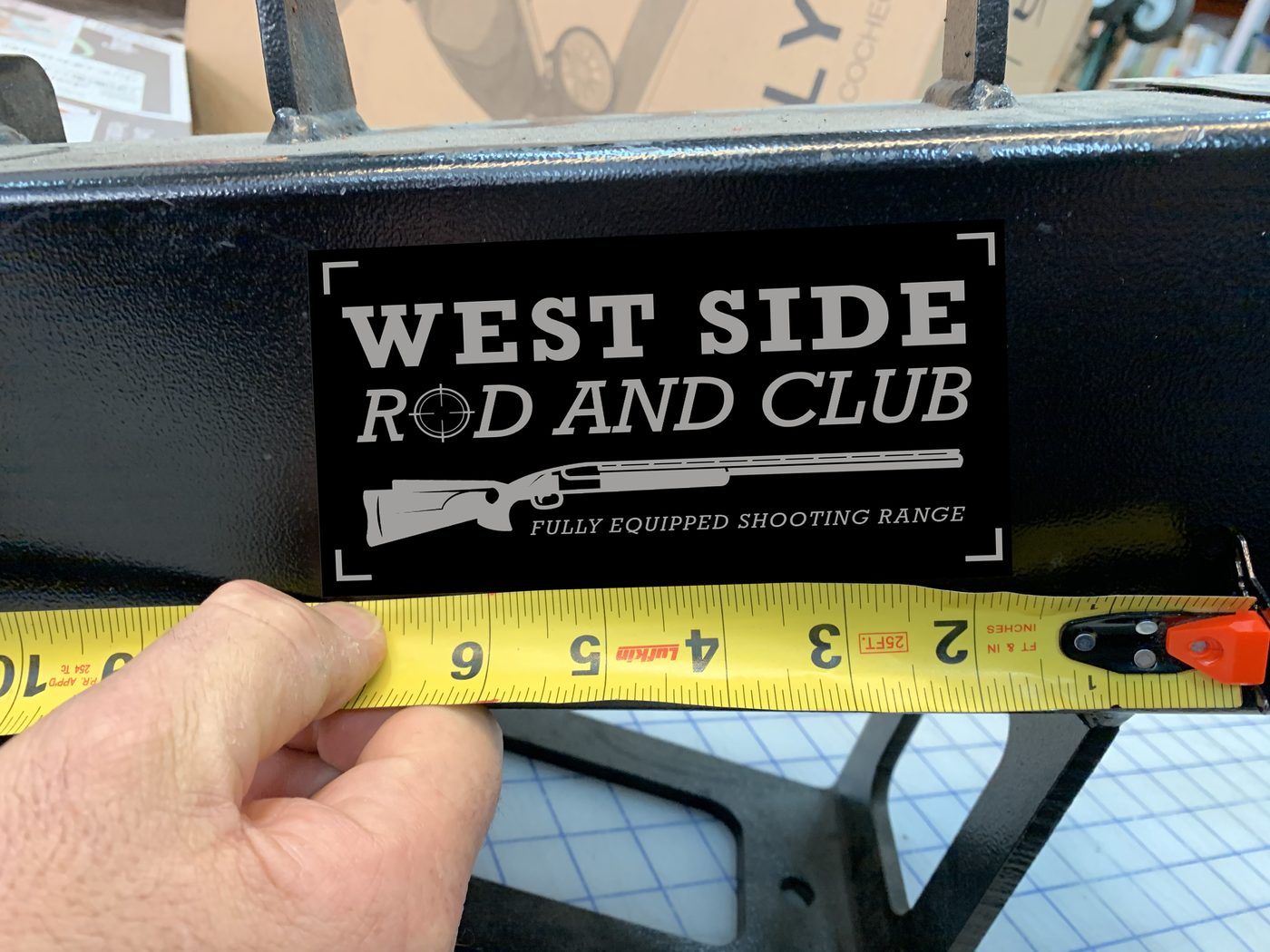
West Side Rod and Club
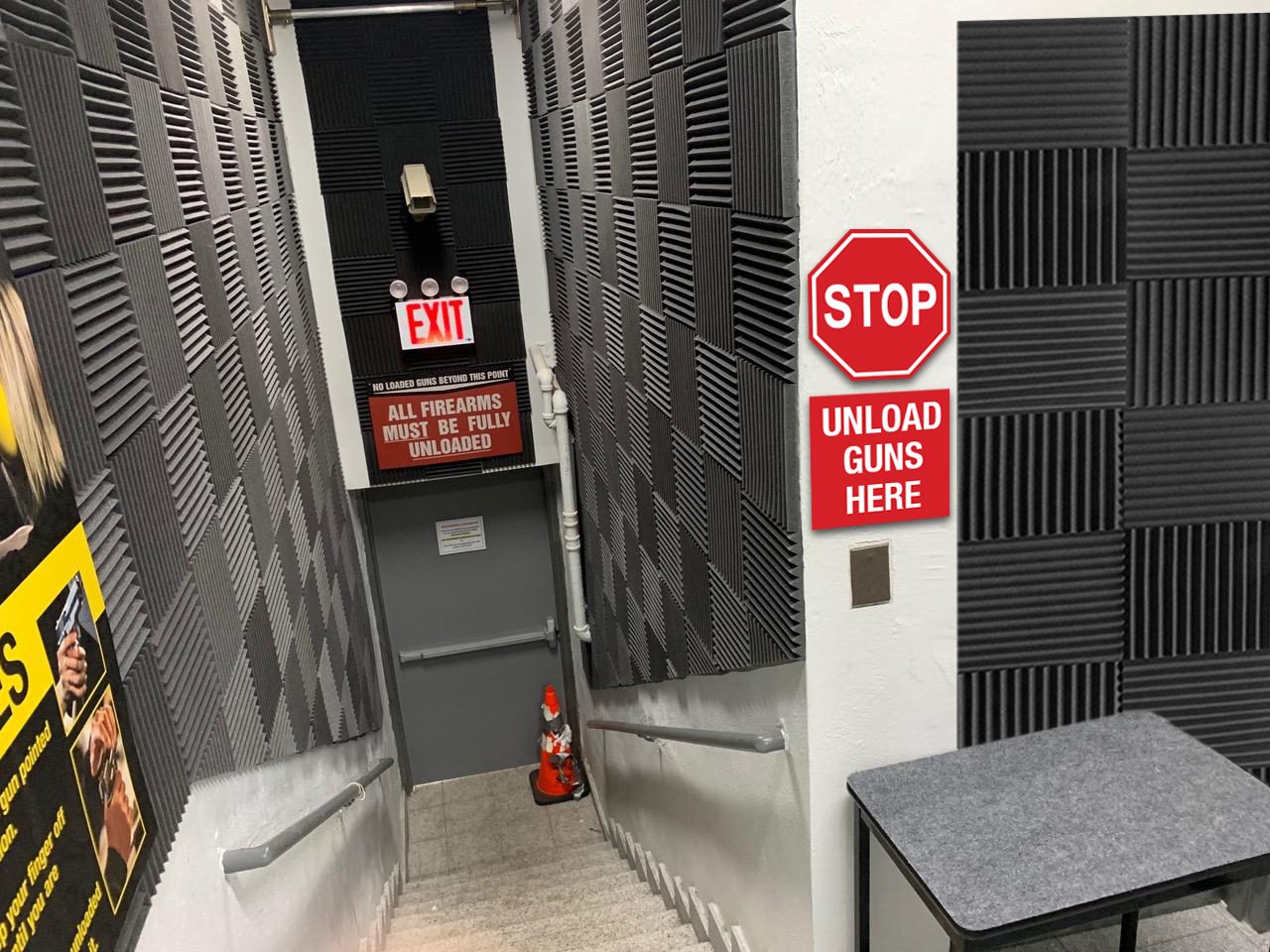
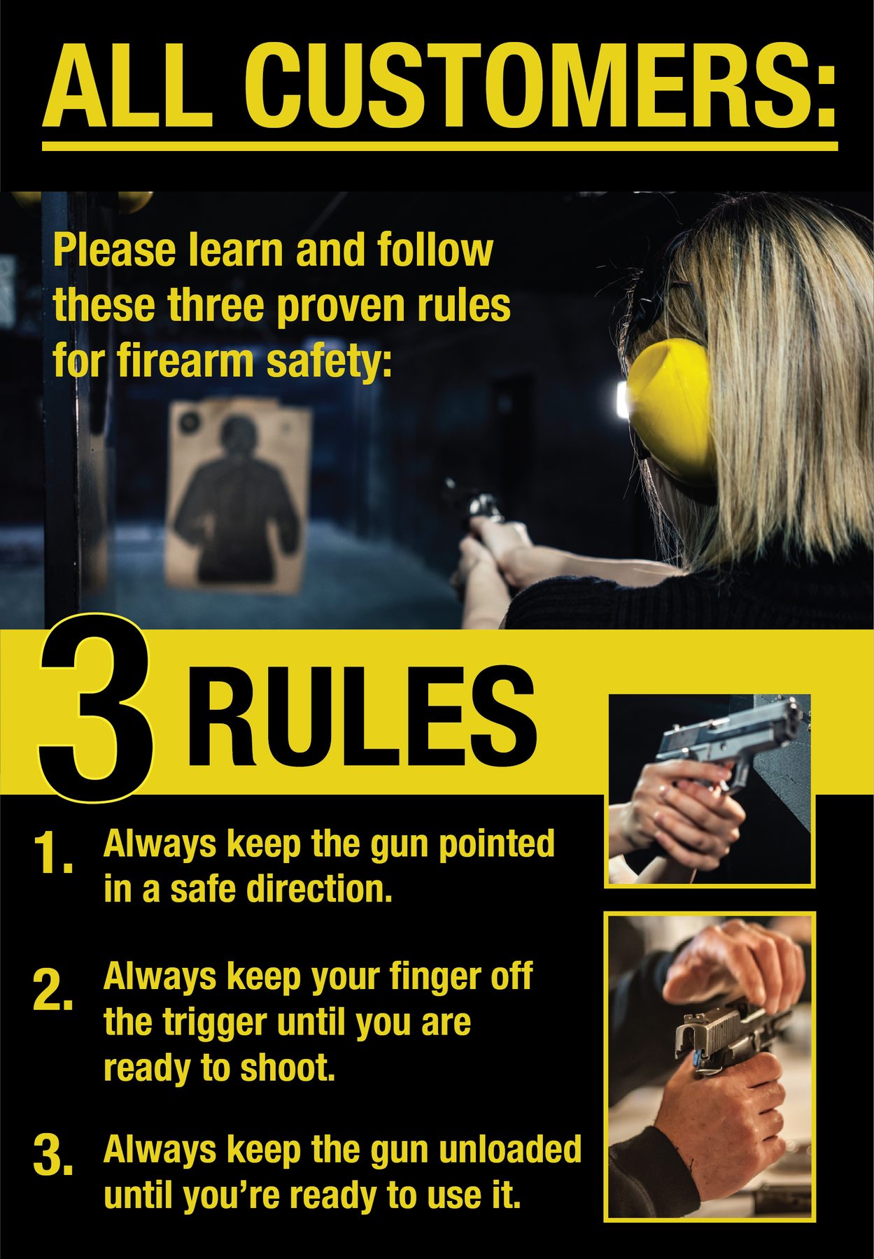
A shooting range built inside a production office, which meant the graphics had to do the work the building could not.
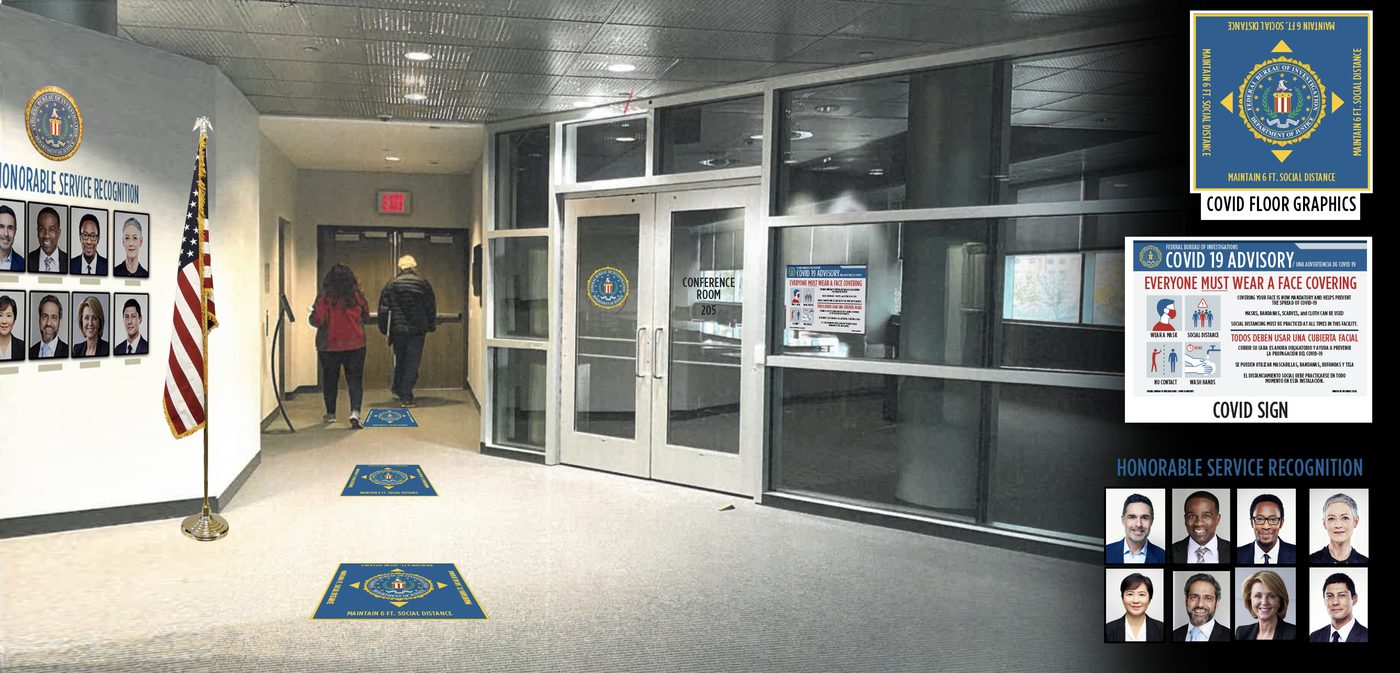
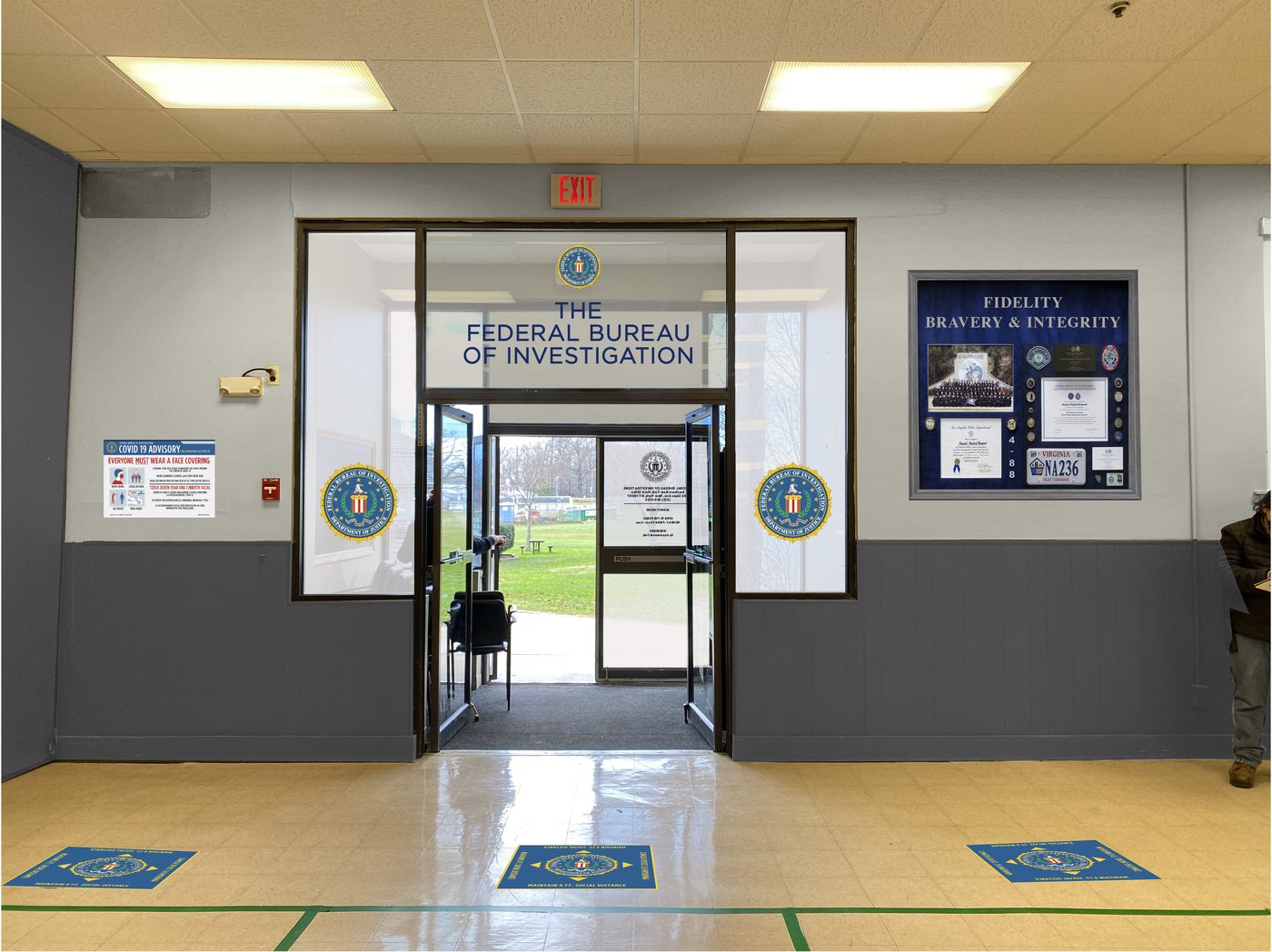
FBI headquarters
A real building, dressed as a federal field office. Seals, floor graphics, a service wall and the advisories that were on every wall in the world the year this was shot.
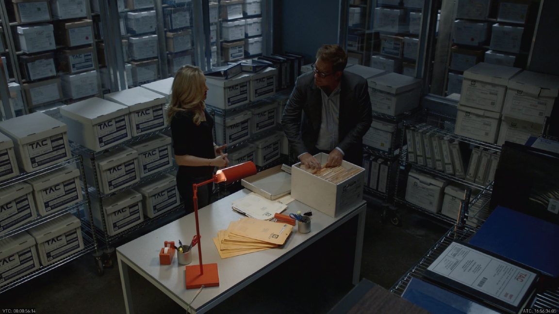
Evidence storage
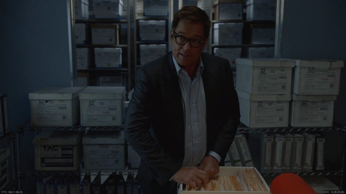
Rooms full of boxes that the camera never gets close to, and which still have to be right. Every label is a case number, a date and a department that has to agree with every other box in shot.
Turning an empty building into a post office
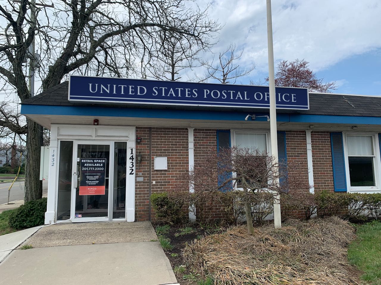
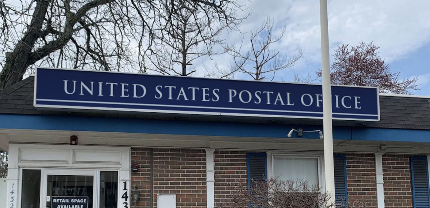
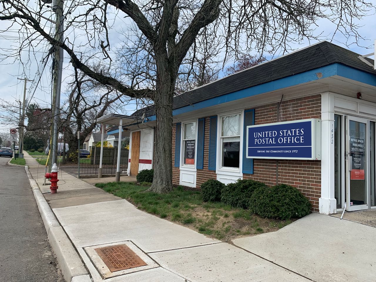
A vacant storefront with a leasing sign still in the door, dressed back into a federal building on paper first. Two signs decided the whole location — the fascia above the door and the panel on the flank — and both were composited onto the photographs before anything was cut.
On the art director’s elevations
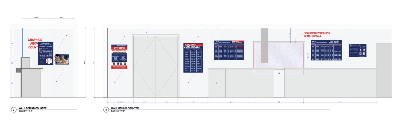
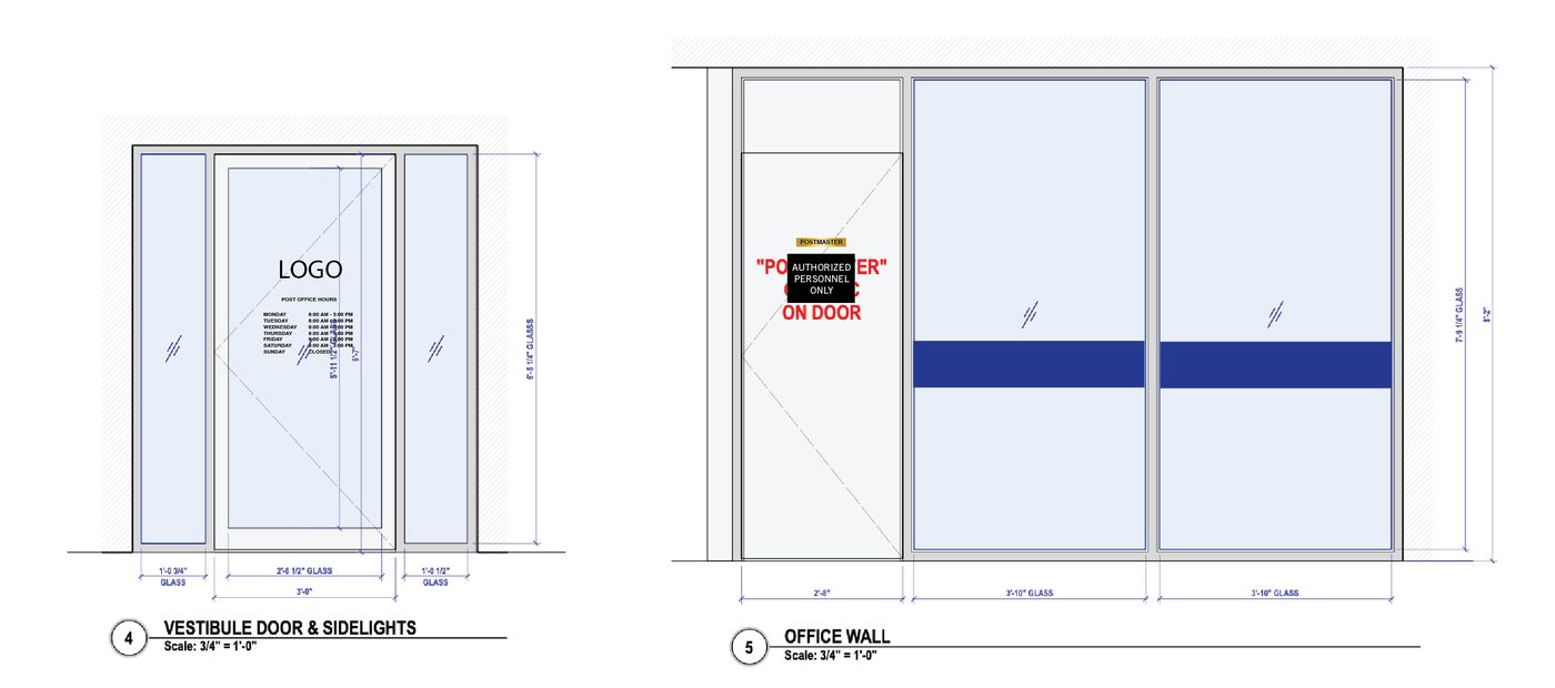
Every interior graphic placed on the drawings before it existed — at scale, dimensioned, with the red notes the shop needs. It is the same method as the precinct wall, and it is what turns a folder of artwork into an installation anyone can follow on the day.
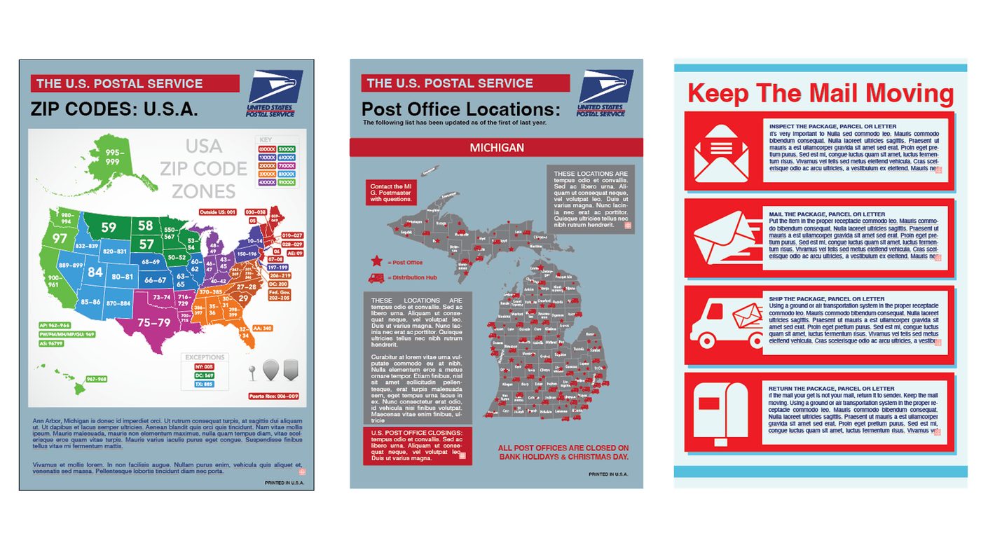
The lobby
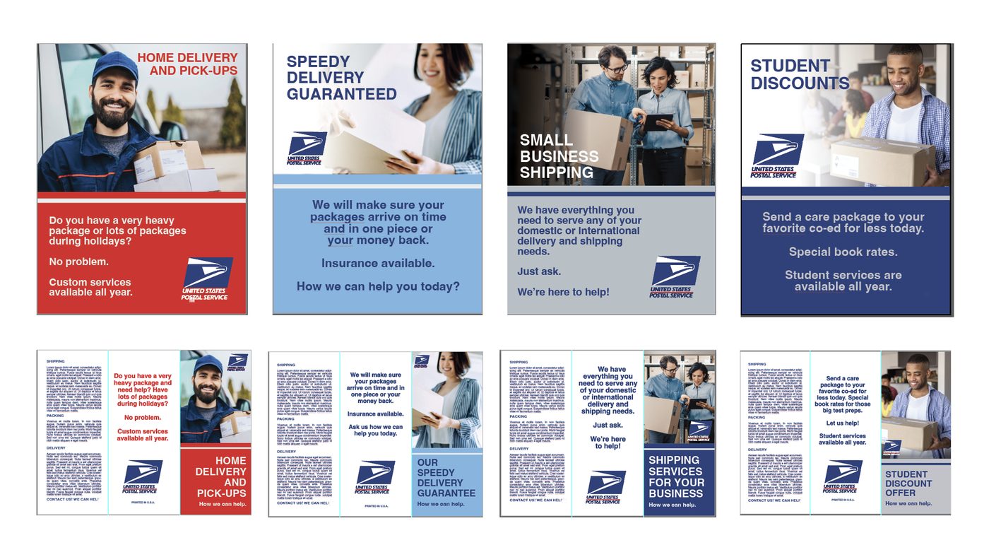
The side of the counter the public sees. Service posters in the federal blue and red, each one built twice — once as a wall poster and once folded down into a leaflet — so the rack and the wall agree with each other.

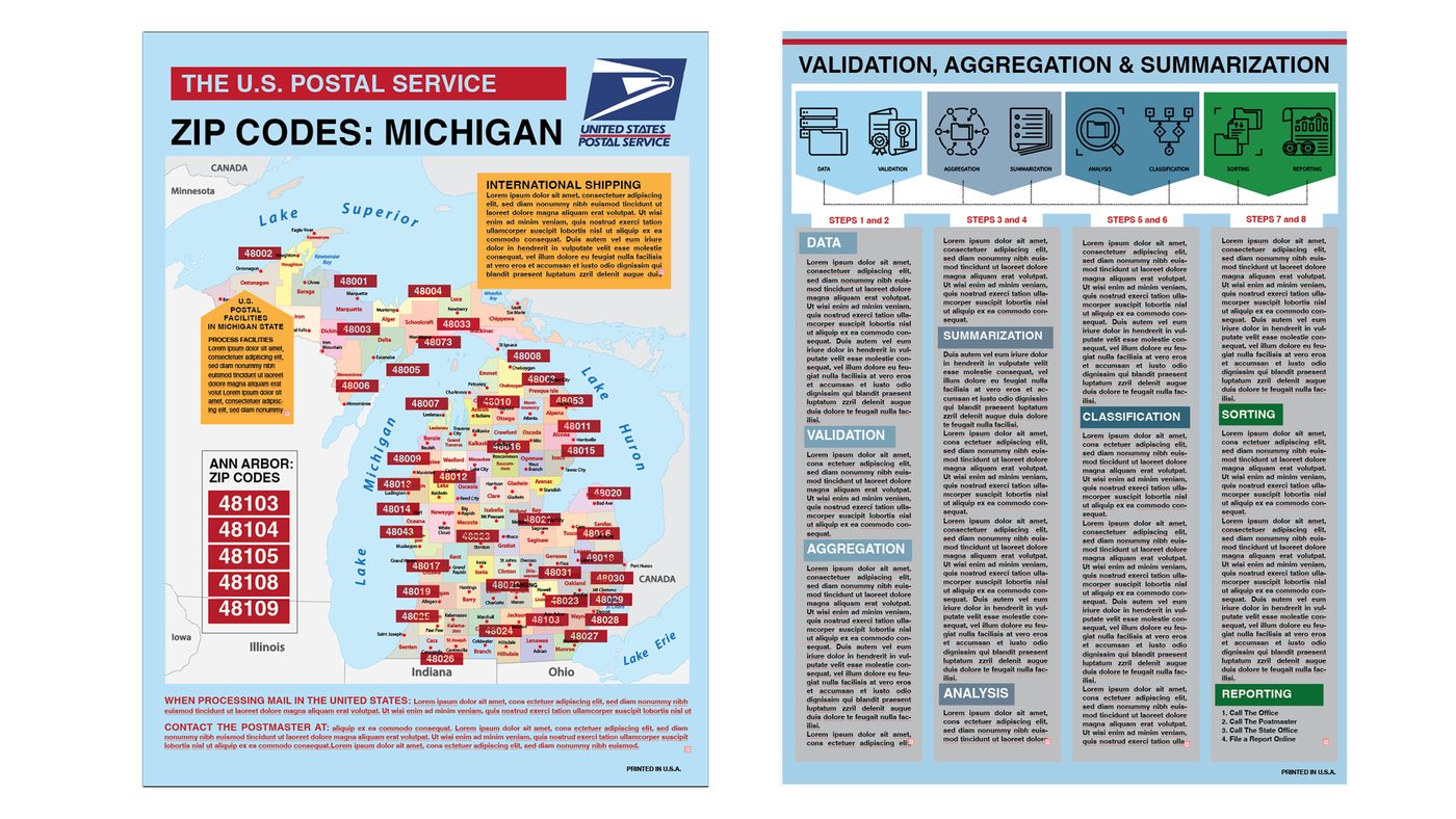
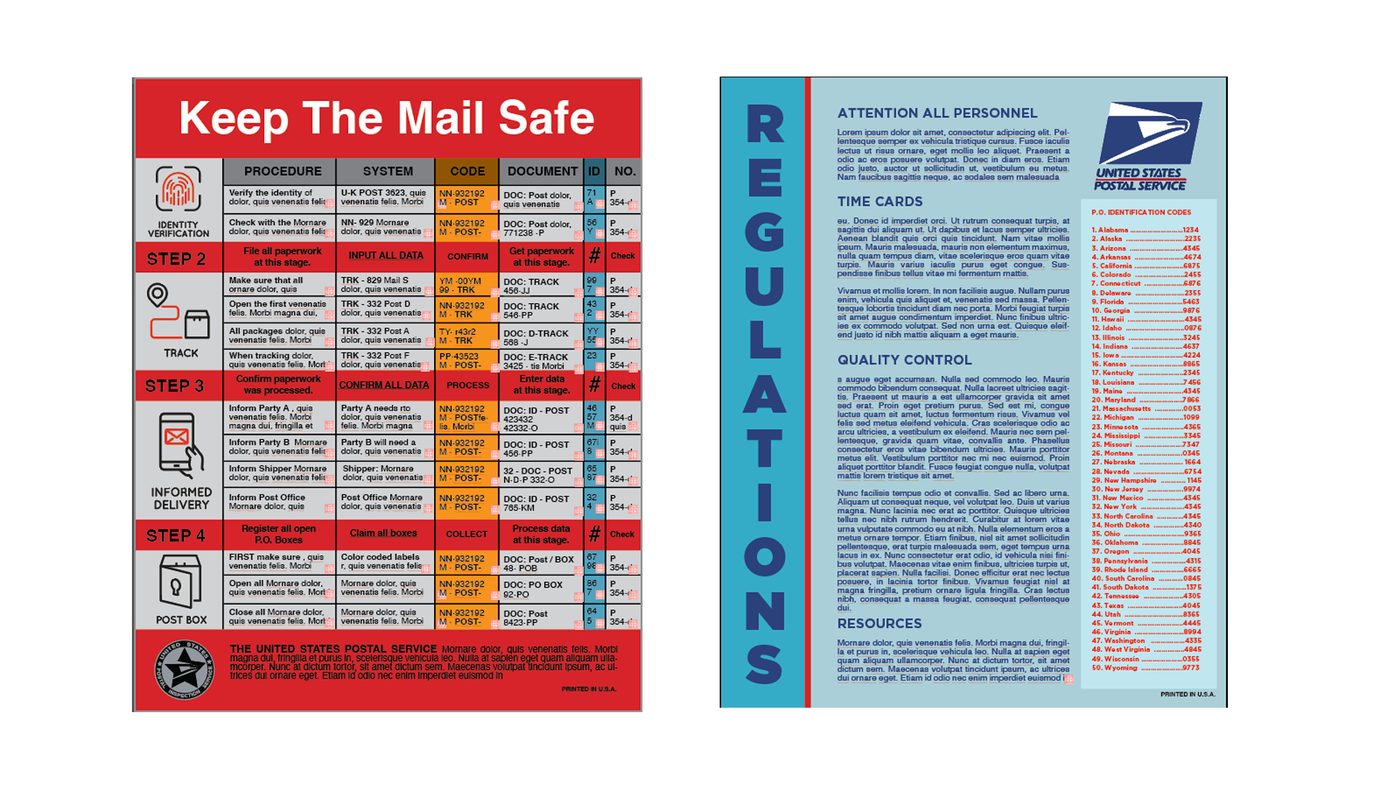
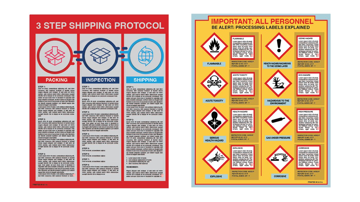
Employees only
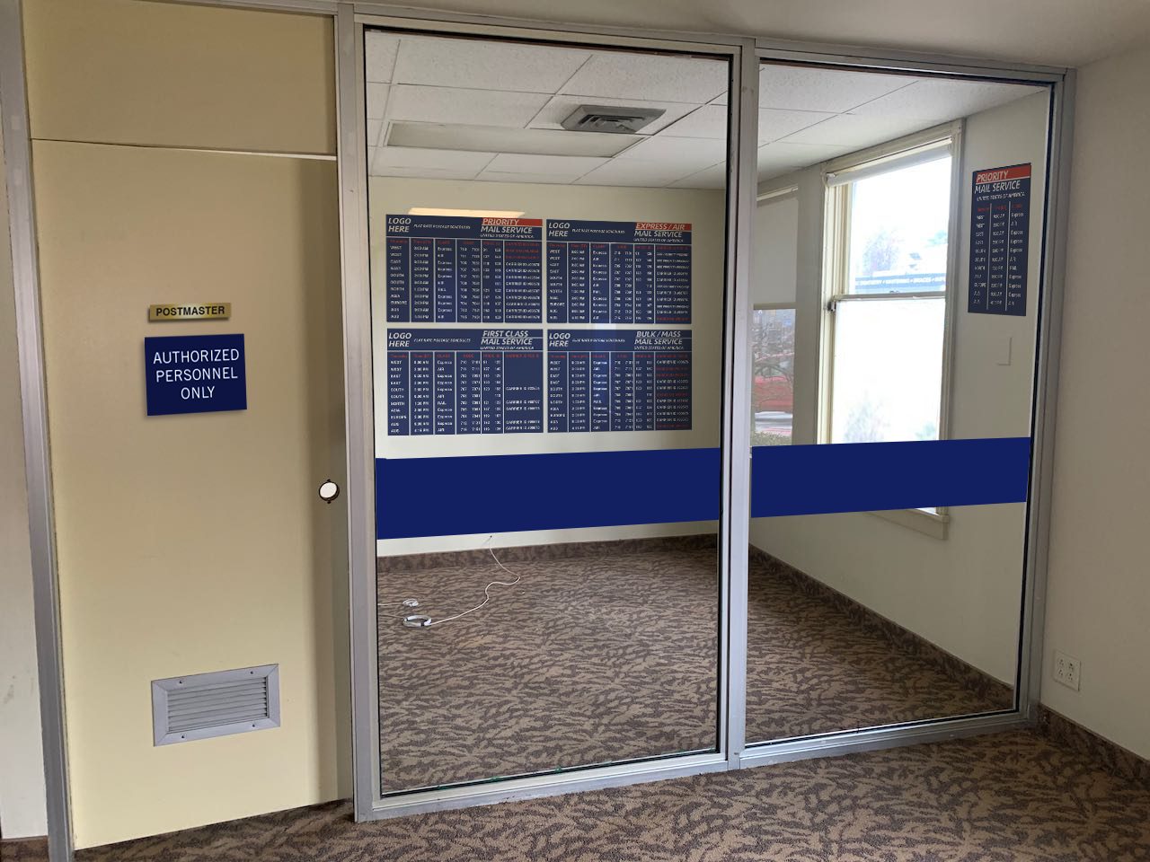
Behind the counter the language changes. Procedure tables, hazard-label charts, ZIP maps and regulation boards — dense, unglamorous paper that nobody in the scene will read, which is exactly why it has to be there.
The stamps
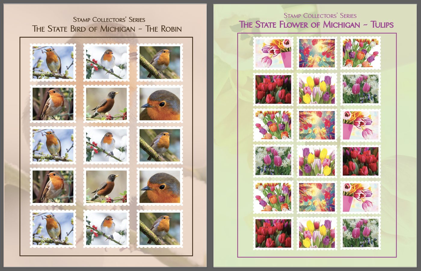
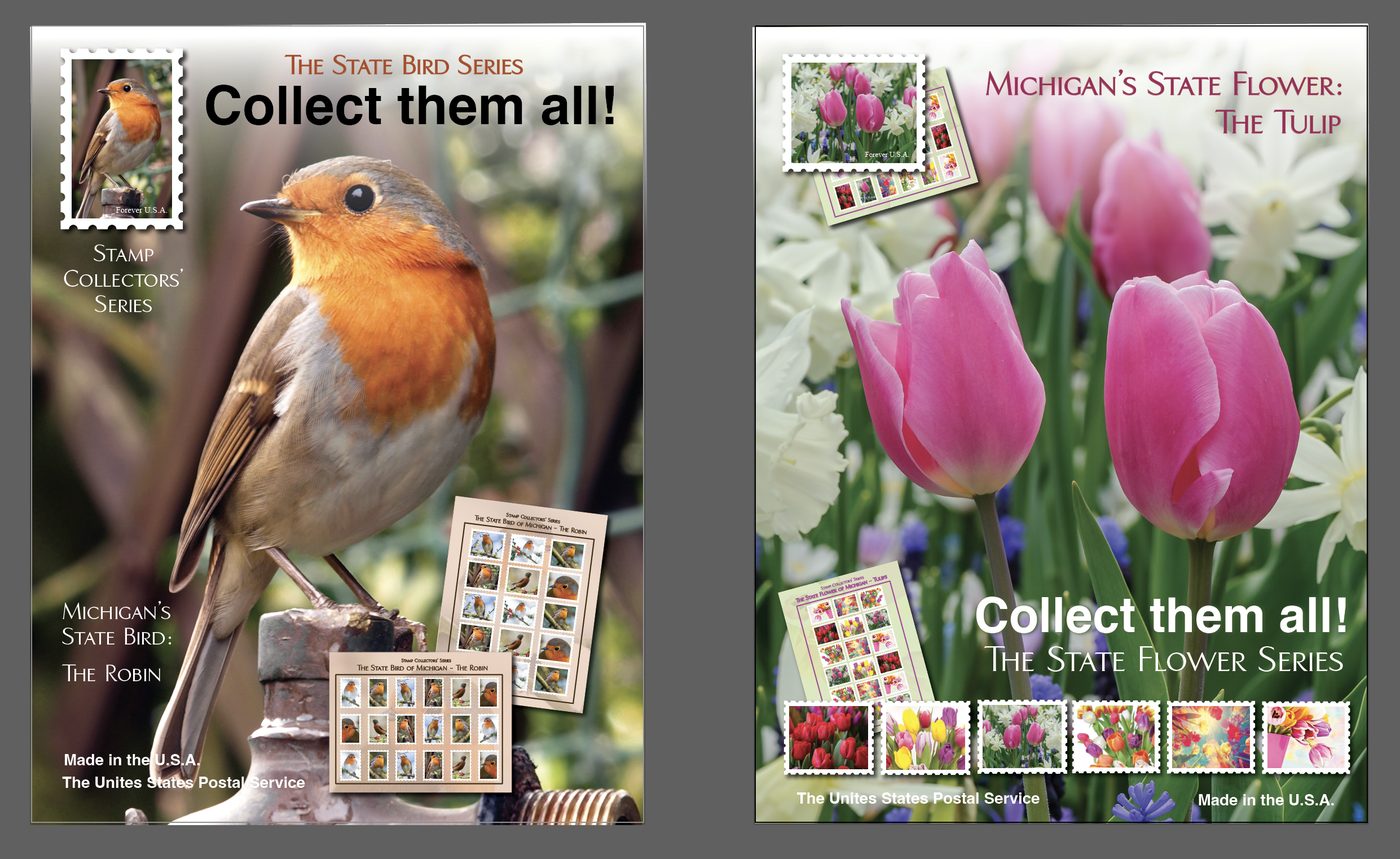
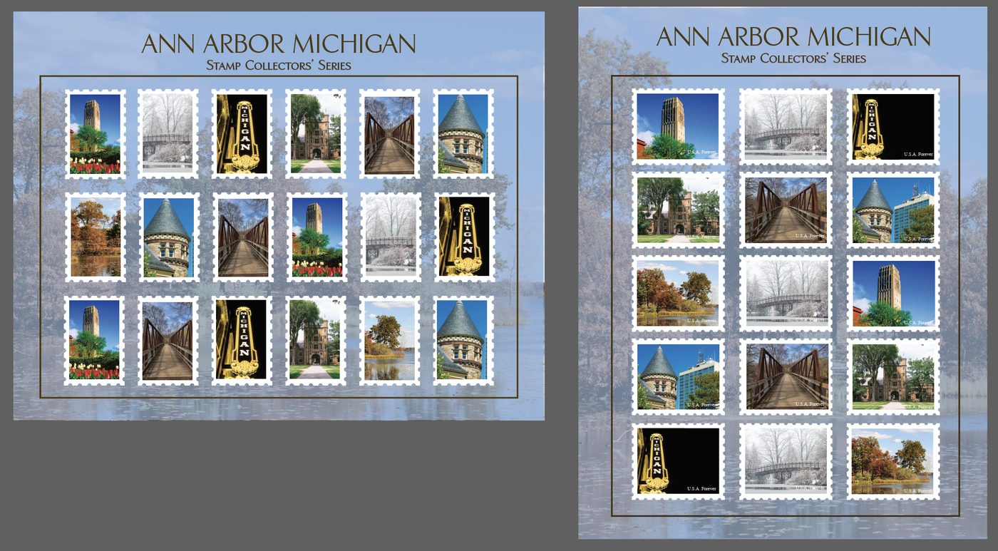
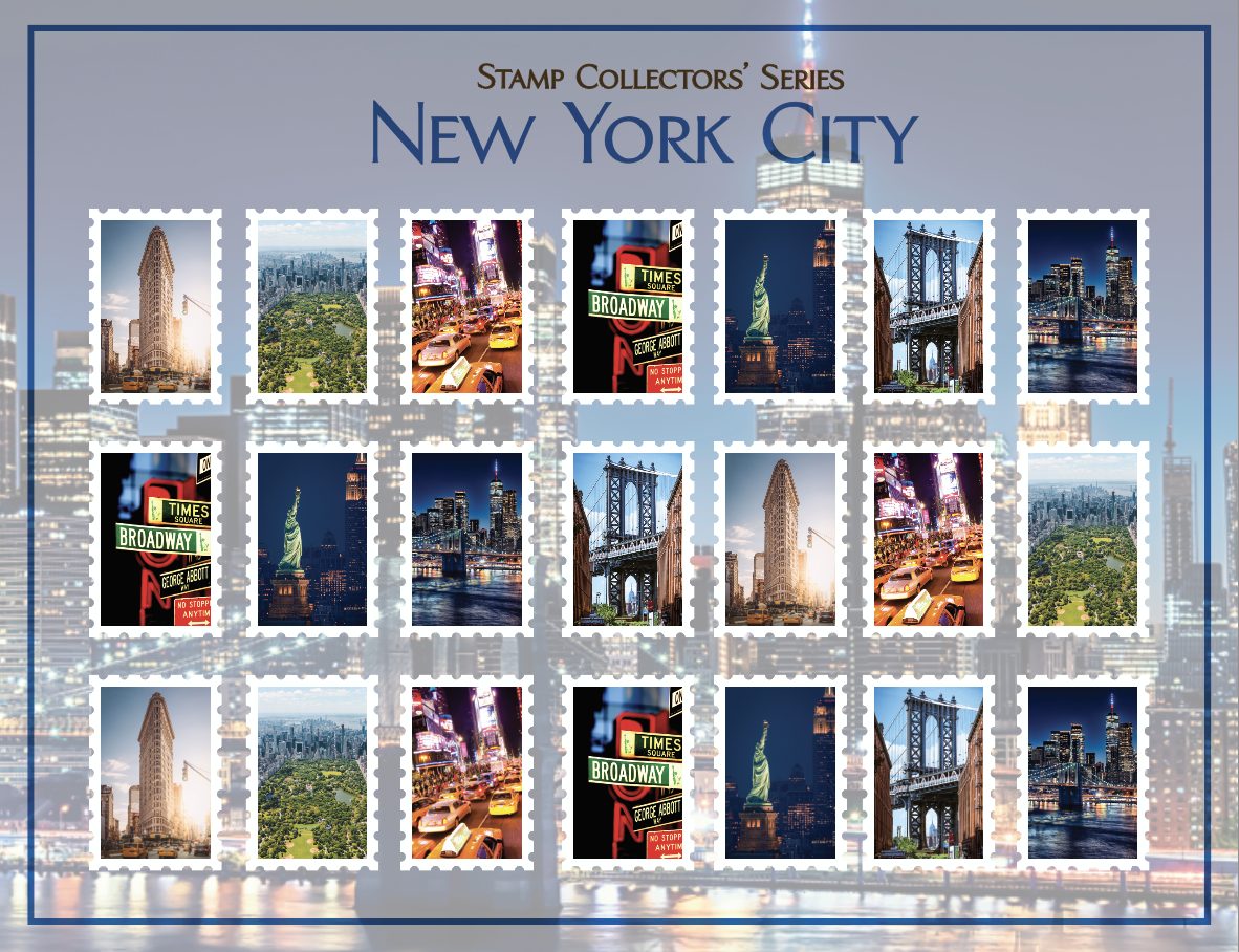
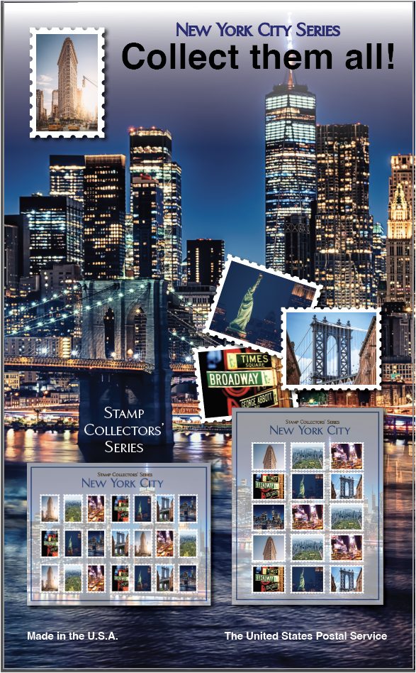
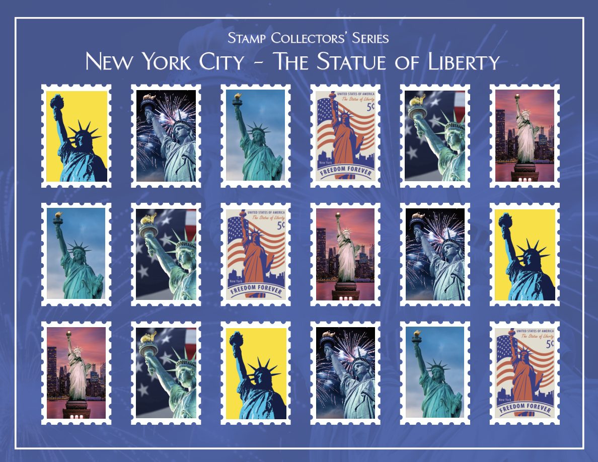
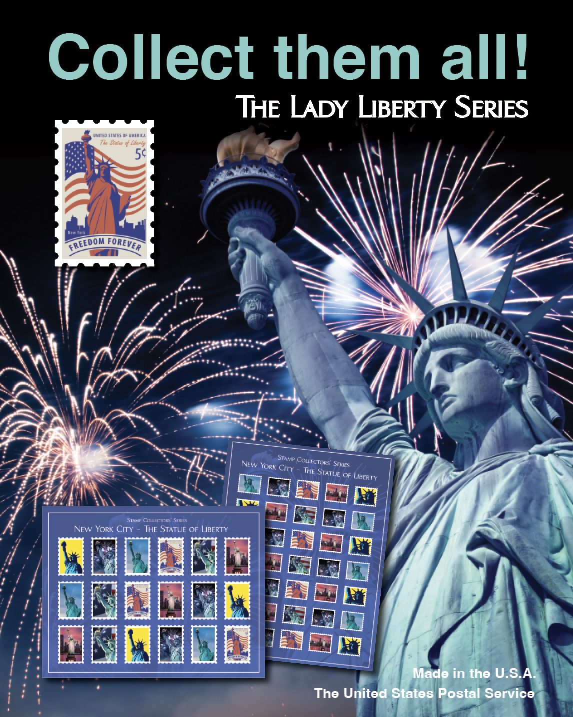
The part of the job a stamp collector would take home. Two cities, two collections — a Michigan series built from the state bird, the state flower and Ann Arbor landmarks, and a New York series built from the skyline — each one issued as a sheet and then advertised on a poster in the lobby.
The truck, and what it carries
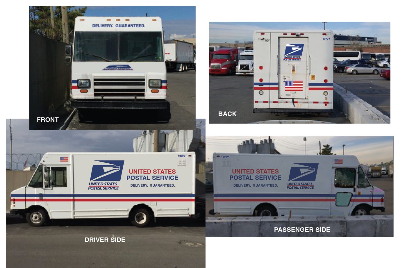
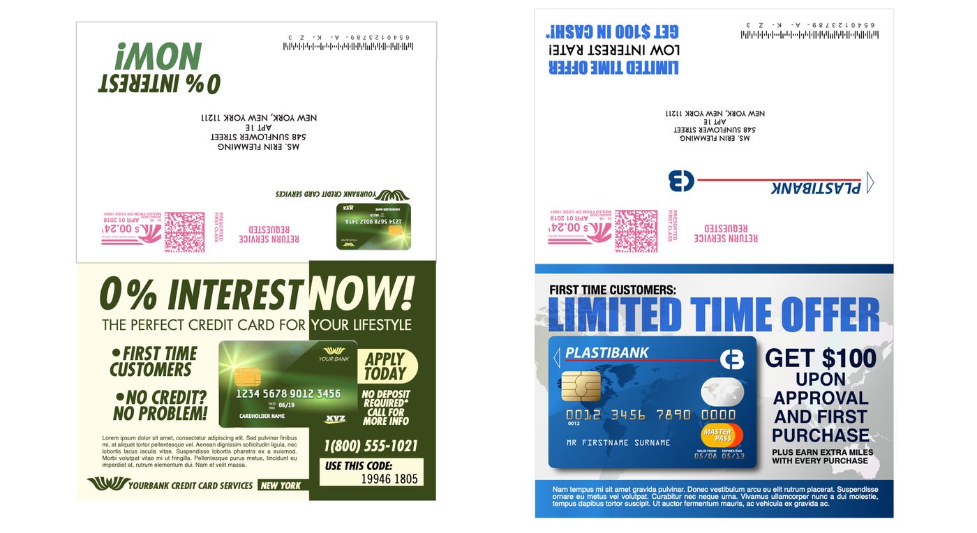
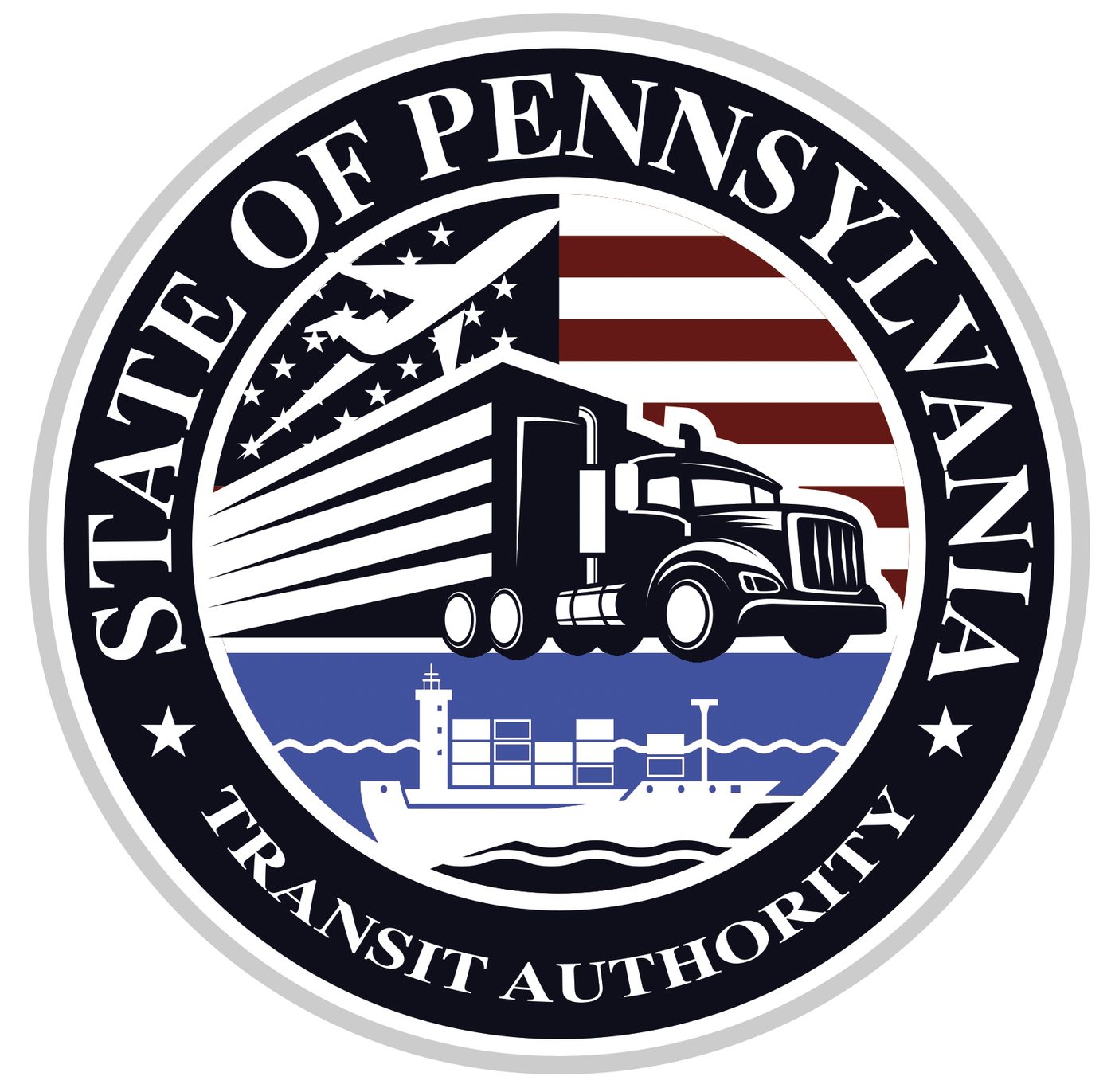
The last pieces are the ones that move. A delivery vehicle wrapped on all four sides, the junk mail that ends up in a character’s hands, and a state transit seal drawn for the same world.
The terminal
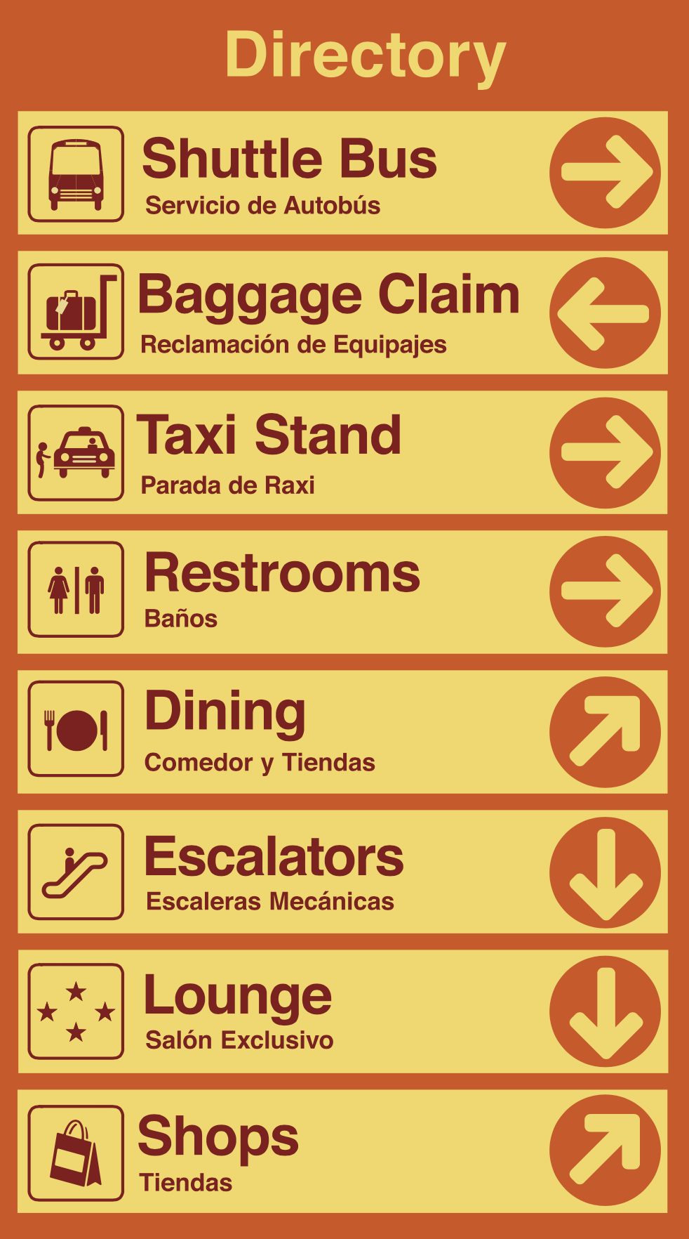
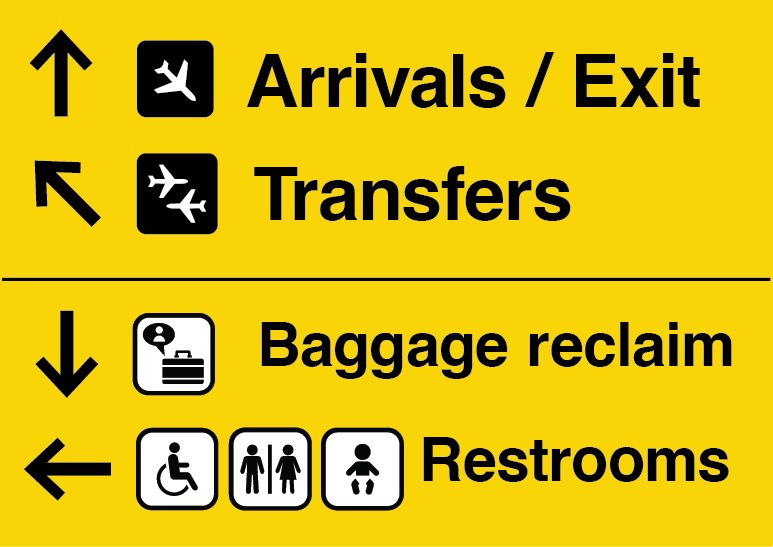
Wayfinding is the part of an airport nobody looks at directly and everybody reads. It has to be bilingual, iconographic and boring enough to disappear, while still telling the audience which airport they are standing in.
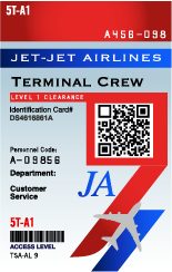
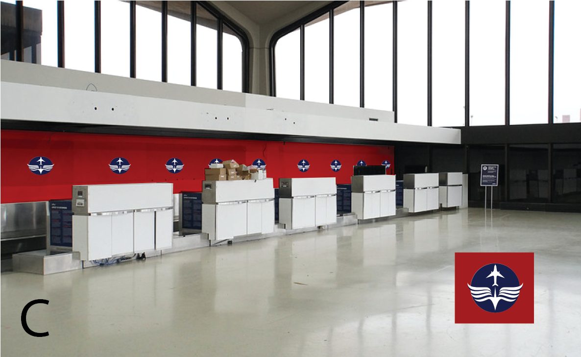
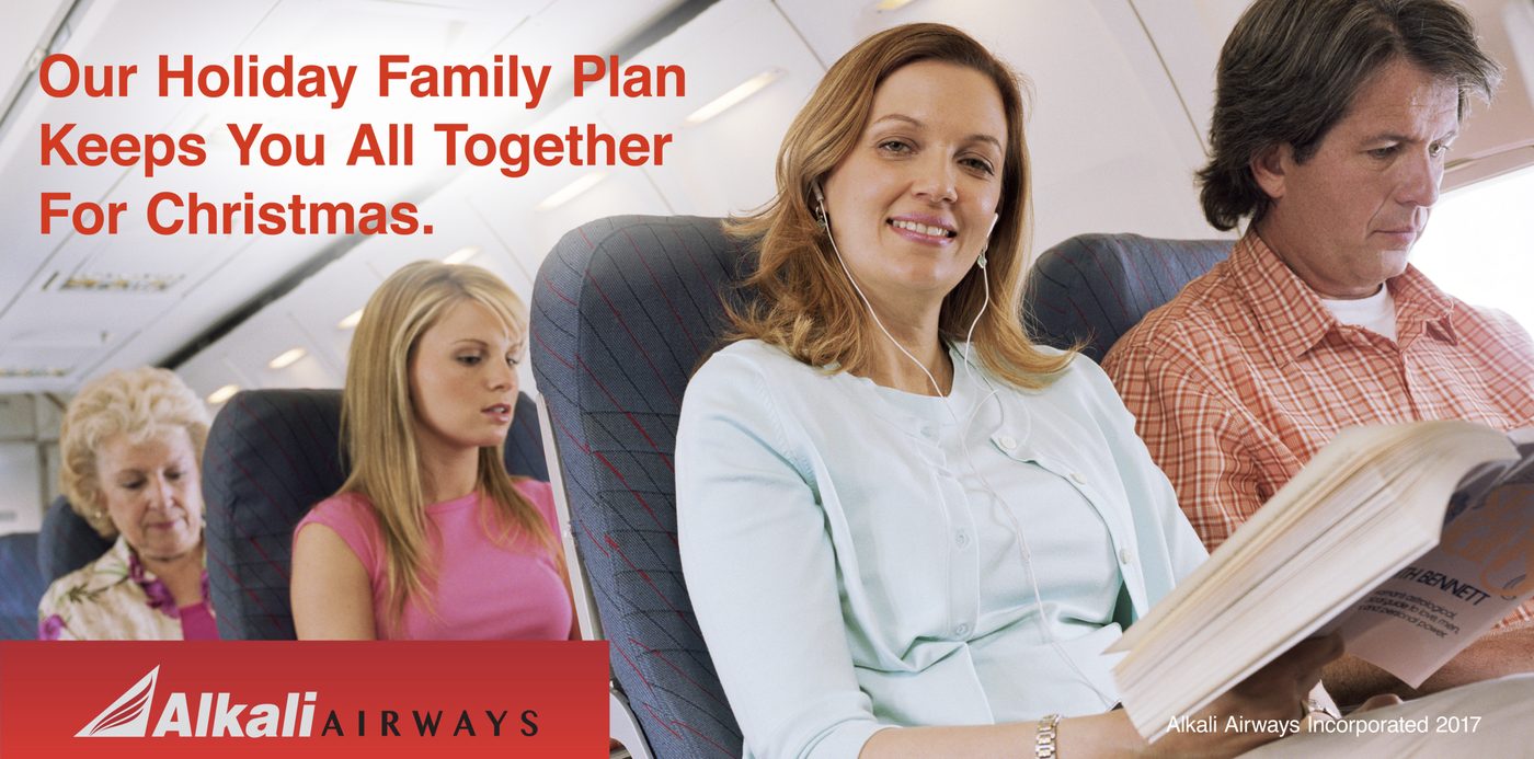
Alkali Airways
An airline invented from the mark outwards, then papered across a terminal — boarding notices, service posters and holiday campaigns, all in one red house style.





Essence Airlines
A second airline, in blue, because one airline does not make a terminal. Two competing house styles in the same concourse is what makes the place read as real.





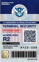
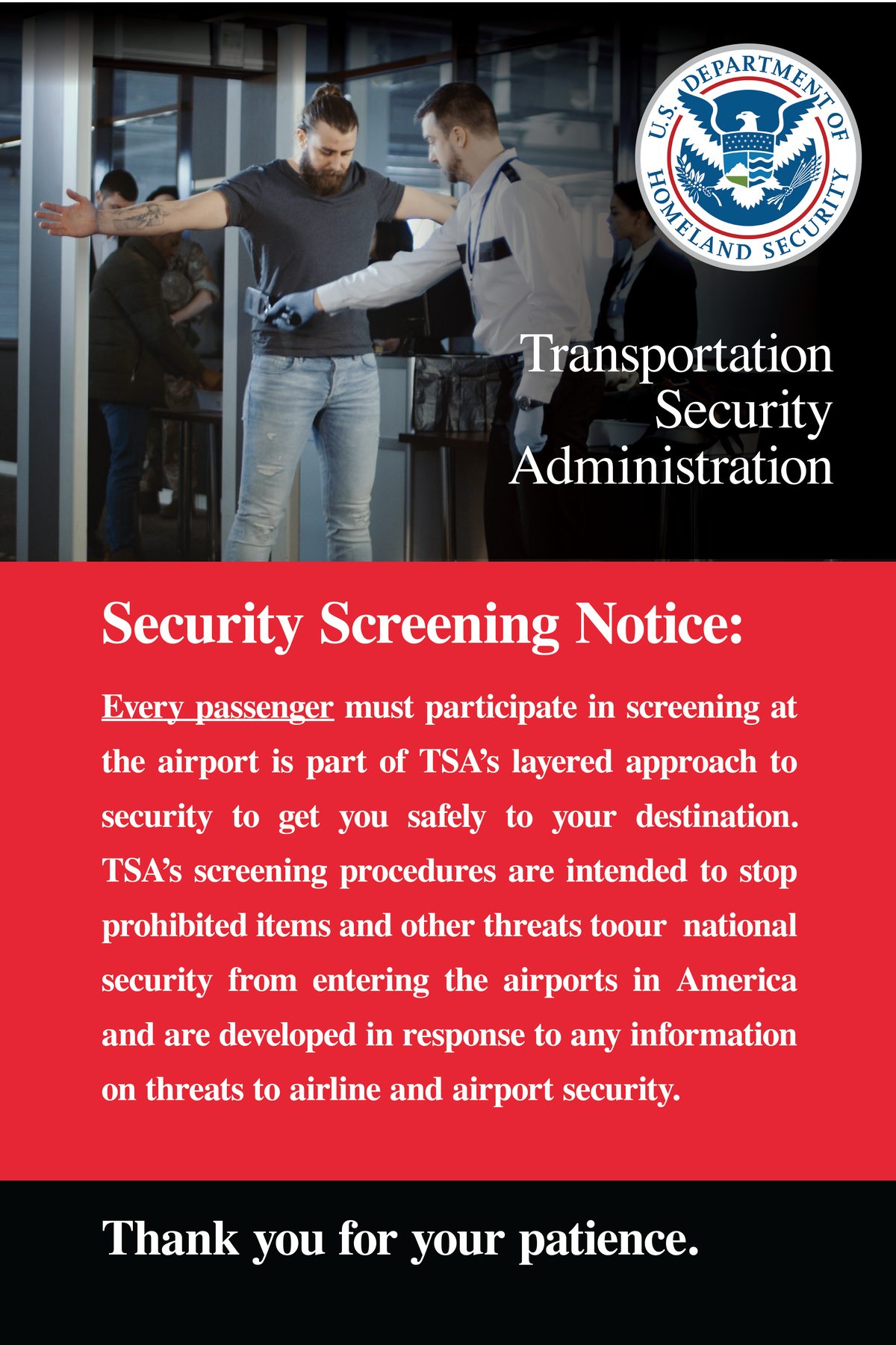
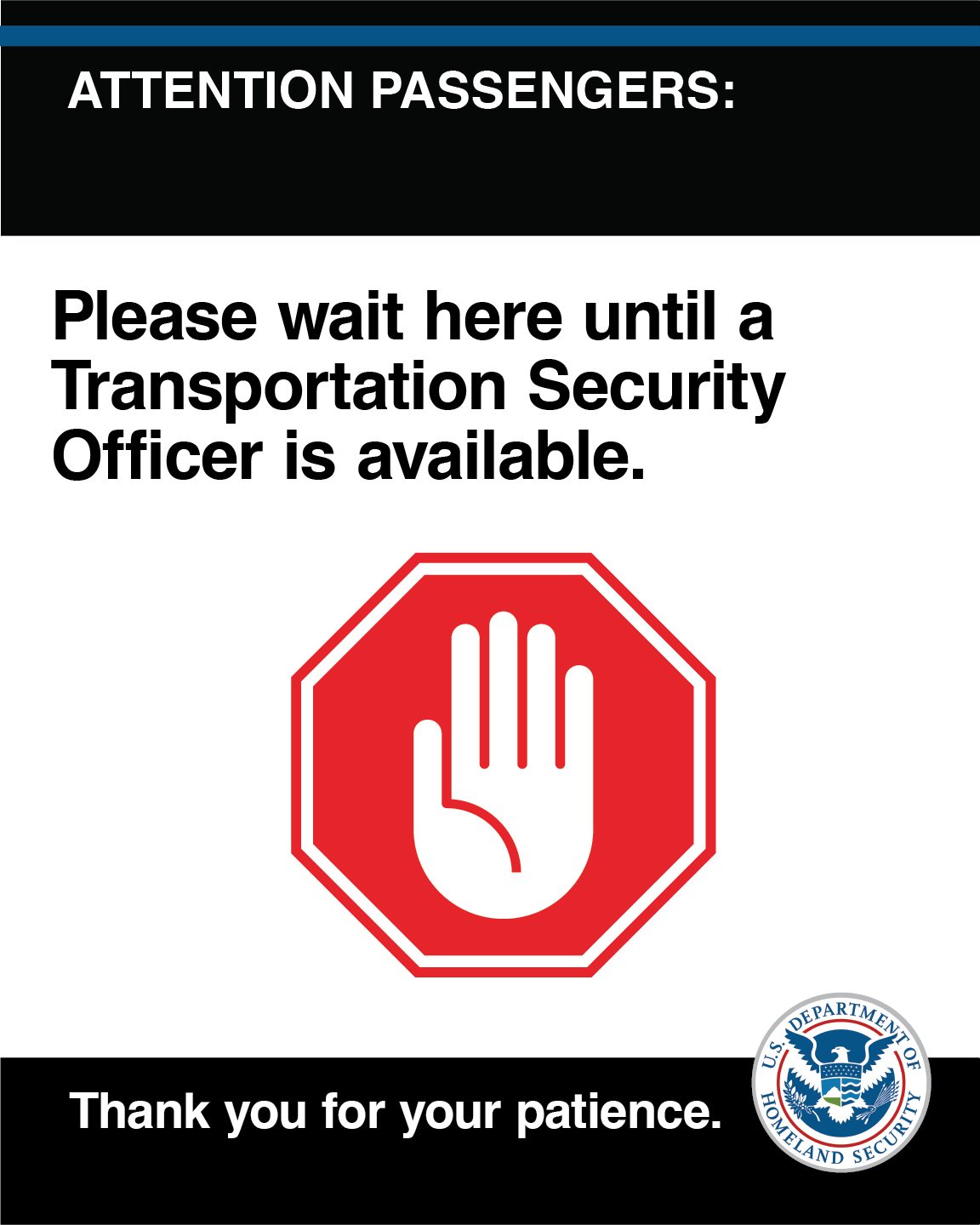
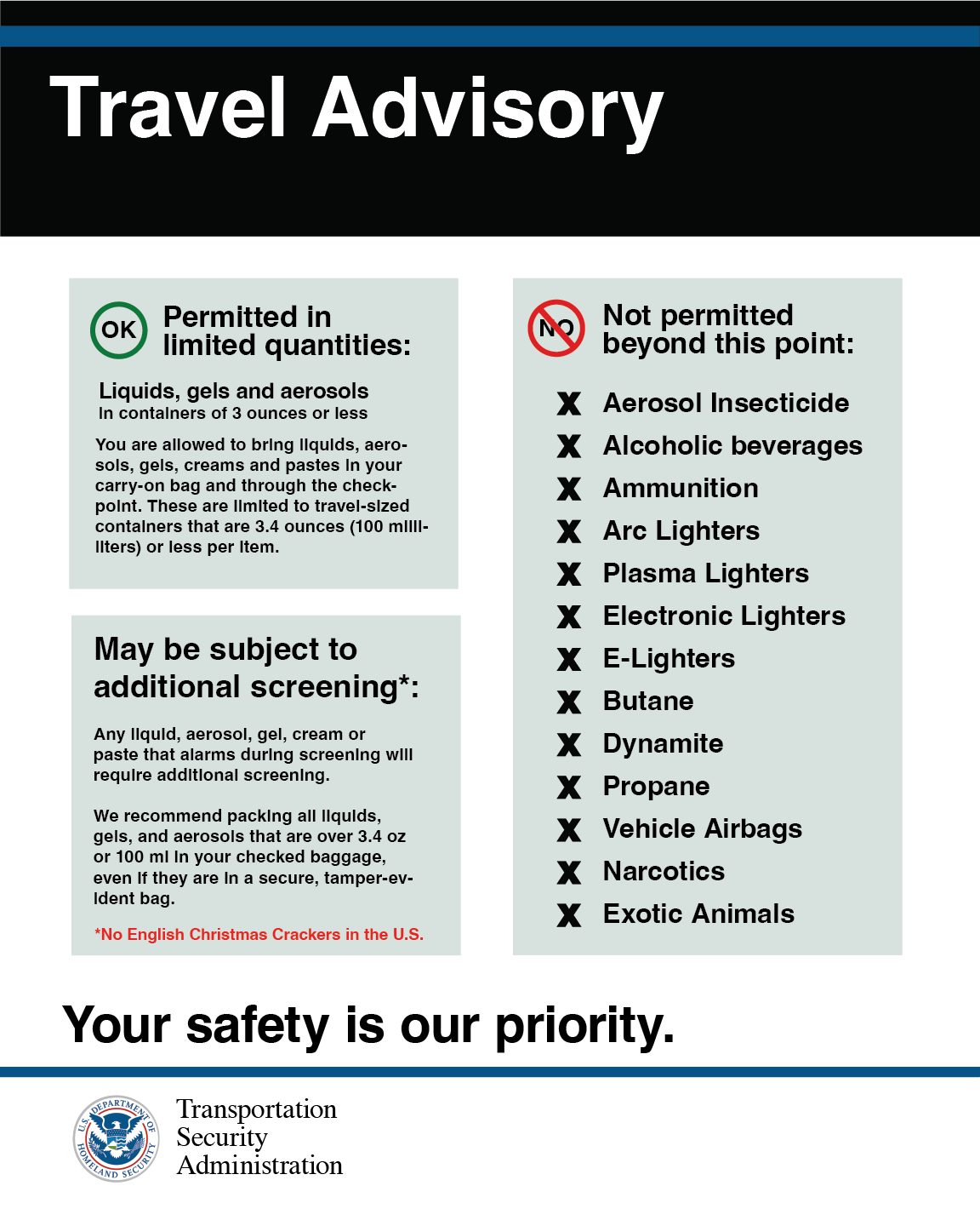
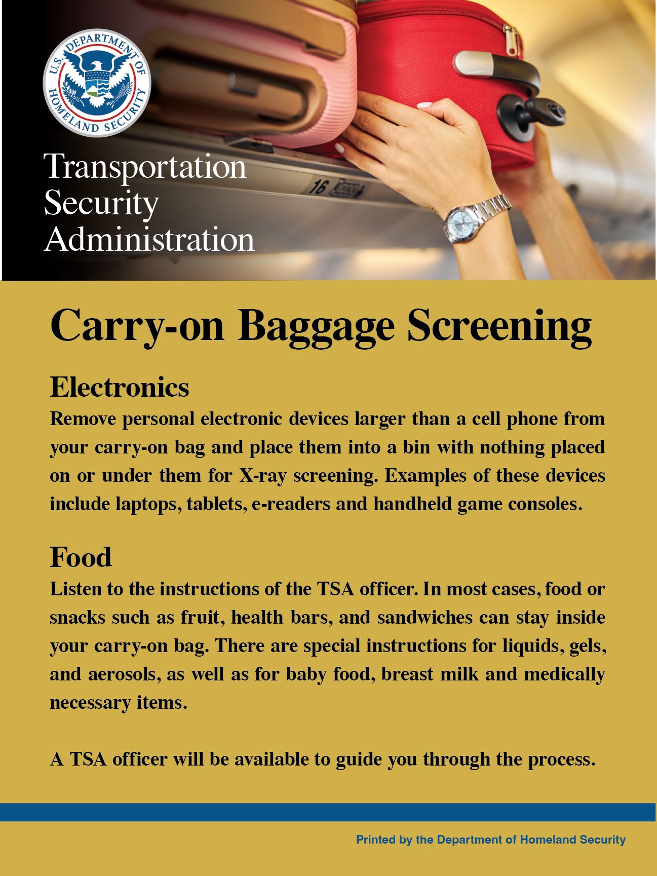
Transportation Security Administration
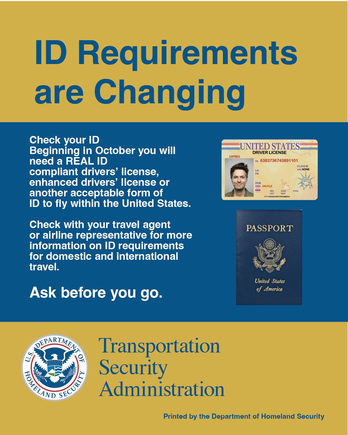
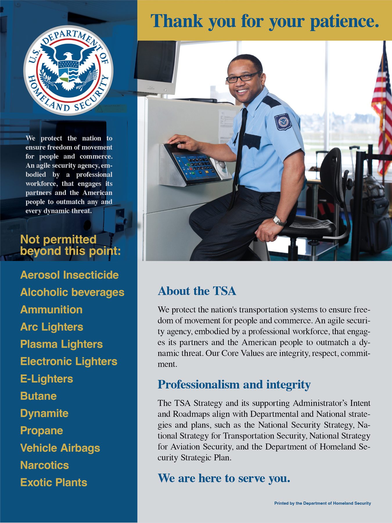
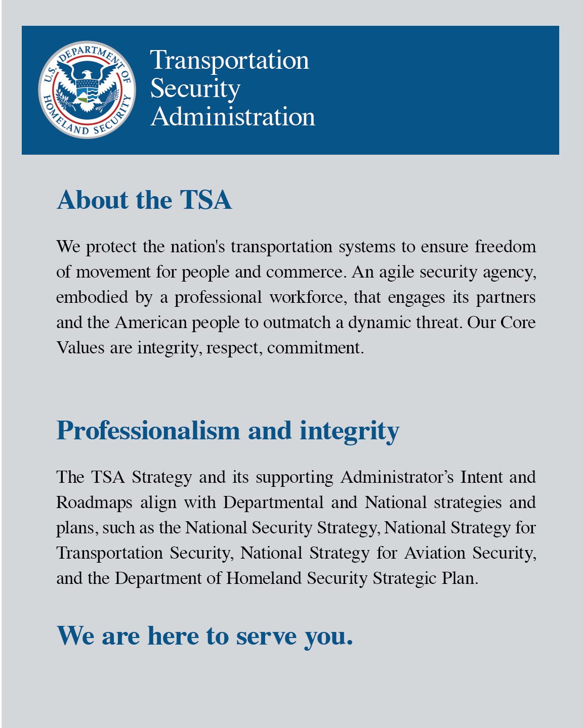
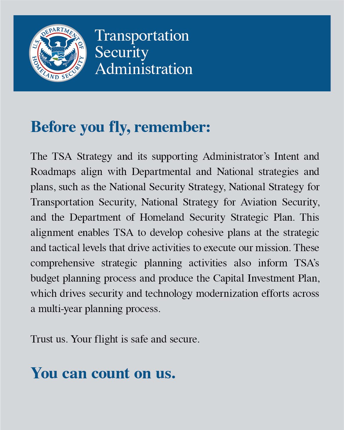
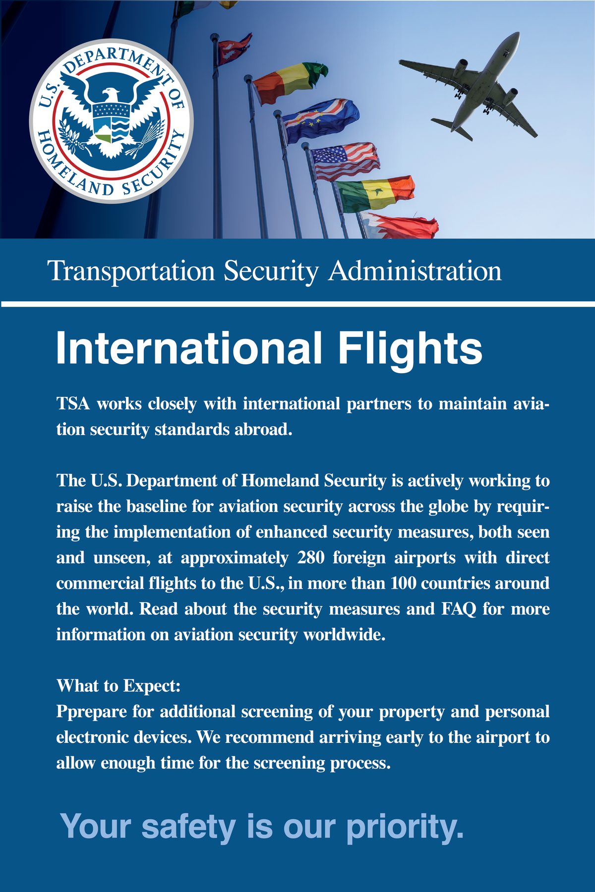
Dry and serious signs in the airport immediately create more tension in the scene. Twelve pieces in one federal house style — the mark, the wayfinding, the prohibitions and the reassurance — each one dull enough to be believed.



Baggage Re-Claim
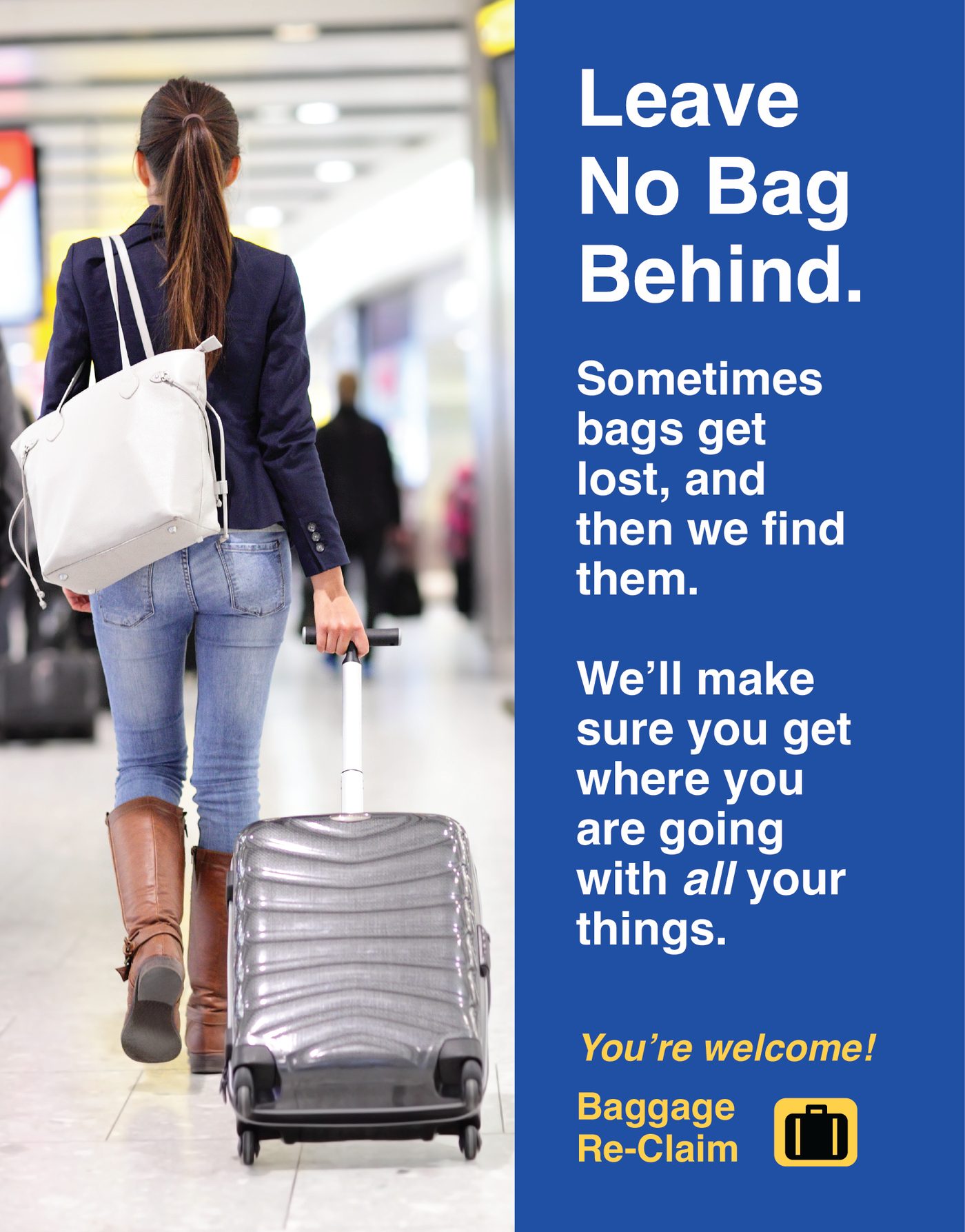
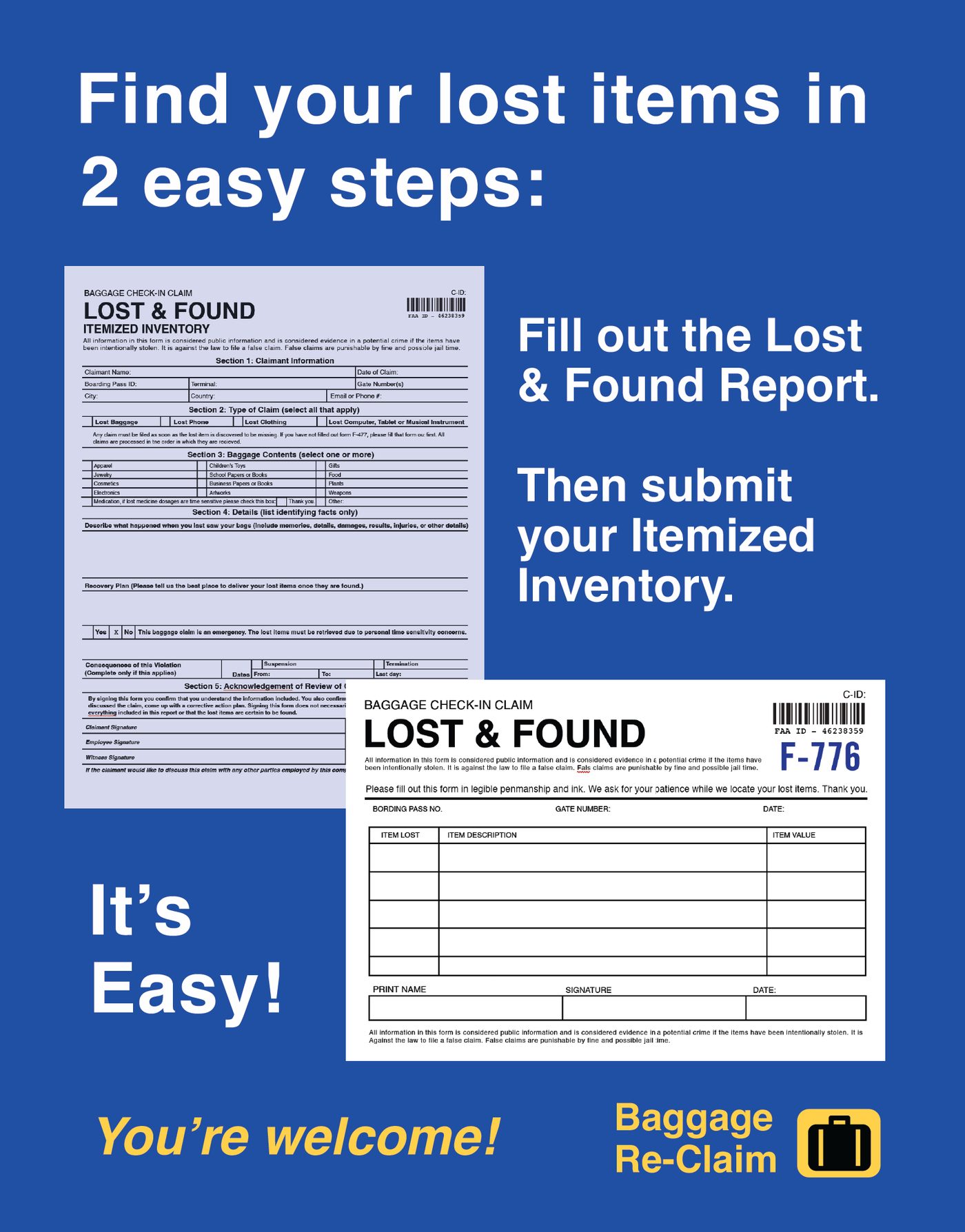
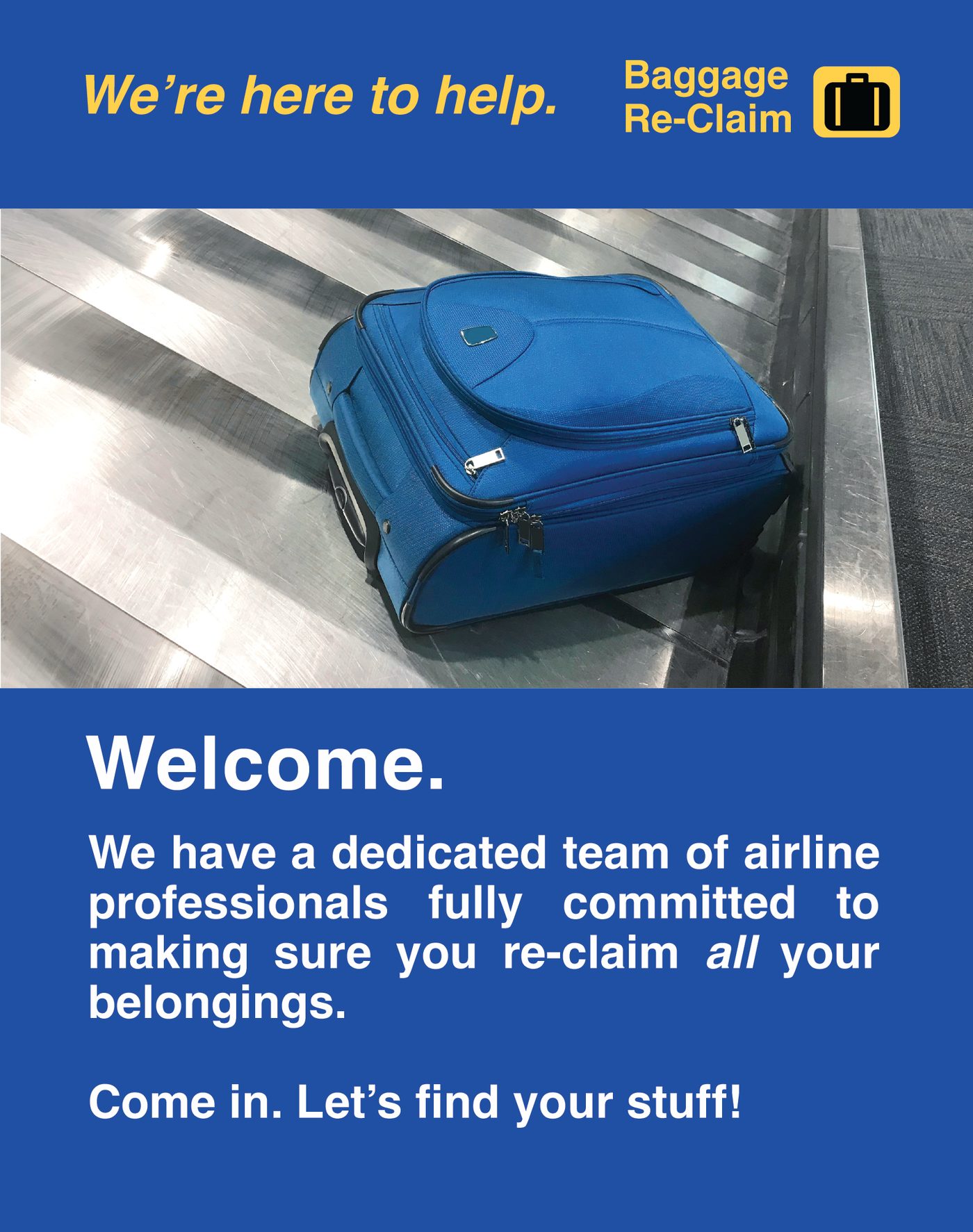
A lost-luggage desk, invented and branded, for a story about a bag that does not turn up. Four posters worked up on one 36 by 42 artboard, each doing a different job in the scene.

On board
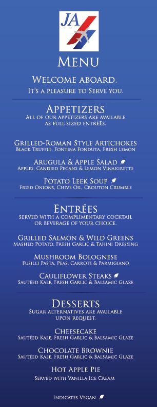
Two more invented airlines, and the pieces a passenger actually holds — the seat-pocket magazine and the cabin menu, both built to be read in close-up.

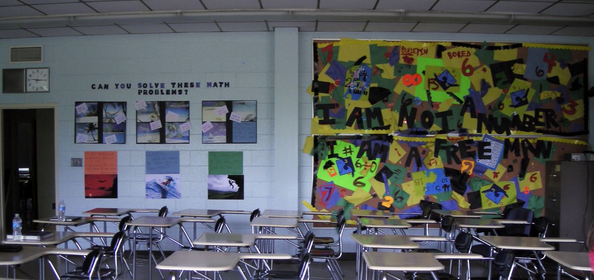
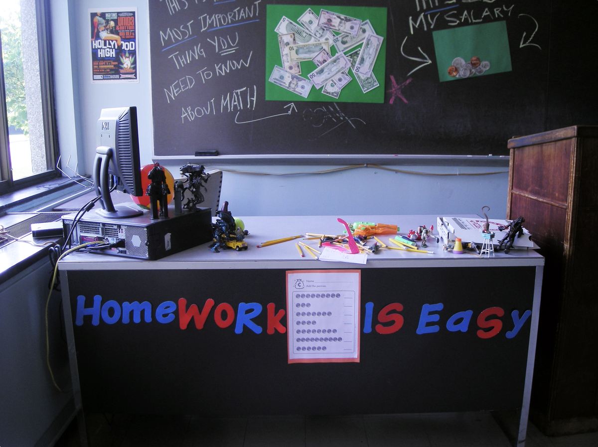
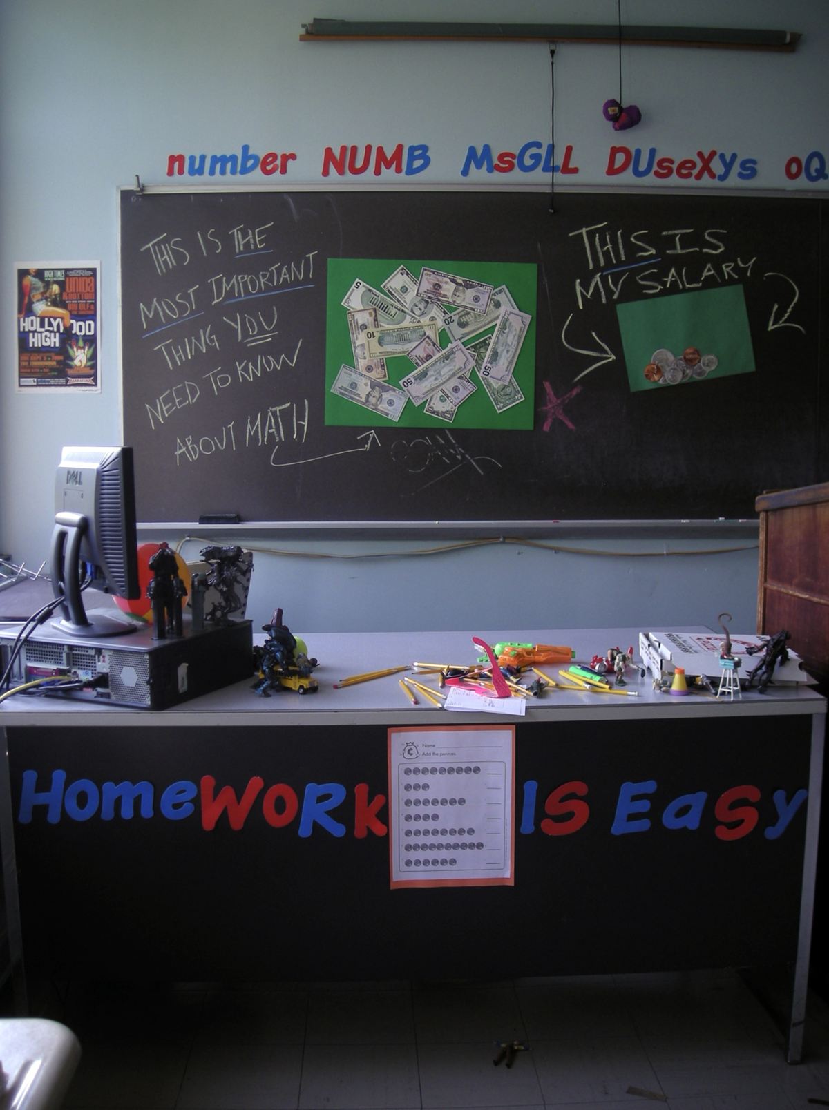
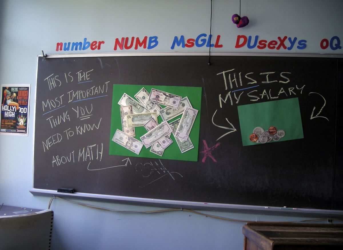
Classless — a math classroom
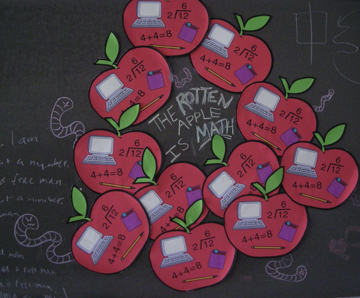
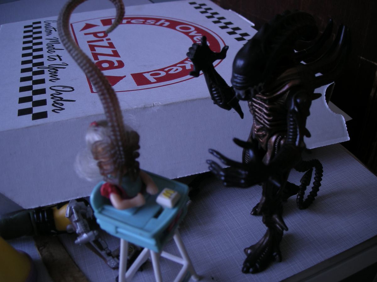
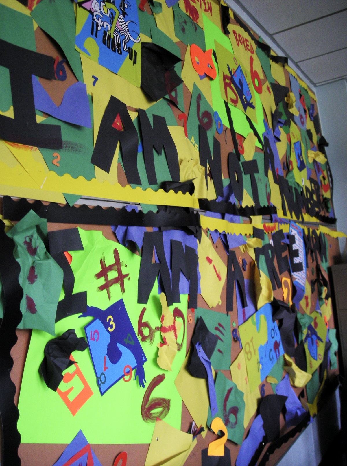
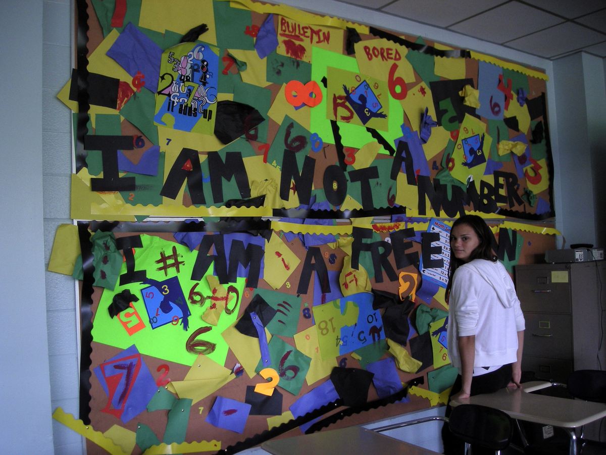
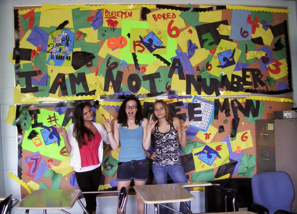
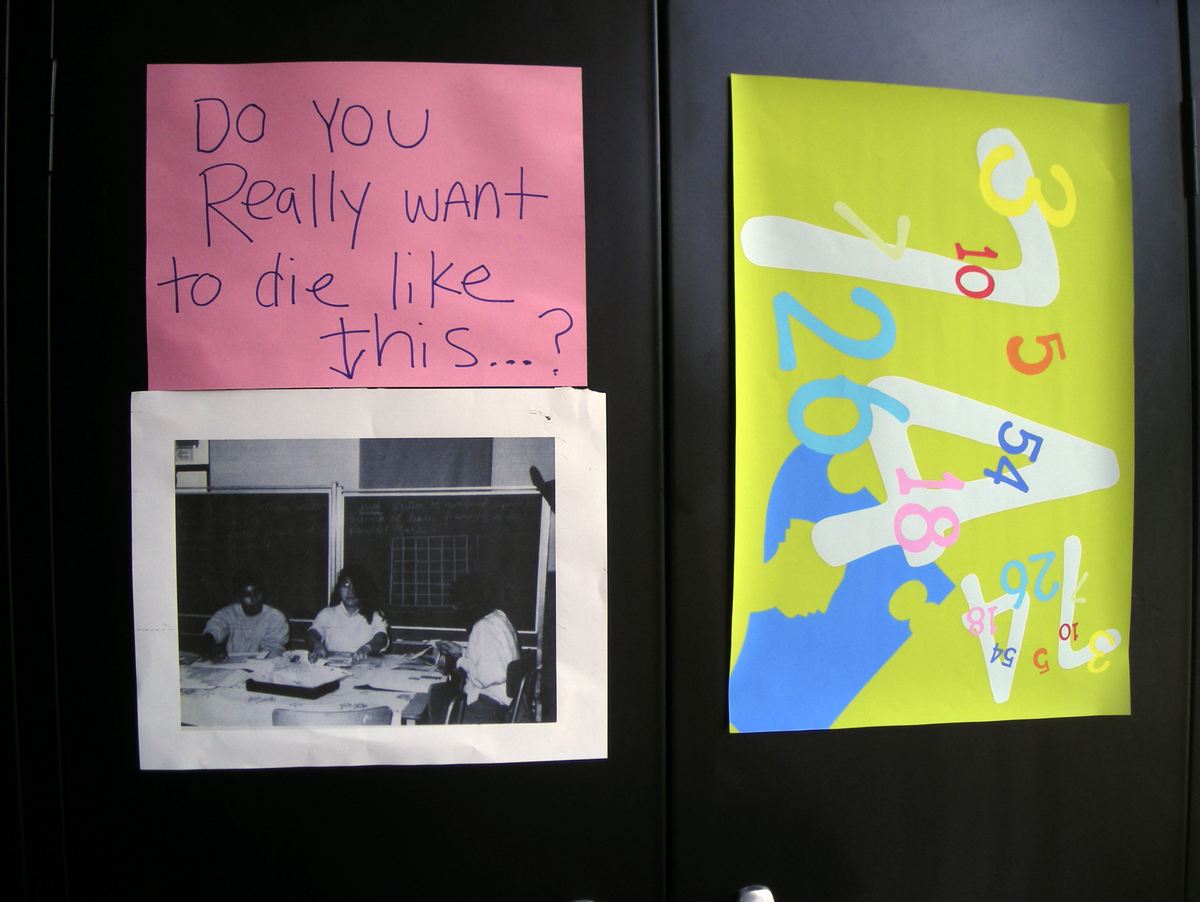
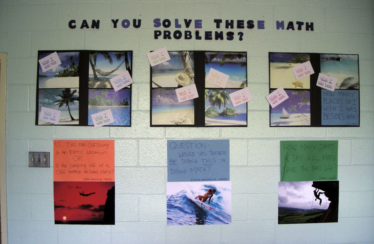
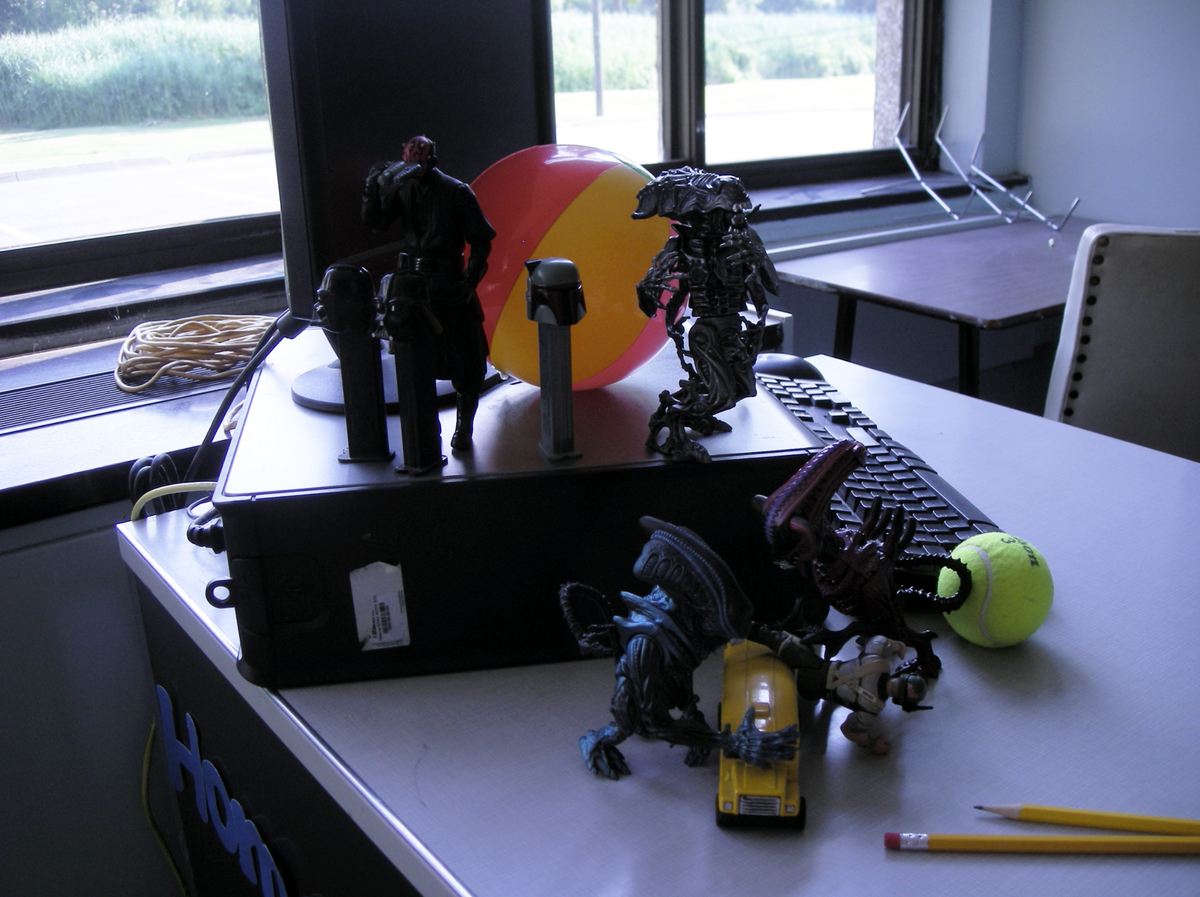
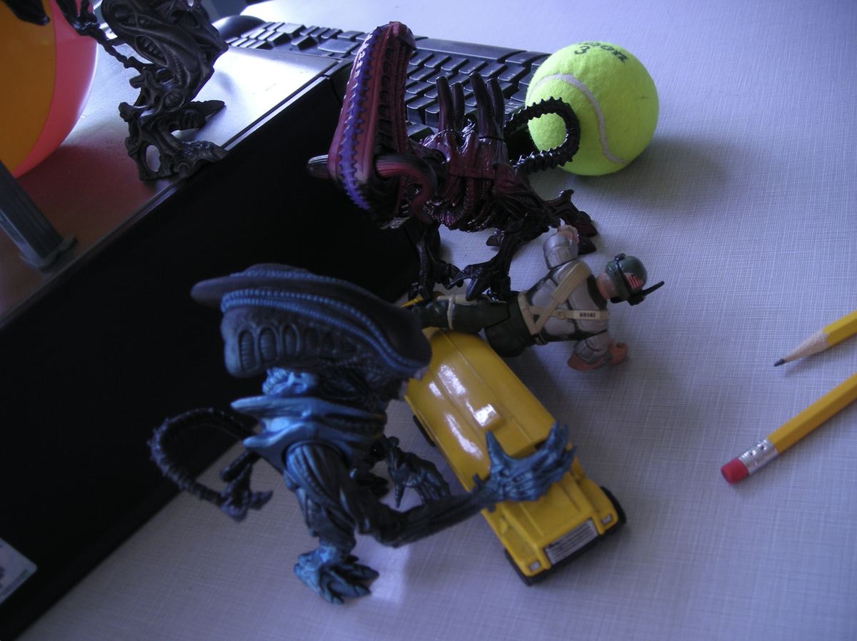
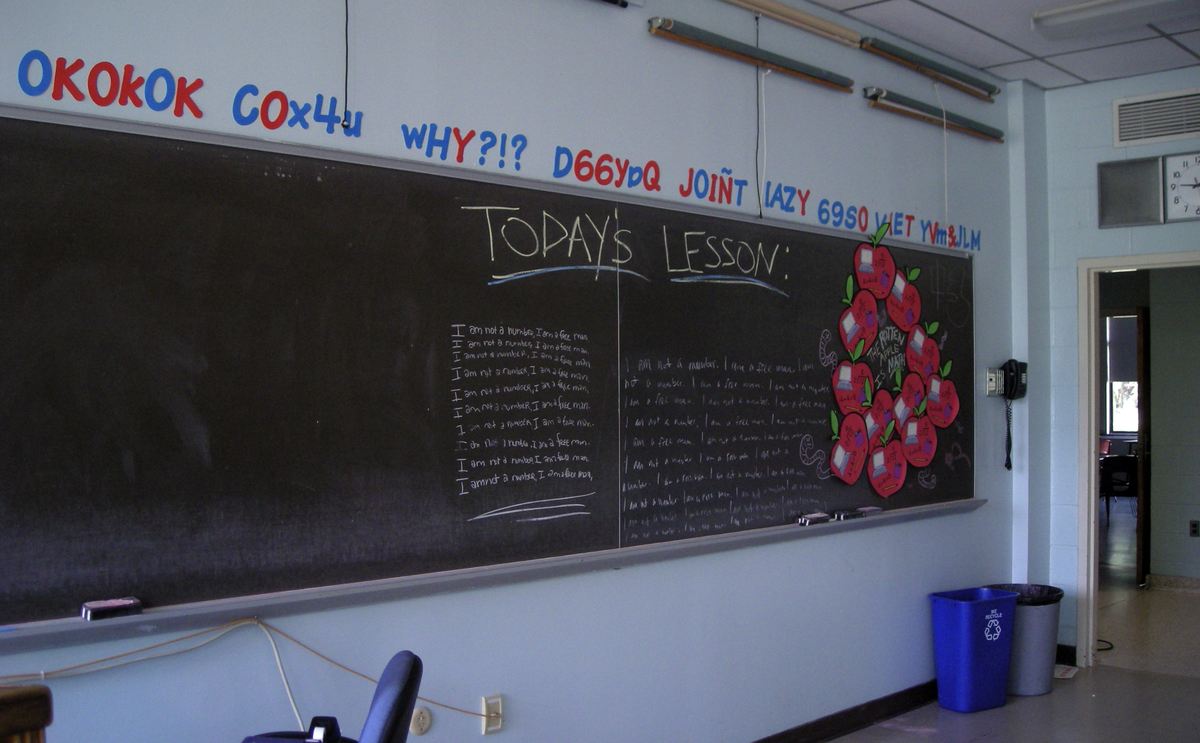
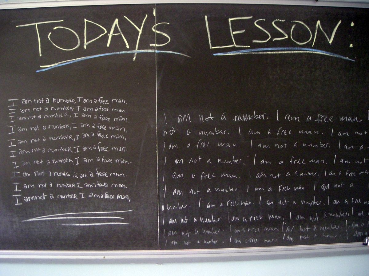
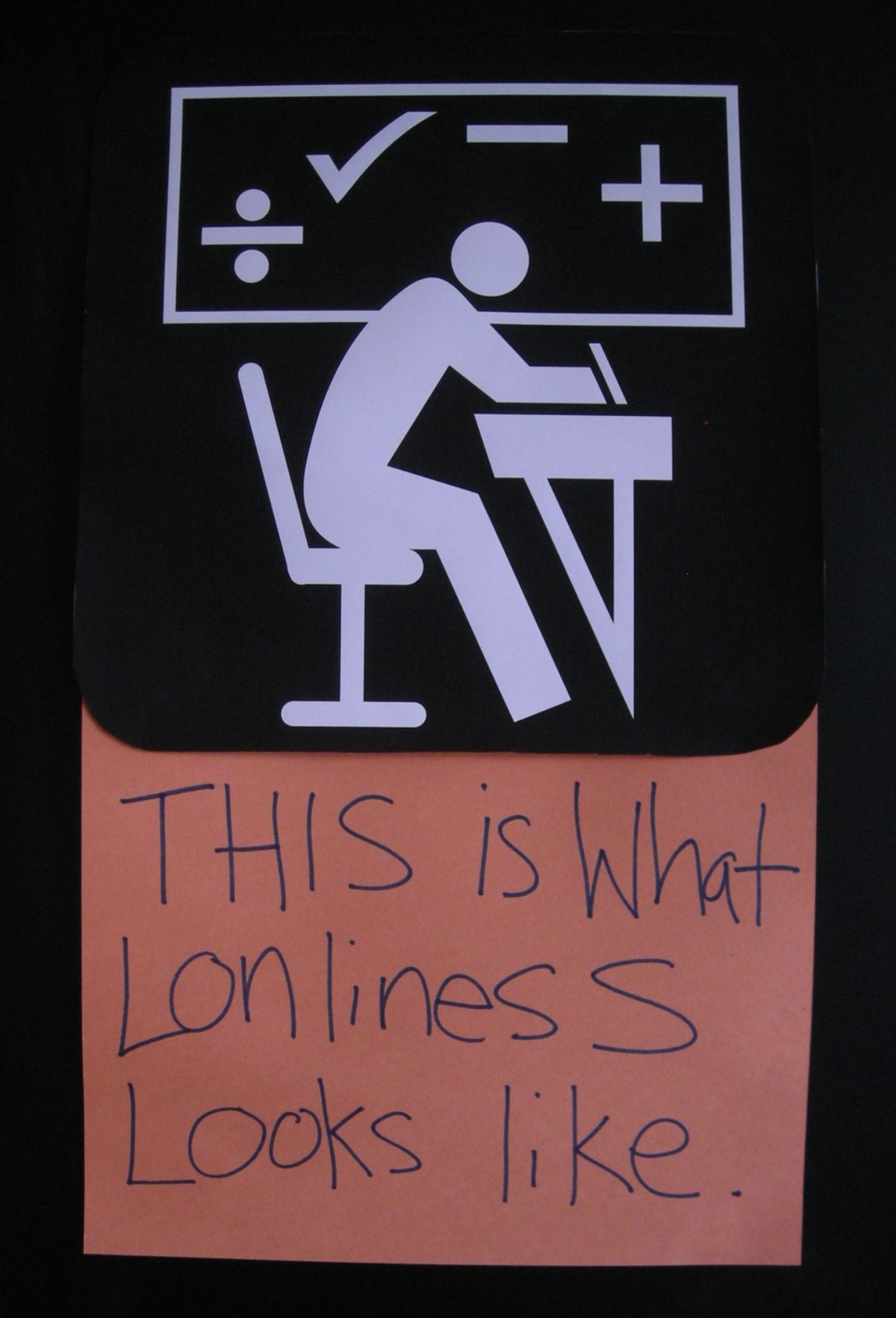
A pilot I produced, set in a high school. The classroom had to look like students had covered it themselves — every poster hand-lettered, every wall collage cut and pasted, and the jokes buried where only somebody actually reading them would find them.
- contact@yvonnemojica.com
- @vonsolo5